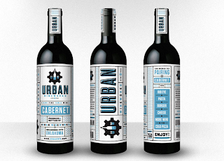
Foundry Collective did a rather typographic identity for Urban Wine Works, and here's the results....beautiful!
Tuesday, November 29, 2011
Visual Analogies Out the Whazoo
This might just blow your mind. Or, you might find it stupid.
Either way it's interesting. It's called Sonotype. The expression of letters and sound. I was really thrown off by the concept at first. It is defined as a series of experimental typefaces that challenges the arbitrary relationship between verbal and visual communication. They use sonogram interpretations- that is a visual representation of speech. It's kind of confusing and bewildering, but the website is fun to play around with. Never drew a relationship between sound and typography like that before!
http://www.sonotype.com/
Cool PDF chart of the pronounced forms and the actual written forms of the alphabet.
http://www.sonotype.com/about_sonotype.pdf
Rudi De Wet
Hakka Type
Type that reconnects globalization of Chinese settlers with fun ways to modify traditional characters.
Hakka Type is cool!
Studio Garo
Studio Garo is an illustration studio run by Gareth Leyshon. Colorful letterforms and hand-done type illustrations fill Studio Garo's work. Check out some of these letterform illustrations.
http://www.studiogaro.co.uk/


Pinterest/lettering
http://pinterest.com/matthew_gordils/lettering/
This is a post to my pinteresting lettering board. This is all stuff that I have been using as reference and inspiration and have collected in my "board" on Pinterest.com.
If you don't have a Pinterest account. GET ONE.
Monday, November 28, 2011
The Rather Difficult Font Game
 So anyone who is looking for a little training on their eye for typefaces, should check out this little game online. It's extremely difficult because the typefaces are shown using characters we don't consider that often.
 It's helped me learn a couple of new typefaces, and also showed me a bunch I don't know yet.
Play the game Here.
Saturday, November 26, 2011
n9ve, animated Typography
nv9e is an Italian based graphic design studio headed by Alessandro Novelli where they specialize in motion graphics. What's great about their studio is that they post behind the scenes and work in process screens. They also delve into photography, animation, and film. You can access their tumblr here or you can visit their website here. Below is their second attempt to animate typography called Alphabet 2. The video is filmed in a stop motion in the series called Alphabet.


The Alphabet 2 from n9ve on Vimeo.
Subscribe to:
Comments (Atom)


