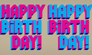
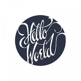
I decided to explore other type collectives and side projects that were started because of or affected by access to the internet, and found three recent and relatively popular sites.
Friends of Type
The Friends of Type blog was founded by Erik Marinovich and
Aaron Carambula in 2009 as way for the two friends to keep in touch from across the country.
It has since expanded from a personal online sketch depository into a group of
four men and their guest-letterers who celebrate their lives, goof around, and share rejected ideas through lettering and typography. They've described it as an "online sketchbook" where they provide fresh content every day from at least one contributor. At the end of every month, they choose a guest designer to contribute for a week.
Calligraphuck
Calligraphuck is a profane greeting card press in London. It
was started as a side project by Australian designer Linus Boman in early 2012,
who was inspired by curse-laden conversations with comedian friends as well as
past designers’ explicit projects. His goal was to take otherwise
personal greeting cards for his friends and give them a broader appeal. One
Indiegogo campaign, a few social media accounts, and an online store later,
Calligraphuck has grown into a business with a few hundred to a few thousand
followers between Twitter, Instagram, Facebook, and Tumblr.
But it’s the internet that really gave this project a chance. He used Indiegogo to raise $5,000 for materials and capital to start this press, a feat that pre-crowdsourcing would have taken months or even years rather than a few weeks. Through social media, he gets free advertising and networking for Calligraphuck, as well as exposure for his other design work. He also stays connected with his fan base/clientele by holding submission competitions for new phrases and obscure curses, allowing the public to contribute to the press and also decide on what they want to see in the store.
Lost Type Co-Op
Lost Type is the most prolific of these three collectives. With their novel business model and interesting display faces, their work has been seen everywhere from Urban Outfitters to summer camp applications. The idea behind it is that designers create typefaces (some complete with punctuation and numbers, some without lower case, and even some number-only faces) and then you name your price online. You can pay any or no amount of money for them, and in return you get virtually unrestricted use for nice free fonts. Naturally, this has made them extremely popular.
While some have lamented the overuse of these fonts (making them uncool or at least way too recognizeable), others have pointed out that corporations or anyone who could pay the full price for a typeface could (and do) choose not to. Critics feel that designers are being taken advantage of, while others feel that it is, again, free publicity. Either way, Lost Type Co-Op remains the only foundry to have this business model. In the online age, they control their typefaces pretty much completely. Why pirate something from a shady site when you can get it from the original for free?


