Friday, February 28, 2014

Paper and Typography

Many typographers and graphic designers find new ways to play with typography fun and entertaining. People play with words in unexpected ways that excite the inspiration in another artist. 
However, even though it's awesome seeing various and, quite frankly wild, ways to play with type, it's refreshing to see a designer go back to simple words and paper. 
Sabeena Karnik is a graphic designer from Mumbai, India, who returns to the use of paper. However, she does so in a beautiful and sometimes very delicate style. 
Her work involves just rolling and placing paper just right in colorful, ornate forms of typography to create wonderful pieces. 
Some examples are listed below. 


Her link to her behance is here is for anyone who is interested in seeing more of her art. 
Again, wonderful work with nothing but paper. 


Friday, February 21, 2014

RETNA


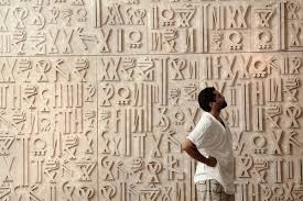
            Marquis Lewis, better know as Retna is a Los Angeles graffiti writer who in recent years has become a star of the contemporary art world, with commissions by Usher and other hollywood stars. His work can be found in galleries everywhere from New York to Hong Kong, and has even done work for clients such as Nike, Louis Vuitton, and VistaJet.

His paintings which appear to be an assortment of complex line work, are actually a paragraph made up of characters in his own unique alphabet. The alphabet consist of unique conscript characters based black letter, Egyptian hieroglyphics, LA graffiti hand styles, and both arabic, and hebrew calligraphy.

Retna comes from a heavy gang affiliated part of LA, where he spend his youth as a graffiti writer, and developed a true love for typography. Retna has never openly translated his work, but he notes that if you study the work enough you, can actually decipher it.


Retnas exhibition in the MOCA consisted of two large murals spelling out the names of the artist that has influenced his work


http://www.youtube.com/watch?v=WUCyvouALKQ


Thursday, February 20, 2014

Now you see it. Now you don't.

Unlike "finer arts" such as painting and sculpture, graphic design was created with the intent of a short life expectancy. Historically, it was never meant to be collected and coddled. It was meant to send a message and that was it.

This practical and ephemeral nature of graphic design has always intrigued me. As Kelly mentioned the other day, and many designers learn, our work is not precious. Even though we bleed for it, we stress over it, we miss those hot dates and killer concerts for it...we have to learn to let it go. 

Throughout many diciplines, a lot of artists and designers are drawn to this idea of ephemery. For them, it can reflect the fleeting nature of life and our moments of joy and sadness. There can be beauty and emphasis created by something that lasts only a short while. 


Here are a few examples where the designers have used ephemeral typography to explore these ideas of fleeting moments. 


One Day Poem Pavilion


Evaporating Letters


Good Design is Long Lasting


Found objects and 48 hours later


Friday, February 14, 2014

Type in Perspective

So I am sharing a couple different videos for this post. The first one is of a child and an adult writing out the alphabet in ink. The child seems like he is trying to mimic the mark that the adult is doing and it is interesting to see how the child recreates the form of the letter. The second video is of anamorphic type. This is where the type can only really be read at a certain angle an when its viewed at a different angle then where it is intended to be read it looks like something else. I think it is just interesting to see type in a different perspective than just printed on paper.


Thursday, February 13, 2014

Snow Day Typography!

Since there has been an abundance of snow this winter.. I'm thinking about practicing some calligraphy out there like this guy.

"Mr Gren" is perhaps the most well-known street artist/semi-vandalist/snow typographer (although no one seems to know who exactly this mysterious man is) see his flickr here.


Chalk lettering.

Unless you've been living under a rock the past few years, then you have probably noticed a bit of a resurgence in the art of the chalkboard.  In terms of hand drawn signs, nothing is more popular than having a well laid out and beautifully written chalkboard sign.  You can find these all over crafts websites and sites like Pinterest and Tumbler, but it's obvious that chalk lettering is a skill all on its on.

There are certain tricks and tools that all chalk letterers should know or have on hand.

For one, your chalk board need to be completely cleaned off and wet down so no previous projects show through.

For the chalk, plain white and nothing special will get the job done the best.  If the chalk is damp then you will get a deeper white line.

You should have a damp rag and a bowl of water on hand to clear off mistakes and sketchy lines.  Wet q-tips are also good to have on hand for small mistakes and fine details.

Another essential tool is a ruler to measure width and distance of your letters.

Looking at these signs you would think that hey, these people must have very steady hands in order to get such clean, crisp lines. That's only part of it.

There are different methods in which you can achieve such a clean almost, computer graphic quality to your chalk art.  

For some it is a matter of mapping out everything before ever touching the chalkboard. First everything is done on the computer and the it is printed and gridded out onto the chalkboard.  Rosemary Wannan


Another method is to upload your art onto a projector so that the chalk lettering becomes a matter of tracing the lines.

The most skilled and serious of chalk letterers achieve their art without the aid of any projectors or grids.  They eye everything and use a ruler to gauge the width of the letters and the distance.  It is time consuming, but the result is well worth the hassle.  

Famous chalk letterer Dana Tanamachi speaks about her method in lettering.

Dana Tanamachi


Nathan Yoder
CJ Hughes

Molly Jacques 

Friday, February 7, 2014

Creating the Karloff Typeface

Here at Tyler, we are often encouraged to make our work conceptual.  If we were asked to make a typeface could we do it with this approach.  Peter Bilak argues that there is no such thing as conceptual type however he went on to explore the idea in creating the typeface Karloff.  In creating this font he found the most beautiful and most ugly fonts in history and set out to combine the two to create a coherent font.

For the beauty he chose Bodoni and Didot.  Both are classic typefaces, created by masters of type in their times.  Bodoni laid down the four principles of type design: regularity, clarity, good taste and charm.


This is the ugly.

This typeface was designed to defy the readers expectations.  It was called a typographic monstrosity and a degenerate.  In his project Bilak wanted to show how closely related beauty and ugliness really are.  He says the difference between the attractive and the repulsive forms lies in the contrast between thick and thin.


He designed these two versions of the typefaces and then combined them.

So in the end, we have a positive, negative and neutral version of the Karloff typeface.


Thursday, February 6, 2014

"Back in Five Minutes" A Typography Exhibition


Something interesting I came across while searching for inspiration was an article about an exhibition dedicated to the art of typography called “Back in Five Minutes”. The exhibition highlighted the work of 5 talented local designers and illustrators. This exhibition took place in cape town, at a gallery called salon91 and opened exactly 1 year ago in February of 2013.

back in five logo web image

The typography in this exhibition is beautiful, most of the artists are both designers and illustrators so the typography is bold, illustrative and very visually engaging. 

Ben Johnston 


(laser engravings on wood, the first one is laser engraved and also hand painted)


(laser cut wood/ handpainted)


(digital print on cotton paper)


Clement de Bruin

       ("broke is the new rich" to the left is a silkscreen and to the right is laser cut perspex)


      clement-de-bruin_quit-slackin_laser-engraved-mda_480x480mm_webclement de bruin_wander_laser cut perspex_430x430mm_web
("quit slackin and make shit happen" - its difficult to read I could only make out some words without finding out what it says but I like the abstract forms the letters make)


Clint Campbell  


clinton-campbell_ampersand_archival-print_530mm-diameter_ed3_web (digital print metallic vinyl on glass)


Dani Loureiro


 (archival print on water color paper) 

(pen and ink) (laser cut wood and perspex)


Justin Southey


 (mixed media sculpture)


(prints showing mix of illustration and image with type )

There is such a strong quality to these designer's work that's really inspirational to me. I love hand done type and illustration, and mixing the two together cohesively can turn out to be really beautiful. Also these designers aren't just limited to one way of working, they are very hands on, and use a variety of materials to execute their vision. Some are just prints, but the choice of surface they choose to print on  adds to their design giving them texture. Other approaches are completely 3d and sculptural while some are made from perspex (transparent plastic / acrylic). Southey says that he strived "...to create pieces which were sophisticated, yet playful. I drew strongly from the local narrative, and allowed my pieces to act as voices of the city.” And I think he did just that as all these designers did. 


The Salon91 website containing artist works and other info: http://www.salon91.co.za/?cat=141

Some articles about the exhibition: Cape Town Magazine