Wednesday, April 15, 2015

Italian Futurists

Link To Video!
"The Italian Futurists hoped to change the world, and were improbably successful in hind-sight. But they have never had a proper show in the America. The Guggenheim in New York has set out to change that."
-The Economist

Futurism: speed, youth, technology, industrial city. They practiced in every medium of art. Avant-garde movement | Milan 1909. Admired violence and very patriotic.


Bruno Munari strongly believed in the principle of public access to the means of visual communication. He believed anyone could produce objects of aesthetic value, given the proper technological advantages. His artistic ambition was influenced by Filippo Tommaso Marinetti whom he met in Milan in the 20's. 

Notable Italian Futurists: franco grignani, giacomo balla, umberto boccioni, fortunato depero, and filippo tommaso marinetti

The link to pinterest highlights typographic examples of the movement!


Link to Pinterest!
Bruno Munari

Thursday, April 9, 2015

The Art of the Lock Up

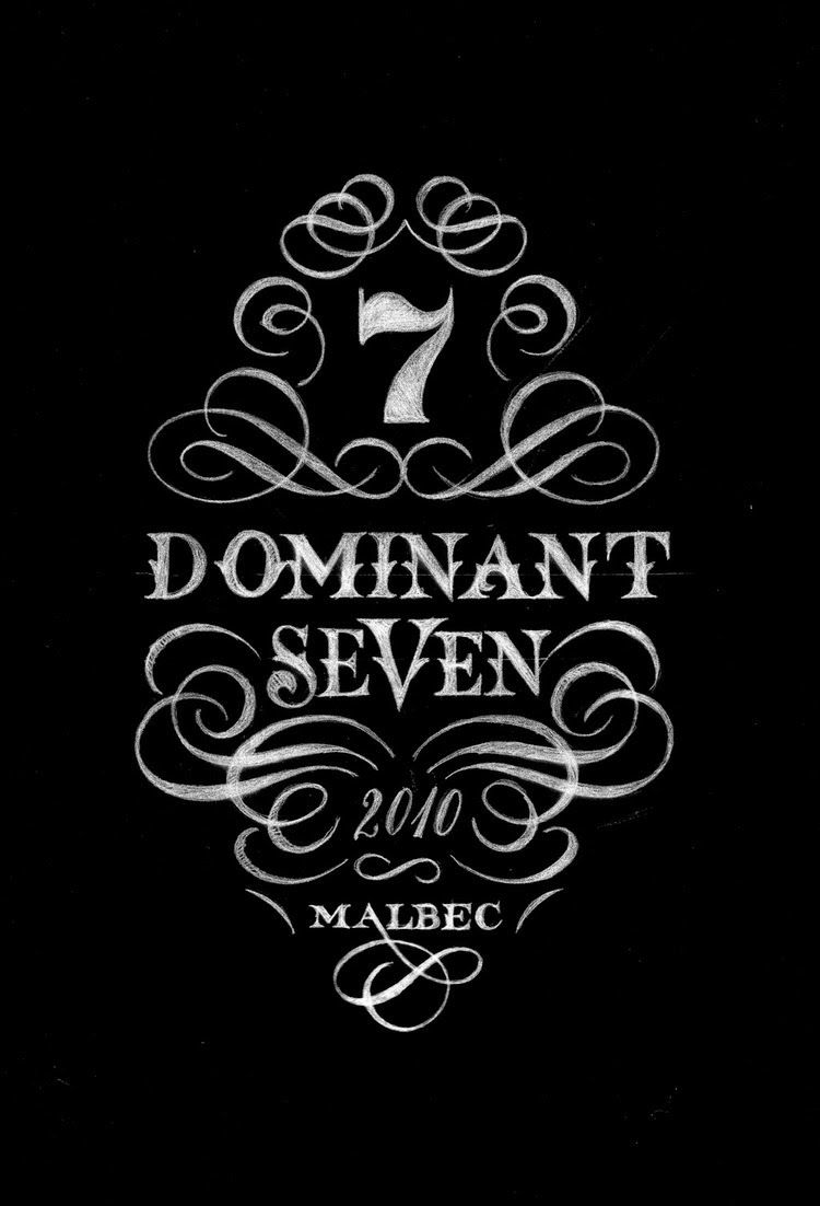
A big trend in typography now is the lock up. Typographic lock ups, when done correctly, are a beautiful and new way to display quotes, headers, callouts, etc.

Here are a few artists that are the front runners of this trend.


Jessica Hische


Jess Hische, a Tyler alumnus, works almost exclusively with illustrated typography, usually in a lock up form. 


Drew Melton


Mik Baro

Illustrator and typographer from Valencia, Spain.


Type Lock Ups as Tattoos

Many people have started getting well done lock ups as tattoos.


Wednesday, April 8, 2015

Typography and User Experience

Reedeeng by Sam
This designed book helps people understand what it feels like to have dyslexia.


Erik Spiekermann
The godfather of modern type, Erik Spiekermann talks with Elliot Jay Stocks about how typography is used in the digital domain.


The Effects of Typography on User Experience 

Typography made from Everyday Objects

A popular type of experimentation among typographers is the creation of letter forms using everyday objects. The idea behind this falls into the category of Constructivism, in which artists were more interested in materials than the actual composition. Artists can either manipulate real objects and photograph them or use CGI software.

"The Sculpted Alphabet" by FOREAL


FOREAL, a German design studio decided to use new sculpting software to create the whole alphabet and achieve some completely new ways how type can be built and seen. 


The result is a series of life-like (slightly gross in some cases) letter forms made from a collection of objects never expected to be seen as typography.

To see the whole alphabet, click here.

"Grillography" by Anti (2014)

To celebrate summer and BBQ season, Norwegian design firm Anti carved and grilled meat, fish, fruits and veggies and turned them into a fully editable and edible typeface.


This typeface was created as a advertisement for a smaller grocery store during the competitive grill season.


See the video of the carving, grilling and photography process here.

"Egg Font" by Handmade Font (2013)

Made with 1000 eggs, 10 pans and 1 bottle of oil, the "Eggs font" took 3 hours to complete and caused 5 burned fingers, and consists of perfectly done sunny-side-ups.


See the whole typeface here.

Friday, April 3, 2015

Typographic crimes against humanity

Typographic crimes against humanity

Crimes against typography are committed everyday. Designing with typography is not an easy thing to do. Like graphic design as a whole, it has to be both aesthetically pleasing and functional. When designing with typography, a great deal of consideration goes into the composition, orientation, size, typeface, and letter spacing.

Designers should know the vast importance of typography, yet basic type-crimes abound. You can witness these atrocities anywhere. Some are quick to dismiss the rules of typography, and some are unaware that these rules exist. Consequently the results of unconscious design can be heinous, hysterical and convoluted. The following examples are the best of the worst in typographic design.


KidsExchange

KidsExchange Sale for-profit organization Founded in 2001 by sisters Julie Blaising and Amy Winstead in Raleigh, NC. The company hosts consignment sales at store locations across the country.
Proper punctuation (and word spacing) should always be encouraged.


When London unveiled its £400,000 2012 logo design, the design community was appaled. Some claimed it resembled a swatstika. Iran even threatened to boycott the Olympics since they believed the logo spelled out "Zion."


Regrettable Rebrands


Designed by Trey Laird and his firm Laird and Partners


Black &Decker Popular tool and appliance manufacturer Black + Decker (formerly Black & Decker) wanted to rebrand itself as a company for the everyman and not one for guys with tool sheds.


Nationwide insurance decided to bring back its pre-1998 eagle logo with some modern updates. The company says it found that its eagle is 50% more recognizable than the blue frame, but it just looks like a bad college logo.


YMCA
the new YMCA England logo seems like bad attempt to "modernize" its look. It just resembles a lesser version of the AC/DC logo.

Monster.com has had over 200 million registered users since it was founded in 1999, and this year it decided to expand. This came with a new logo in the form of a flag with 3D effects. Sometimes being radically different just results in being off the mark.