Sunday, April 10, 2016

Korean Alphabet and Typography

Korea originally did not have its own Alphabet system and instead, was using the Chinese character system to write. It wasn't until the 15th Century(1443 A.D) where King Sejeong the Great, decided to create Korea's own Alphabet system that was outside of the Chinese character system that was inefficient to Korean language. He and his team developed what is now known as the Hangul system. It's made up of 24 basic letters that can combine into 40 letters in total. Broken down, there are 14 basic consonants, 10 basic vowels, 5 double consonants, and 11 double vowels.


The Korean writing system of Hangul isn't written in the manner of just horizontal letters, like the English Alphabet system. Instead, it made up of letters written in both horizontal and vertical to create a syllable. 

As seen in the illustration above, there has been an attempt to lay out all the letters horizontally (instead of combining them in a block frame), but this was not widely adapted or accepted due to its lack of readability and difficulty of conveying meaning in Korean.


Every syllable begins with a consonant (initial), followed by a vowel or two (medial), and sometimes ends up with another single or double consonant after a vowel (final). 


The literacy rate in Korea today is about 98%, and the majority of those who are illiterate are the older generation women, who went through the time when Korea was under Japanese rule and the Korean War. 


Because Hangul isn't just written from left to right, kerning can be seen vertically as well. 


If you pay close attention to these letters and to the spacing of letters in each syllable, the “늑” and “늘,” the final consonant “ㄱ” has less strokes than “ㄹ”, and takes up less space under the medial vowel “ㅡ”, and therefore, the position of “ㅡ” in “늑” is lower than that in “늘.” If a type designer does not space every one of the thousands of possible Korean Standard or Unicode syllables carefully, the strokes become compressed and hard to read when typeset. It is similar to the result of “missed kerning” (when specific pairs of individual glyphs in typefaces do not have consistent spacing around them) in the Latin alphabet design.


Because of the way Hangul is written, type design in Hangul can look dynamic with vertical kerning.


Extra: I thought this image was an interesting example using Korean Alphabet characters with English Alphabet characters. The letter "S" was replaced by the Korean character "ㅅ" which sounds like S, while the letter "W" to "ㅠ" , "K" to "ㅋ", and "R" and "L" to "ㄹ"


https://moma.org/explore/inside_out/2015/02/05/korean-hangul-typeface-design-a-unique-game-of-modular-design/
http://keytokorean.com/classes/beginner/learn-how-to-read-anything-in-korea-by-learning-hangul/
http://agfont.com/?page_id=3286


Friday, April 8, 2016

The Ampersand

Ah, the ampersand; the favorite character of countless graphic designers. Although the ampersand is loved by many people for its calligraphic and malleable characteristics, few people actually know the history of the ampersand.

The ampersand is a logogram, which is any character that represents a word, like the @ symbol, but it didn’t start out that way. It began in the 45th century CE as a ligature that combined the letters et, which mean “and” in Latin.  This ligature started out very recognizable as an E and a T, and slowly became more stylized.


This ligature was added to the end of the alphabet as the 27th character, and when school children were reciting the ABCs, instead of saying “X, Y, Z, et et” (and and) they would say “X, Y, Z, et per se et” (and by itself and). This became “and per se and,” which when slurred together becomes “ampersand.” (fun fact: a word comes about from a mispronunciation it’s called a mondegreeen.) 

Today, the ampersand is mainly found in logos, like Johnson & Johnson and Barnes & Noble. But it is also the subject of a lot of art. One blog, back in 2010, posted a different ampersand for each day of the year. The blog was called 300&65.

Here are some of my personal favorite ampersands:

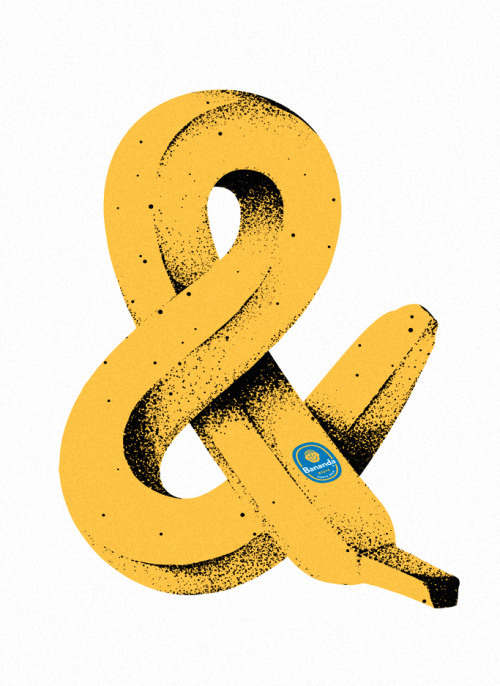
Bananampersand by Brent Schoepf.

Campersand by Beth Sicheneder.

ampersand linzer cookies by unknown

Inflatable ampersand by The New Republic

magazine cover by katrine kolstrom

ampersand cookie jar

amfursand by unknown

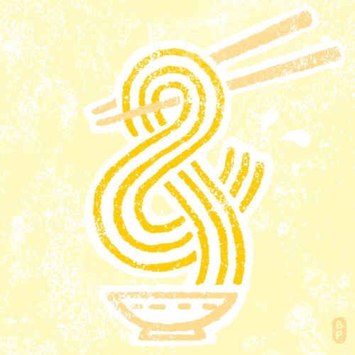
by beto petiche 

by tim easley


Thursday, March 31, 2016

Arabic Calligraphy


Arabic calligraphic scripts can be divided into two great families: the so-called rectilinear scripts (Kufic), and the cursive or round scripts. Although Kufic is too often presented as if it were a single, specific script among the rest, that is a mistake, and it can be only be reduced to a formula in an artificial way. To clarify this, I will briefly describe the respective history of these two families and explain their fundamental differences. (Note that all the names by which we designate the scripts are applied in retrospect. Period sources used them more fluidly if at all.
Kufic

In pre-Islamic days, writing was known to the peoples of the Arabian peninsula, and a rudimentary Arabic script was in use. It was rudimentary because they had little use for it, being a culture with a strong oral tradition, and the earliest texts that have come to us show all the awkwardness of a system that hasn't yet found its legs.
Then, almost overnight, they found themselves in the possession of something that needed to be preserved not only word for word, but down to the pauses between the words. That was the Qur'an, and it required a worthy transcription, with Arabic acquiring a special status, being seen as the language God chose for His revelation. The letters of the alphabet were now magical beings since they were capable of holding and preserving the divine Word. 
round scripts

The round scripts are called in Arabic al-khatt al-mansûb, which is "the script that conforms, that is regulated". That is the main difference with Kufic: the round scripts are formal. There are very specific rules to write each letter and connect them together, rules to be practiced till the hand follows them automatically. 

Wednesday, March 23, 2016

Bradbury Thompson

Bradbury Thompson was born in Topeka, Kansas, and lived from 1911 to 1995. In 1934, he graduated from Washburn College, and designed their first mascot in 1937. He was the art director of Mademoiselle” from 1945 to 60, and designed Westvaco Inspirations for Printers from the 1930s to 62.


Alphabet 26


In 1958, Thomson began developing Alphabet 26, an attempt to streamline, simplify, and over all make the English alphabet more logically designed. According to Thomson, it is unreasonable for an alphabet of 26 letters to have 19 letters that change based on when they are upper or lowercase, and 7 where the upper and lowercase are identical. It is inconsistent, would not be accepted in other design, and makes it difficult for children to learn to read the language.


He also had issue with the similarities of some characters. “d,b,p, and q” are all very similar and often a point of confusion for children when first learning to read. The idea, in the end, would be a typeface with 26 distinct characters, specified as upper and lowercase by size.
Fonts have popped up, inspired by the original idea, such as “Mean 26”. Though this font is available in italics, where the “a” changes (a), which seems counterproductive to the initial idea.


Westvaco Inspirations

Westvaco Inspirations for Printers ran from 1925 to 62, with the purpose of demonstrating Westvaco Corporation's paper and printing process with design, photo, and fine art. Because of this, Thompson had a lot of creative freedom, needing to demonstrate several mediums and push what could be achieved on the paper. 


Bradbury Thompson had a very distinct style in his magazine design, where he made use of type and color in order to interact with the space in ways that were very unconventional at the time. His layouts make great use of bright, attention grabbing color and strong imagery. More often than not, type and characters are used as both imagery and information.

Other magazines, like Mademoiselle,” while showing strong signs of his design, show the limits of the cost of color and much less room for experimentation.