Ah, the ampersand; the favorite character of countless
graphic designers. Although the ampersand is loved by many people for its
calligraphic and malleable characteristics, few people actually know the
history of the ampersand.
The ampersand is a logogram, which is any character that
represents a word, like the @ symbol, but it didn’t start out that way. It
began in the 45th century CE as a ligature that combined the letters
et, which mean “and” in Latin. This
ligature started out very recognizable as an E and a T, and slowly became more
stylized.
This ligature was added to the end of the alphabet as the 27th
character, and when school children were reciting the ABCs, instead of saying
“X, Y, Z, et et” (and and) they would say “X, Y, Z, et per se et” (and by
itself and). This became “and per se and,” which when slurred together becomes
“ampersand.” (fun fact: a word comes about from a mispronunciation it’s called
a mondegreeen.)
Today, the ampersand is mainly found in logos, like Johnson & Johnson and Barnes & Noble. But it is also the subject of a lot of art. One blog, back in 2010, posted a different ampersand for each day of the year. The blog was called 300&65.
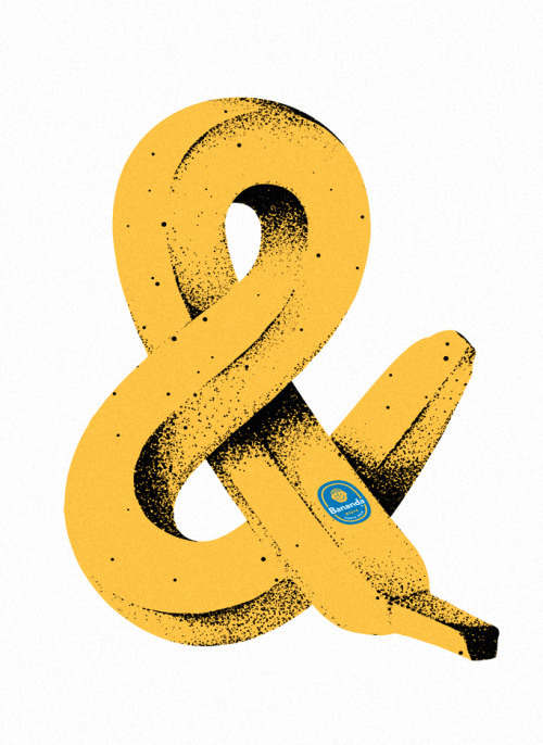
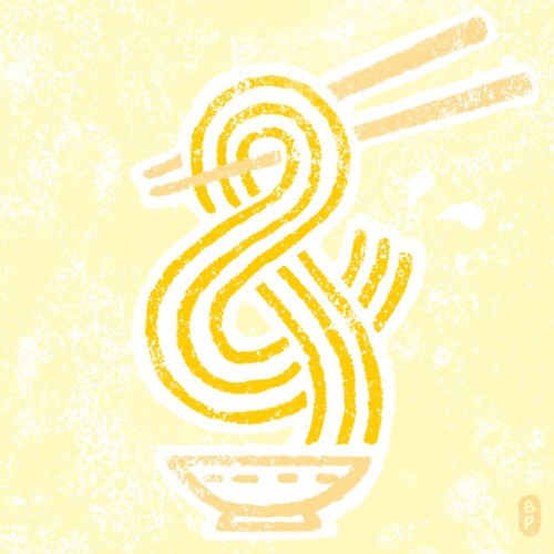
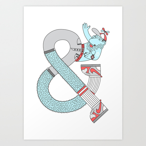
Here are some of my personal favorite ampersands:
ampersand linzer cookies by unknown
Inflatable ampersand by The New Republic
magazine cover by katrine kolstrom
ampersand cookie jar
amfursand by unknown
by beto petiche
by tim easley


That is a sensible blog. I suggest it. You've got a lot understanding about this issue, and so much enthusiasm.
ReplyDeleteBest essay writing service