Tuesday, September 30, 2014

Typography Apps

We are all attached at the hip to our phones so as designers we should want to know what some of the best and most fun apps for our phones are. The app world is full of ways to improve your type skills and make type even more of your life then it already is. Most of these apps are just for IPhone/IPad because I have an IPhone and was able to test these ones out.


What the Font - free
This app lets you take pictures of fonts in every day life and shows you similar fonts and finds the font that you are looking for. It is not the most reliable but it works if the background is not to busy and the text is legible.


FontBook - 3.99
Fontbook is a resource for researching and comparing typefaces and fonts. It looks very extensive it has hundreds of examples. I didn’t download this app because I couldn’t afford to buy all these apps but this app had great reviews.


The Font Game - .99
The font game was created by Justin Stahl. It is a game where you have to guess what font is being shown there are 30 fonts and once you master those you move on to type terminology. I had a good time playing it trying to improve my score.


Helvetica vs Arial - free
This game is really simple you look at the word or sentence in front of you and say if it is either Helvetica or Arial. The more you get right the higher your score you get 3 lives. And was fun to play.


Kern - free
Kern is a game that teaches kerning. A random word with a missing letter appears at different point sizes. As the leading begins to shrink, you move the missing letter to its proper space. Your score is calculated based on the size of the type, the leading height, and the perfection of placement. It's a lot of fun and a great way to brush up on your skills. I thought this game was a little confusing but it was still interesting to play.


The Typography Manual - 3.99
This is a typeface and font resource that has a lot of helpful information including details on type anatomy, a glossary of type terminology, Mac and HTML key combos, an Em calculator, and a font-size ruler. I found it to be really helpful and worth the money.


Ampergram - free
This app was created by Philip Pastore. It lets you create endless typographic compositions using photos of fonts. You can also take your own photos and upload them yourself. And then you can save these text images to your phone and share them with your friends


OverGram - free

Over is the full version but it does cost money. This app Over is the perfect choice for any Instagram addict, enabling you to add typography to your images quickly and easily. I thought it was fun and had a lot of choices its not a learning app but still fun.

Paul Reis

One of  my favorite graffiti font styles, Brooklyn was developed by graphic designer Paul Reis, who describes it online as 'a calligraphy-based typeface that is both sleek and brutal'. Created as a result of his calligraphic exercises and doodles, Brooklyn is available in two versions, regular and inline.


Friday, September 26, 2014

Punctuation.

Punctuation!
Punctuation.
Punctuation?


If words are the meat of a language, then punctuation is the bones and nerves. Without punctuation, language begins to mesh together and refuse to make sense. Commas are the difference between inviting your grandma to eat and eating your grandmother (“Let’s eat, Grandma.” “Let’s eat Grandma.”) Periods, commas, and quotation marks are some of the most common of punctuation marks, but there are many marks that often go unused, though their purpose is equally as valid.

Ampersand:
Logogram originating as a ligature of the Latin “et”, meaning “and”.
Asterism:
Three adjacent asterisks, used to indicate minor breaks in text.

Dagger:
The original mark for the divide symbol. Used to indicate a footnote, after an asterisk has been used.
Number Sign (Pound Sign, hash, Octothorpe)
Various uses in Computer Science, musical notation, and a new popularity in social media.
Section Sign (Hurricane):
Used when referring to a specific section in a document, usually in legal contexts.

Fleuron:
One of the oldest marks, used in Greek and Latin Texts to divide paragraphs. Can be used to fill the first line indent. Were Phased out with the introduction of line breaks. Also used for borders.

Index (fist)
A small, pointing hand. Fell out of favor due to being a difficult mark to handwrite, though it was once used as an attention calling bullet-point.

Interrobang:
A ligature of the exclamation point and the question mark. More commonly written without the ligature, as “?!”.

Irony Punctuation:
A backwards question mark. Unfortunately this mark is often unused.

Lozenge:
A printers mark, often used for prodders and patterns.

Guillemets:
What the French and various other countries use instead of quotation marks.

Pilcrow:
The Paragraph mark. Used in text to indent separate paragraph or to make the beginning of a new paragraph in a large block of text.

Thursday, September 25, 2014

Jamie Alloy - Photo Type

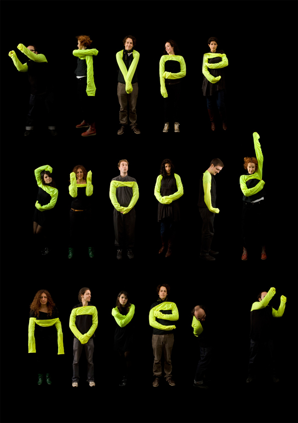
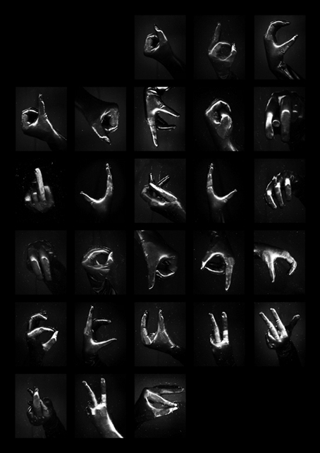
 Amandine Alessandra is a London based photographer who's work is mixed with design and typography. I find her type very beautiful and intriguing. I came across Amandine's work while researching type done with light paintings which is when the camera has an extra long exposure and captures the movement of light. This is a well known modern way to create. Amandine Alessandra uses the camera to do something similar but she captures the movement of hands (which are the brightest thing in her photograph so it is captured very well). This piece of her work I found the most interesting but she also creates type with a faster shutter speed in different ways shown below. The body is her main source of creating photographic type. 
https://vimeo.com/100358256http://www.amandinealessandra.com/index.php?/project/book-as-block-block-as-type/

Wednesday, September 24, 2014

Drop Caps

Drop caps are larger letters that usually take up two to three lines of text. These letters can be ornamented or left simple, but can greatly influence the tone of the text. Often associated with children's storybooks, they can easily lend a whimsical look to the pages, but can just as easily give a modern feel.


The tradition of these ornamental letters begins during the middle ages, with the advent of the illuminated manuscript. These dense, illustrated, hand done volumes struggled for legibility and ornamented initial caps served as paragraph markers that allowed the viewer to scan for the paragraph that he or she wanted to read. For example, when reading the Bible, one might be searching for the Sermon on the Mount, and that passage would be marked with a larger letter, with an illustration of Christ surrounded by people, preaching. But most were not lavishly illustrated, and merely served a utilitarian purpose of drawing the eye to divisions within the text.


With the advent of the printing press, hybrid manuscripts started to appear, where the main body text left a gap for an artisan to come in and illustrate only the drop caps. They began to serve less of a utilitarian purpose, and became a status symbol and a luxury item.


Currently, drop caps no longer serve a utilitarian purpose, but are a purely aesthetic decision made by the designer to communicate ideas. They can be set type, illustrated or hand done.


Notably, Jess Hische did a large series of initial caps that push the boundaries of lettering. These can be examined in more detail on her website: http://www.dailydropcap.com


Drop caps can be placed in InDesign as part of creating paragraph styles. The program can take letters from the beginning of a paragraph, or can substitute an image or illustration for the initial letter.

Helpful links and tutorials:
https://www.youtube.com/watch?v=ct2t5KquDh0
http://helpx.adobe.com/indesign/using/drop-caps-nested-styles.html

Tuesday, September 23, 2014

Drop Caps

Drop caps or "initial caps" have been used dating back to the 4th century CE. Originally, they were not used as decorative elements. Scribes used them to mark where a new section started in the text, much like an indent in the beginning of a paragraph functions today. In the 15th century monks and scribes used drop caps as a way to start a new idea in a passage. "Historiated" drop caps were drop caps that contained an image in them to relate the image to the text. They also marked specific places in the text. In the image below you can see how the initial cap "P" in the word "Petrus" contains an image of Saint Peter, an example of an "historiated" drop cap. Initial caps like these were often in illuminated manuscripts.


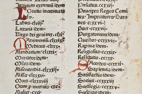
Drop caps were also used in books during these times. In the example below, drop caps are being used to order information alphabetically in a table of contents in a book. The initial caps were written in after the book had already been printed. Although not as beautiful as those in the illuminated manuscript, they still serve an important purpose.


Early printed books often strived to replicate illuminated manuscripts. Space was left after the book was printed so an artisan could illustrate an initial cap and borders. An example of this is seen below.


Today, drop caps are no longer necessary and are typically used as a decorative element. They are often associated with an "old" or "traditional" feeling as they had been used so often in older texts.


Designer Jessica Hische has created a project called Daily Drop Cap, in which she created a drop cap for every letter of the alphabet, for twelve entire alphabets. The drop caps are done in a number of different themes and different illustrative styles.


Source: http://www.smashingmagazine.com/2012/04/03/drop-caps-historical-use-and-current-best-practices/