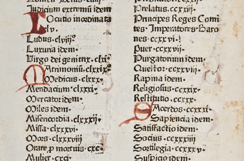
Drop caps are larger letters that usually take up two to three lines of text. These letters can be ornamented or left simple, but can greatly influence the tone of the text. Often associated with children's storybooks, they can easily lend a whimsical look to the pages, but can just as easily give a modern feel.
The tradition of these ornamental letters begins during the middle ages, with the advent of the illuminated manuscript. These dense, illustrated, hand done volumes struggled for legibility and ornamented initial caps served as paragraph markers that allowed the viewer to scan for the paragraph that he or she wanted to read. For example, when reading the Bible, one might be searching for the Sermon on the Mount, and that passage would be marked with a larger letter, with an illustration of Christ surrounded by people, preaching. But most were not lavishly illustrated, and merely served a utilitarian purpose of drawing the eye to divisions within the text.
With the advent of the printing press, hybrid manuscripts started to appear, where the main body text left a gap for an artisan to come in and illustrate only the drop caps. They began to serve less of a utilitarian purpose, and became a status symbol and a luxury item.
Currently, drop caps no longer serve a utilitarian purpose, but are a purely aesthetic decision made by the designer to communicate ideas. They can be set type, illustrated or hand done.
Notably, Jess Hische did a large series of initial caps that push the boundaries of lettering. These can be examined in more detail on her website: http://www.dailydropcap.com
Drop caps can be placed in InDesign as part of creating paragraph styles. The program can take letters from the beginning of a paragraph, or can substitute an image or illustration for the initial letter.
Helpful links and tutorials:
https://www.youtube.com/watch?v=ct2t5KquDh0
http://helpx.adobe.com/indesign/using/drop-caps-nested-styles.html


No comments:
Post a Comment