The 50s to 60s
In the fifties to mid sixties, rock concert posters were typographically very clear cut about purpose. In bold, display, woodblock style, sans serif they displayed who, what, and where quickly. In a matter of seconds, one could look at a poster and know everything he or she would need to know. Big names took the top of the hierarchy, always being the strongest and boldest, drawing the attention of anyone interested. location and date (or secondary artists) took the secondary position, being found right after one was drawn in with the big names. Imagery outside of type was secondary, type was bold, bright, and attention grabbing, often times either knocked out of a color, or a solid black.
This was reminiscent of the poster design of the time, specifically boxing advertisements.
The 60s to 70s
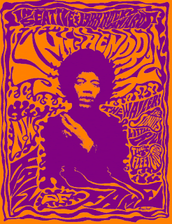
With the rise of psychedelic rock in the mid sixties, music became more about breaking rules and representing itself as an art form. Poster typography reflected this by becoming both the information and the art of the posters. Other imagery often times fused with the type, becoming one piece. The posters followed no rules regarding typography or advertising of the time.At the same time, they were a good method of advertising. They grabbed attention, and, after some time, they could be read by those they were advertising to. The type itself, while distorted, would follow certain rules. Generally, the type would read logically left to right and up to down. Specific words and ideas would also often times stay reserved within their own shape, separated by negative space.
The 90s to Now
Modern posters portray who, where, and when fairly clearly typographically. Otherwise, posters are much more variable due to music artists better communicating with poster artists, wishing to develop a specific image. Type is more reserved, taking secondary focus to the image. Hierarchy wise, the band's name takes precedence, generally big and bold, but the grid structure is variable.
Frank Kozik
Ronlewhorn
Gregg Gordon
Ken Taylor


No comments:
Post a Comment