Thursday, October 6, 2011

Not Your Typical Type

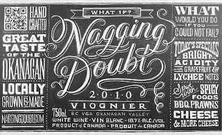
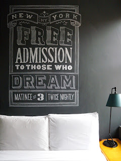
I stumbled upon custom chalk letterer Dana Tanamachi a little while ago, but I still enjoy looking at her work and process. She currently works for Louise Fili. I am mostly impressed with the way she manages to incorporate an unusual and time-consuming process into a beautiful and elegant design. Her work exhibits a modern feeling yet the chalk material adds an older charisma that probably brings back childhood memories to most of us. The relationship between vintage and modern is explored through her layouts and styling of letters, and I feel that her pieces are noteworthy of establishing this balance which is present throughout all of her work. You can view more of her work and publications which employ her lettering athttp://www.danatanamachi.com


I also looked at artist Vladimir Koncar, from Croatia, for inspiration about unusual and unconventional type. Koncar really pushes his materials outside the box. In fact, none of his explorations here were done through the computer. I feel like this is important to see because too often these days, designers limit themselves to what they can do from their desk, instead of getting out and looking for other opportunities that may suit their designs better. I think his soil type is especially fascinating, because it deals with living/changing forms. His statements at the bottom are interesting because of the solid relationship of message and medium. They relate the idea he is expressing to the type, just as designers relate their type to the ideas they are trying to get across, but Koncar does it in a much different, and stronger way. While his typography may not work for most projects, I think it is important to keep in mind the endless forms letters can take on, instead of being manipulated solely on the computer.


Type on Comic book covers

Aside from completely geeking over the stories and illustrations of comic books, does anyone ever actually take a look at the sort of type they use on the covers that usually repeats throughout a series? Their may be some changes from issue to issue or specials but, I mean, c'mon, theyre so beautiful some of them and really emphasize what the bulk between the pages is about.

I was scrolling tumblr and I happened to find a blog specifically for comic book covers. While gazing I thought "Wow! These are some pretty sick ways of doing type in an illustrative way" so naturally, I had to post it.

Some are pretty old and some are current. Its just amazing to see how thought out some of these are in terms of their concept.

Every good cover tells a story.

Type Emphasizing Actions

MK12 is a design studio that specializes in both motion and print pieces. They create a lot of movie introductions and movie credits. These videos were done by them for the movie Stranger Than Fiction.

This first video uses kinetic typography to help further emphasize the actions and routine of Harold Crick's every day life.


This second video is the ending credits, the treatment of the type here is interesting as well. I really enjoy how the type is handled and laid out in each scene.

Periodic Tables of...Stuff.

Okay, well here's an interesting something I found via the Behance Network. This periodic Table of Typefaces was designed by Cam Wilde and features some of the 100 most used type faces by graphic designer. Not only is it nice to look at and a cool idea, it might also help you finish your projects.


In addition to that periodic table at the Behance Network, I would like to link you guys to the Behance Network itself.

It's a social networking site for professional artists that allows you to upload your work, have others comment on it, and hopefully find jobs through the thing(heh). Some Tyler alumni have already joined, in fact- here is some nice type work from Danielle Miller, and here's some nice design from Kathryn Feryok.

And here's another periodic table that serves as a neat example of how you can use type and preexisting visual schemes to mess with people's expectations.

Wednesday, October 5, 2011

Type-a-file.com

http://www.type-a-file.com/

This is a CSS (cascading style sheet) which is used to style and layout your websites. It can be applied to any sites CSS. It is meant to give your “web typography a head start.” You can tag elements of your site in the html code with things like “kicker” (an opening paragraph to introduce) or “dropcap” in your paragraph and the basic coding is done for you. It makes designing on the internet with good typographic practices easier.

Tuesday, October 4, 2011

Saturday, October 1, 2011

3D Type

I've been obsessed with pop up techniques lately, and here are some extremely clever techniques used to illustrate the alphabet using a variety of folding and tab devices. I found it extremely inventive and wish I knew how they created such clean, crisp shapes.


An often ignored area of typography, numbers! Here the same three dimensional pop up techniques are applied to numbers. I found it very ingenious!