Thursday, October 11, 2012

Forget the Film!

While searching for inspiration for my blog post I started thinking about all the different ways that typography is used for real world applications. I came across a post on pintrest that lead me to a website called www.watchthetitles.com.  It is a website completely devoted to showing the opening credits and closing credits to films, TV shows, live events and anything else that has awesome animated type integrated with it! The sites description makes an excellent statement about the first 2 minutes when the opening credits start and the lights go down that is when the viewer is transported into the world of the film and that the job of the title designers.

One set of opening credits that I found particularly interesting were the ones for a movie that came out this year called Magic Trip. The job of the opening credits is to set the scene and the mood of the film. I thought that this one did a really good job. The film was set in the 1960’s and the cinematography and I think the typography are used together in such a cohesive way it sets the mood perfectly for this film. You can find the video here! http://www.watchthetitles.com/articles/00220-Magic_Trip After reading the article from this video I read about the designer Karin Fong and the other kind of work that she does. On the site I found 7 other movies that she did the credits for. Another that really stuck out to me was one called dead man on campus. She fit the all of the credits in with the images, at first I was not expecting to see that but it was a nice surprise. It really set the scene for the movie. http://www.watchthetitles.com/articles/0046-Dead_Man_On_Campus 


I checked out her AIGA profile and she has done mostly title design work for many different genres of movies! From Disney’s 102 Dalmatians to a Discovery documentary called Breaking Point. These different movies are completely different styles but for each one she does a fantastic job of setting the mood of the film.


Depth


I was browsing pinterest the other day when i came across Jordan Metcalf. After looking at his work, he seems to have a huge range of style and the way he handles type. He has work that looks more traditional like his "popular mechanics cover" and then he seems to have a lot of really modern or experimental looking type such as "type-two" and "form, function, feeling". I absolutely enjoy his Modern looking type treatments. He really pushes the limits with each typeface, and somehow the type is still relatively easy to read. Also this pertains to all of his work, he creates so much depth with his work. In some of them its hard to stop yourself from trying to reach through the computer screen and grab it. Jordan really opened my eyes to the world of depth with typography, he does little things here and there that makes the type jump right off the page.

Starting with Pencil and Paper


The thing that inspired me the most is seeing his process and seeing the different stages of his design. Also the movement and depth he creates with these elaborate letter forms and compositions, as well as his use of color. It not only creates depth but also allows the type to explode off the page. I absolutely love the pencil drawings, sometimes better than the final product.


http://www.behance.net/PapperOPenna

Tuesday, October 9, 2012

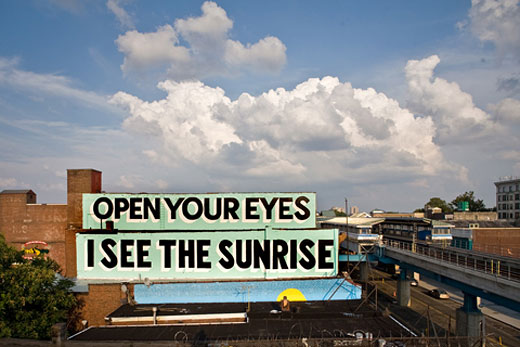
ESPO

The first time I ever heard of Steven "ESPO" Powers is when i read his book "The Art of Getting Over"which is about the history of Graffiti and some of its most important and influential writers. Powers was born in Philadelphia and lived here until 1994 when he moved to New York City. ESPO ended his graffiti career in 1999 and Steven Powers began to focus on studio art. Powers has gained world wide notoriety for his Murals in Philadelphia, Dublin, Belfast and many other cities. His work has also been featured in 2.75 shows (according to his website).

Personally I am a fan of ESPO and his awesome Philly hand style, but also his ambitious New York City storefront gate paintings. Steven Powers personal works are very witty and hilarious while his murals are not the typical lame messages, but slogans that are a bit more thought out in execution and appearance. All of which have a quasi pop-art, 1950's signage feel and his illustrations only compliment the type.


http://www.firstandfifteenth.net/

Stephen Fry - Kinetic Type


Stephen John Fry is an English media personality best known for comic acting, and presenting and writing roles which he uses in his videos. Stephen Fry does kinetic typography in a interesting way. He uses this language that is blunt but shows how grammar is correctly used. He has a creative mind and the voice of his is something else. The way he uses type in this video is geometric and methodical. The real outstanding conversation is the talk of the word bling which is define as The Oxford English Dictionary has bling as "perhaps imitative pf light reflecting off jewelry, or of jewelery clashing together" as its origin. Take a look and see how he uses the type to represent his so proper language.


Friday, October 5, 2012

Eat Your Words


When one thinks of typography usually the first thing that comes to mind is computer designing, and formal fonts.. well at least for me it does. In Anna Garforth's work, this is certainly not the case. Anna is a mixed media artist who focuses on type, but not just any kind of type. Her work is constantly pushing the boundaries of how type is physically made and how that changes the message that is being said. Anna experiments with all kinds of mediums, from moss to dough and even duct tape. By combining formal elements of good type choices and creative ways to make them, she is able to come up with some interesting and unexpected solutions to get whatever message she intends across.


I think Anna is pretty relevant and really useful to people that are just beginning in typography. Her work allows you to detach any baggage you may know that comes with "good type," and allows you to really get into her images and question exactly how she is making them. Even though her creative processes are unexpected, she still is able to create readable and impacting pieces that bring excitement and overal fun back to modern day type. All of her projects have some specific meanings associated with them, but she finds a way to mesh her love of type and design with the communicative purpose that graphic design usually incorporates.


website : http://www.crosshatchling.co.uk/index.html


Thursday, October 4, 2012

The Ampersand

For my blog post I chose to write about the typographical form of the ampersand. It is a form that for some reason I have always been intrigued by. How designers handle the ampersand is something that I am always interested to see.

Just for some general history on the ampersand. It is a ligature of the letters e and t from the latin word for and. The ampersands history began back to the first century C.E. when it was written in Old Roman cursive. Below you can see the evolution of the form. 
When carolingian minuscule came along in the 9th many ligatures that were being used were no longer used the ampersand however stuck around. The ampersand has since evolved and although it is no longer used in formal writing we still see it in formal names of businesses and movie titles.

Another reason I chose to write my blog post about ampersands is that I found a blog in which for everyday of the year a ampersand was posted from a different type face.

While the blog is no longer updating everyday due to the fact that the preset year is over I still really enjoyed looking through all the different examples of ampersands from different typefaces. I found it interesting that some still really maintained the clear forms of the e and the t while others abstracted this form. Here is the link to the blog http://ampersandampersand.tumblr.com/.