Thursday, October 9, 2014

Alphatecture

I found Alphatecture interesting because usually typography involves building forms and molding shapes to create the letter forms. However, with Alphatecture it is all about using what is already in your surroundings to find the forms in something that was not meant to resemble a letter. Peter Defty is well known for his execution in this process. He is a professional photographer based near Leeds, in the UK. He takes photos all around the world and creates different alphabets based on each city he has been to.
Google Maps Typography uses the same idea but approaches it a little differently by using an aerial view to find letters in natural land/ building formations. This particular alphabet was put together by Rhett Dashwood, he did it over the course of several months. Its a little hard to read, but it shows lots of creativity and persistence.


http://rhettdashwood.com/16575/Google-Maps-Typography 

http://www.pinterest.com/murathocaoglu/alphatecture/ 

Typography Side Projects

A side project is a piece of work that a designer self-initiates and is not hired to create by a client. Side projects vary in every way as they are typically utilized by a designer to explore in depth a personal interest. Side projects are a great avenue for exploring new or unfamiliar techniques without the pressure of a deadline (for the most part) or the requirement to fulfill a client's needs.

Besides being enjoyable and a learning experience, side projects also provide an opportunity for a designer to showcase their skills. A designer may be hired by a client to do work very similar to his or her side project. With side projects it seems as though designers have a public outlet for personal work. It is also turning out to be a great way in which a designer can market his or herself for the kind of work they want to do, be it more illustration or hand done lettering.

Friends of Type


40 Days of Dating


Nicholas Felton's Annual Reports


Wednesday, October 8, 2014

Chalkboard Type

Chalkboard type is becoming a very popular way to design and apply type. Dana Tanamachi is among the most famous for doing this, but we are seeing more and more designers start doing this.

At the Columbus College of Art and Design, two college students have been breaking into their school and anonymously creating type on their chalkboards. They go by the name "Dangerdust", and create a weekly artwork. They are both seniors in the Graphic Design department, and remain passionate about their art, even on top of their course-load. They even used one of Jess Hische's quotes and her for inspiration for one of their pieces:


We even see it here at Tyler! At the Hatchery, the new store opening up in the lobby.


Philadelphia Mural Arts Program & Typography's Role

Out of the hundreds of community arts projects across the country, it is difficult to find one more recognizable and widespread than Philadelphia's Mural Arts Program. A city whose buildings, neighborhoods, and citizens are incredibly different from one another, Philadelphia is a place where it is necessary that a common ground be present for its inhabitants. The work produced by the Mural Arts Project certainly provides that and so much more. From animals and nature to history and religion, the topics that these murals focus on are intended to bring people and their communities together once and for all.

It is no question that the larger-than-life pieces of artwork depicted on walls of buildings across the city of Philadelphia are pleasing to the average eye. However, although several of the murals are driven by singular artists who create them for recognition or fame, a majority of the wall paintings have much to do with community-based volunteer work. For example, Jane Golden, a driving force behind The Mural Arts Program and an expert in revolutionary urban art, came up with an idea several years ago to introduce the organization to troubled youths with poor upbringings and even worse reputations. These young men, most of which had come from deprived childhoods, were channeling their misfortune through public vandalism and graffiti. Golden, seeing the good in all, took a risk and reached out to the boys, hoping to capture their attention. She tried to persuade them into making the leap from illegal action to beneficial doings by turning their urge to make graffiti art into a desire for mural art. The young men’s participation in the program would also act as community service. Knowledge of this turned the offer into one they simply could not refuse. As months went by, the mural arts gained large amounts of popularity, giving each individual project even more meaning and continuing to help Philadelphia's citizens and visitors of all ages.


--

While many of the murals produced through the Philadelphia Mural Arts Program rely heavily on pictorals to get their point across, it can easily be argued that type is the most important factor. Just like anything in the art world, images without words or captions are generally intended to be left open for interpretation. However, the Mural Arts Program is more than just an opportunity to display abstract art. Each piece has one or several specific messages attached to it, and it is crucial that these messages are easily read by anybody and everybody who views them. That being said, it's great to see murals that produce a hybrid of both pictures and words with such beauty and cohesiveness. It is even often that, in these works of large-scale art, the picture is the word (like in the first image). Pieces such as these may be considered even more successful than others, for they cover both type and image in the matter of a single glance.


Now that the importance of typography's role in the Philadelphia Mural Arts Program has been explained, it must also be stated that typeface and font do, indeed, matter here. Just like a publication as physically miniscule as a newspaper article, the purpose of these gigantic murals is to be read. In addition, nobody wants passerbys crashing into each other in attempts to decipher a word or phrase on the side of a building. Therefore, the copy must be very easily legible. Unique and pretty to look at, sure—but understandability comes first. This means serifs and sans serifs that are the perfect size, weight, color, et cetera; and tracked an appropriate, thus readable amount. Upon first glance, all of the murals you see in the City of Philadelphia may not seem to have taken typography into such consideration, but that's because they represent it so flawlessly. It would be absurd to not put thought into the manner in which words are presented to the community, visually. After all, words are the way we communicate and help one another as citizens and as human beings—very fitting when considering The Mural Arts Program's true purpose.


--


--

To hear more from founder Jane Golden, find out where all of the murals are located throughout Philadelphia, and more: http://www.muralarts.org/

Tuesday, October 7, 2014

Window Typography


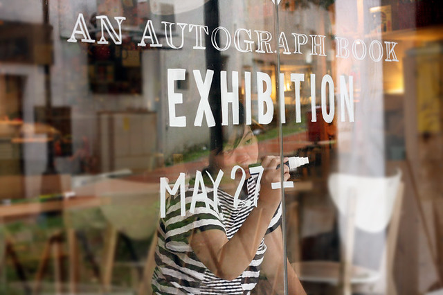
I've always loved hand lettering. This week I decided to look into typography that can be found on windows. Mostly these illustrated (or set type) letters can be found in shop windows. Some of these letters are vinyl cut while others are directly written on the windows with markers. There are shops online where you can custom order you vinyl letters, but others may like the more hand done approach. There are special pens and markers which write on glass such as chalk markers which give a bold and appealing look. There is a video here about a workshop held called "tempting typography" which shows the process of hand lettering on windows and how beautiful the end result can be.

Tempting Typography

 http://media-cache-ak0.pinimg.com/736x/84/93/b3/8493b33b989cf3be603d706529abd12a.jpg

http://media-cache-ec0.pinimg.com/736x/54/e1/a2/54e1a2bab47bd3ea8cd5a5dd41cc5157.jpg http://media-cache-ec0.pinimg.com/736x/13/d6/05/13d605535fa4337abe822d467f1e773d.jpg

http://www.nicework.co.za/nice-blog/wp-content/uploads/2013/01/1861f912ffc62062bdeaf9a94c145d44.jpg

http://kphotoblog.com/wp-content/uploads/2012/11/toronto_typography_photography.jpg


https://c2.staticflickr.com/8/7384/8814959497_22067196d3_z.jpg


http://media-cache-ak0.pinimg.com/236x/0d/5c/b4/0d5cb4732ec1add227966a8038c8f95c.jpghttp://25.media.tumblr.com/tumblr_lt3642c9ZO1qln2e2o1_500.jpg

shop window in amsterdam - if we decide to go the lettering/ornament only route w/ no image, we could do something like this. If it still is too simple, it can be embellished even more w/ layered type, etc.


Wednesday, October 1, 2014

Digital Distribution of Fonts and The Typographer Behind It all

Today it seems like by the click of a button we can download and use fonts, but ever wonder how it all started? There was one revolutionary that started it all. Erik Spiekermann Co-founded Font Shop with his wife Joan Spiekermann where they became the first digital distributor of Fonts. In 1989 Joan and Erik Spiekermann signed contracts with leading type foundries and stored hundreds of fonts on floppy disks. The way people ordered these fonts were to call and order them they would send out the font on the floppy disks through the mail. 

Soon after the launch of the original vendor of digital type he teamed up with that other famous graphic designer, Neville Brody, and founded FontFont, which has since then become the largest independent foundry of original type designs. Not only does it produce some contemporary classics, but it also houses wildly imaginative designs, and spearheaded many innovations in digital type technology. His distribution of type on floppy disks soon became obsolete and FontShop moved their company to the Web and distributes fonts online.

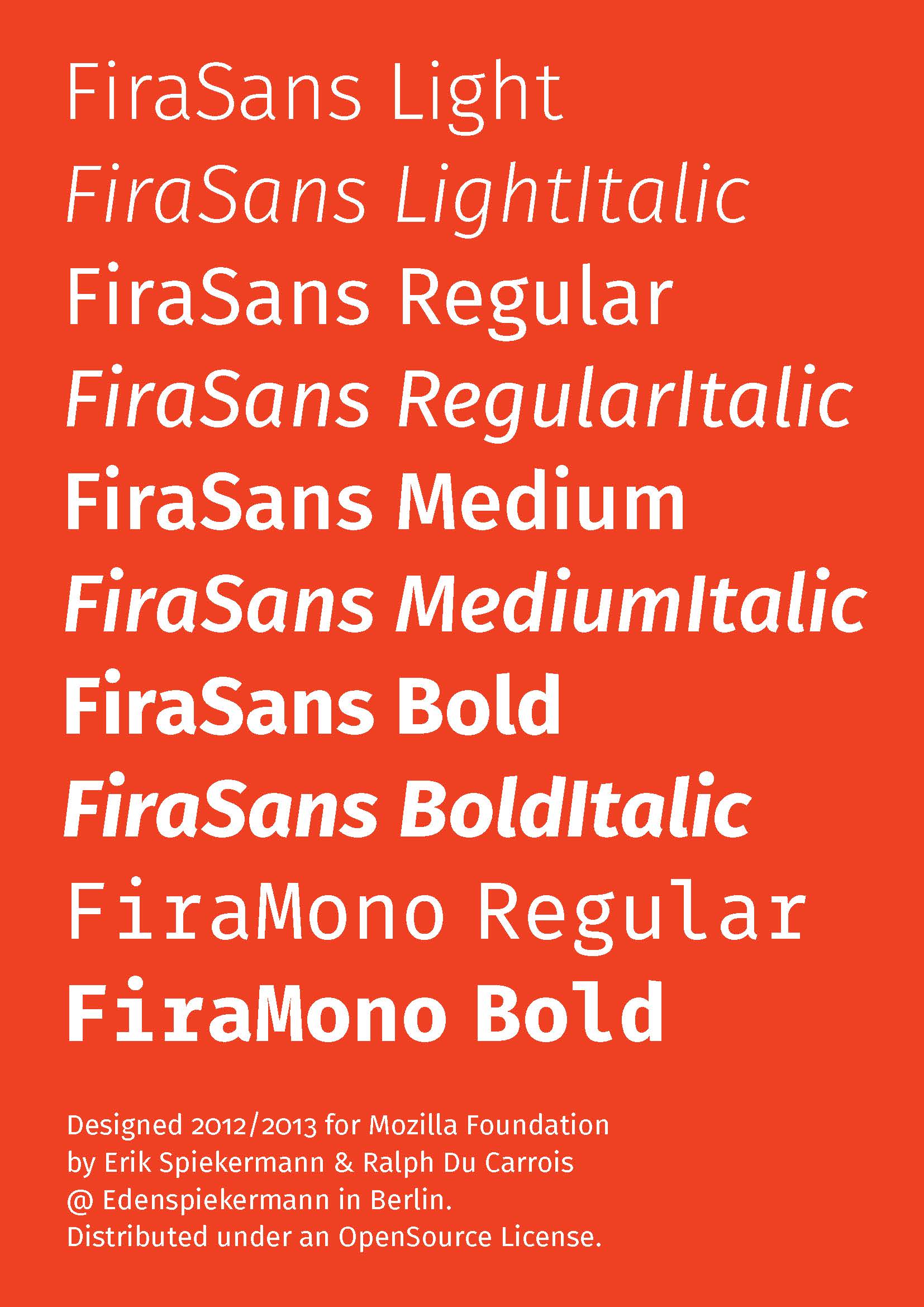
Erik Spiekermann has created 475 typefaces to this day and all of them are readily available for purchase on FontShop.com and he continues to make more work to this day. Some of the typefaces that he created are Berliner Grotesk, FF Meta, ITC Officina Sans, and FiraSans.
.

He was founder of MetaDesign in 1979, Germany’s largest design firm with offices in Berlin, London and San Francisco. He is responsible for corporate design programs for Audi, Skoda, Volkswagen, Lexus, Heidelberg Printing, Bosch and way-finding projects like Berlin Transit, Düsseldorf Airport and many others.


http://vimeo.com/19429698 - Putting the Face back into typeface

Road Signs, an Unnoticed Art Form


Although highly unnoticed, street signs are all part of the vast majority of design when driving or walking down the street. From big to small. and wide to tall, street signs are an everyday convenience that  make our lives a hell of a lot easier and go highly unnoticed. There simplistic use of typography and vectorized marks are a way to get the message across to the viewer as fast and easy as possible as well as help people navigate their everyday life.

There are many different typefaces used around the world for different street signs. Helvetica is used to navigate around New York city subway systems, where as Helvetica Neue is used for road signs in Hong Kong. Clarendon is the face used in our US National Park systems. Each face is used in a particular way to serve a specific function, readability. “Some road signs used grid-based typefaces, some were extremely wide geometric typefaces with the simpler forms of a and g, some very thin, and some very heavy (Ralph Herman}." Part of the reasons these faces work so well is because of their unique style in being able to read them without hesitation. Although sometimes designed very poorly. These signs are created to be scene and read quick and easy so people can glance at them quickly and go on there way. They are designed to be read up close and from football fields away.  


With the flux of automobiles on the road and the rise of industrialization beginning in the 1920’s, adaptations had to be made to keep people safe and to be able to navigate while driving. Simplistic and minimalistic street signs and road markers were the answer. The rise of type faces and the idea of readability and clarity was a heightened point in design.  Swiss designers became obsessed with this idea of clean but elegant design. The design of the signs were sometimes very decorative with a decorative serif set on it but as time went by the design of these became more simplistic due to mass production. 


Antique Street signs seemed very peculiar and interesting because of the history and look of these signs. It seemed that the typeface would be pressed into some kind of metal or aluminum and the painted. I have always been fascinated with antiques and antique signs and lettering because of that antique quality. Signs were usually hand painted back in the day in which gave them so much more personality and style. Today signs are usually just set type on material mass-produced. Although the type-face on these signs may be elegant and clean the aesthetic quality is just not how signs used to be.