Friday, March 18, 2016

Google Doodle


The first google doodle ever made was on August,30,1998. It's only 2 years after the two original creators of the site have built their idea in their Stanford dorm room, and less than a week before Google was even an official company. Larry Page and Sergey Brin went to a Burning Man festival and wanted to show people that they were away, so a stick figure was used to placed behind Google's second "o". This was merely a comical way to show that the founders were "out of office".


Burning Man Festival 1998

Because people loved it so much, Brin and Page decided that they will continue this idea with decorating the company's logo. Dennis Hwang, the (then-intern, now the company's webmaster) was asked in 2000 to draw more. 
Halloween 1999


Halloween 2014


Thanksgiving 1998
First Day of Fall 2015 (Northern Hemisphere) 

Google Doodles are now known for celebrating major holidays, famous artists and scientists around the world. The doodles have become more not only just a still image, but also more interactive through out the years.


Day of the Dead 2015


German Reunification Day 2015

First Day of School 2011 - Estonia, Poland, Russia


Keith Haring's 54th Birthday


Starting in 2014, Google Doodle also started the annual contest called "Doodle 4 Google". This is a competition to have children create a Google Doodle logo for a $30,000 college scholarship, a T-shirt, google chromebook, Wacom digital design tablet, and a $5,000 technology grant of tablets or chromebooks towards their school.

My Best Day Ever... (2013), Winner: Sabrina Brady, Wisconsin, 10-12 grade level

Thursday, March 17, 2016

"An Oasis of Ascenders, Ampersands, and Slab Serifs"


Outside the lovely city of Las Vegas, surrounded by desert, is a typographer's dream. And this dream is The Neon Boneyard; a two-acre Museum which is home to over 250 historic signs. It is home to the most famous signs of Las Vegas, which include: Caesars Palace, Binion's Horseshoe, the Golden Nugget, The Stardust, Palms Casino Resort, New-New York, Lady Luck and O'Shea's.

Each of these signs have been donated or loaned by individuals, businesses or sign companies. The biggest contributor is a major sign manufacturer, YESCO. These ‘boneyards’ would house discarded signage to be used for their source parts or “bones” in the creation of newer, updated signage. As projects grew in scale, the sign makers could no longer house the volume of leftover signs and they began shipping used marquees straight to the dump. An outraged public, the Nevada Arts Council and YESCO stepped in to preserve the neon markers of Vegas past.


The signs' ages range from the 1930's to present day. And these typographic sculptures are tangible history of technology, industry, style, entertainment, pop culture, and most of all: design. You have the to experience of what it feels like to stand beneath a seventy-foot tall initial and to see up close the curves of a signature made of sheet metal. 

 
"It’s hard not to be impressed by the physicality, craft, and art-form in the construction and precise details of every letter. Aside from the craft, you’ll see up-close letterforms that are so unusual, but reflective of an eclectic history that is now only barely captured in design books."

The Neon Museum can be visited 24 hours a day, 7 days a week. You can guide yourself through or sign up for a hour long guided tour.


Sources:
http://idsgn.org/posts/typographic-oasis-the-neon-boneyard/
http://www.neonmuseum.org

https://www.flickr.com/photos/idsgn/sets/72157626625825143/

Friday, March 11, 2016

The Art of Graffiti


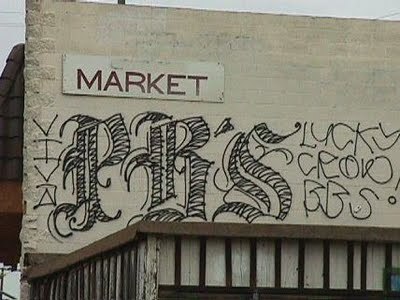
Graffiti has been known to be mainly a thing that criminals do to express themselves by spray painting words and images onto walls when they aren't allowed. A lot of the bad publicity about graffiti derives from gangs marking their territory by using graffiti. Lately, graffiti has become an arising and more acceptable art form. The word graffiti comes from the Italian word "graffiato" meaning "scratched." It first arrived in Philadelphia in the late 1960's and spread to New York City in the 1970's. It was revived when hip hop emerged in the 80's.

Letterforms
The letterforms in graffiti derived from the simple stroke of a spray paint can to write a simple word, then went to bubble and block letters with shading. Graffiti can be seen as the simple lines, beautifully created letters, or letters intertwined with imagery. As graffiti is looked more and more into as an art form, it becomes more common to see graffiti as well thought out plans that can connect to the setting they are in, such as the art of the famous graffiti artist, Banksy (seen later in post). Many of the letterforms are freehand and do not look like any sort of typeface, but there are scenarios where the letterforms are based on typefaces such as in the picture below. 


Tagging
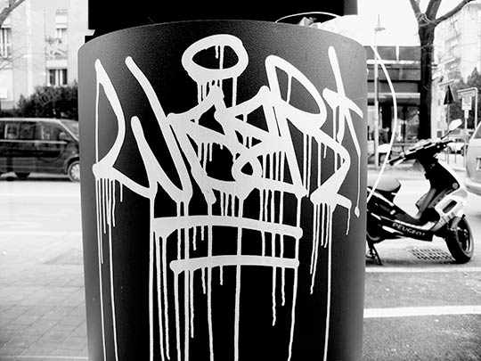
The history of tagging is that graffiti artists would try to create their signature more stylish than anyone else's by using special effects, color, and overall size.


Famous Graffiti Artists
Banksy
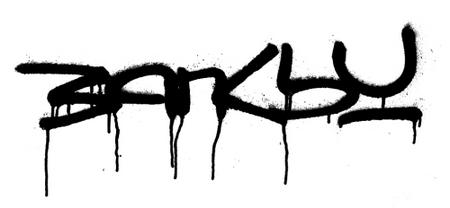
Banksy is a European based graffiti artist who paints creative images to interact with the setting of his art.


Sonik
Sonik is an American graffiti artist who mainly tags his name along with other scenery. He was arrested in 2015 for creating 20 tags.


More Creative Graffiti


ScreenshotScreenshot
Screenshot


Italics & Aldus Manutius


Introduction

When I first began research for this post I started by finding information about italic type and its modern uses, obviously designers and the average person of the modern day have a very specific use of it as a member of a type family, however I discovered there is as much of a rich history behind it as one would think of when imagining Gutenberg's innovations. 


Symbol used by the Aldine Press

History

Italicized type was invented in the 14th century by a venetian named Aldus Manutius who started the Aldine Press in is regarded as one of the leading publishers of the Italian renaissance. Manutius, with the help of another renaissance type designer Ludovico Ariggh. The goal was to create a typeface that would be easier to read than the current cursive face; Chancery Hand. The Aldine typeface as it was called by italians was heavily influenced by calligraphic type where the fonts were fluid and slanted a small degree to the right. 

One of the first renditions of Aldine type

The first appearance of Aldine type is a very small note in The Epistole of St. Catherine of Siena in 1500 in a woodcut illustration. The very next year Manutius and a publisher, Francesco Griffo, published the first book in all italic text within pocket versions of Satires of Juvenal & Persius.  Although the typeface was created by Manutius, copies soon began arising and the term Italics came into being as a way non-italians referred to Aldine type. The first iteration of Italicized type did not have slanted uppercase letters, which were integrated later by type designers in Lyon, France.

The Italic/Aldine characters are on the heart and
book in St. Catherine's hands (note the feet...)

Example of early Chancery handwritten text.


Back to the Books

Manutius not only helped design italicized type, but was also responsible for creating the first inexpensive and portable books. Prior to this, the majority of books that were found were enormous, elaborate and expensive volumes, often found in churches, that a person had to travel to in order to read. The books Manutius designed were much smaller and more simply designed, for an average person to be able to pick it up and take it with them anywhere.


(Audio discussing the life and achievements of Aldus Manutius)
http://www.wnyc.org/story/aldus-manutius-and-birth-paperback/k/

Thursday, March 10, 2016

The Typography of Illuminated Manuscripts


The Typography of Illuminated Manuscripts


The illuminated manuscripts are some of the earliest known books that are still in existence. Almost always religious in context, these codices were created circa 300 AD as an alternative to the unwieldy scroll. Manuscripts were popular throughout the Renaissance and Middle Ages up until the invention of the printing press in the 15th century.

Creating an illuminated manuscript was a very lengthy process comprised of many steps. It was common for the task of writing the text and illustrating the decorative borders and drop caps to be split between two people; a scribe and an illuminator. The style of the script used changed depending on current styles and cultural trends. Classic Roman letters were used in the early Middle Ages but then gave way to bulkier Uncial and half-Uncial letterforms. Towards the 13th century and the late Middle Ages dense, stocky blackletter was used because it allowed more text to fit on a page.

Scripting and illuminating took careful planning and extensive designing before anything was created. Just as book layouts are composed today, manuscript designs were sketched and gridded far in advance.

The process of creating a manuscript from the compiling the quire to binding.

The illumination of the drop caps, or historiated initials, included gold leafing and painting and the designs common during the Gothic period were the most ornate. The execution of illumination was delicate and tedious.

An illuminated historiated initial.
The illumination process.

* * * * *

This post was inspired by the exhibition "Traversing the Globe through Illuminated Manuscripts" at The Getty Center in Los Angeles, California. Photos taken at the museum:


Diagrams found on Wikipedia.