Thursday, February 11, 2016

Typography in Web Design


Typography in Web Design

Typography helps to create an experience for users before they’ve even read a word or clicked a button in a website, it also has the potential to go beyond merely telling a story.

Type can create an atmosphere and elicits a response much the same way as tone of voice does, if it got a well treatment.

First of all, consider the user: What do you want them to feel and experience when the page loads? Typography establishes a mode of communication and, in turn, the personality of the website. The choice of typeface will determine how people respond to your website. 


This page is colorful and fun. You are greeted with lovely serif letters. The website shows how type can be used as graphic elements and incorporated into a design. The multicolored serif typeface breaks away from the classic, maybe even sober, idea we may have of serifs.


Designed to look like an old poster, this website for a vineyard is quite unique and innovative. The design successfully achieves a vintage feel and translates beautifully as a website. the text is embedded as images on the website, preventing it from being copied and pasted. Also, surely a similar design could be created at less than 3.4 MB and 43 HTTP requests.


The large letters in a custom typeface span the screen and continue off page, making the Rijksmuseum seem larger than life. The home page then rotates through beautiful photographs of the museum’s contents.


This Web design studio greets you with a photographed welcome message, which is refreshing. The user immediately gets a sense of the physical space that these designers work in. There is rawness to it, an authenticity. The type is the focal point without being loud or overwhelming.


This website has a definite Bauhaus feel to it, with its flat colors and Futura font. The overall aesthetic is minimalist and clean but definitely not boring or dull. What grabbed my attention was the “Thanks / Danke” piece, in which the language you’ve set (English or German) determines which word stands out in bold red. It’s such a great idea for websites that support more than one language.


Here is a talk by Matthew Carter, it's talk about typeface on screen. Interesting and useful, how you enjoy it!


Rock Through the Ages

The 50s to 60s

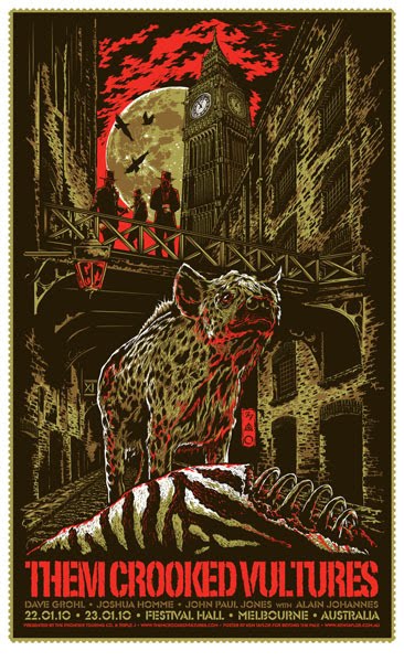
In the fifties to mid sixties, rock concert posters were typographically very clear cut about purpose. In bold, display, woodblock style, sans serif they displayed who, what, and where quickly. In a matter of seconds, one could look at a poster and know everything he or she would need to know. Big names took the top of the hierarchy, always being the strongest and boldest, drawing the attention of anyone interested. location and date (or secondary artists) took the secondary position, being found right after one was drawn in with the big names. Imagery outside of type was secondary, type was bold, bright, and attention grabbing, often times either knocked out of a color, or a solid black.


This was reminiscent of the poster design of the time, specifically boxing advertisements.


The 60s to 70s

With the rise of psychedelic rock in the mid sixties, music became more about breaking rules and representing itself as an art form. Poster typography reflected this by becoming both the information and the art of the posters. Other imagery often times fused with the type, becoming one piece. The posters followed no rules regarding typography or advertising of the time.

At the same time, they were a good method of advertising. They grabbed attention, and, after some time, they could be read by those they were advertising to. The type itself, while distorted, would follow certain rules. Generally, the type would read logically left to right and up to down. Specific words and ideas would also often times stay reserved within their own shape, separated by negative space.


The 90s to Now

Modern posters portray who, where, and when fairly clearly typographically. Otherwise, posters are much more variable due to music artists better communicating with poster artists, wishing to develop a specific image. Type is more reserved, taking secondary focus to the image. Hierarchy wise, the band's name takes precedence, generally big and bold, but the grid structure is variable.

Frank Kozik

Ronlewhorn

Gregg Gordon
Ken Taylor


Friday, February 5, 2016

Typography as a mathematical equation.


The Golden Ratio
The golden ratio is a special number found by dividing a line into two parts so that the longer part divided by the smaller part is also equal to the whole length divided by the longer part.

This principle has been used through out history in the design of architectural structures and paintings. With the recent development of printing, type setting, and page layout, the golden ratio has found its way into this avenue as well. 

Great page layout, design, and architecture many times just feels right. It has that sweet spot that feels balanced and visually appealing. According to some designers this is a result of the golden ratio. 

The sweet spot for typographical layouts
Aldus Manutis was a printer in the 15th century. His work included the development of roman type, italics, and the modern appearance of the semicolon and comma. Within his work we began to see an interested in balancing a page layout for readability and appearance. As an example, Aldus would match the typography of his work with the illustrations. 


There is a reason to why we continue to reference his beautiful timeless set text. One of them is the concept of modular scales from his decisions in page layout, sizing of type, and thickness of letters. 

“a modular scale, like a musical scale, is a prearranged set of harmonious proportions.”
-Robert Bring Hurst


How do we use the golden ratio in our work?
When setting type for a body we usually have somewhat of an idea to the sizing. We look for the sweet spot, the spot that really sings. Once we have found this sweet spot, we then have the first ingredient when setting up a modular scale. What ever that size is we can either multiply it by 1.618 or divide it by this number to begin seeing a series of harmonious numbers. The type of numerical sequence we find naturally occurring in nature. 
It is important to understand that we cannot follow this equations completely, but that it gives us a basis for well designed layouts and typesetting. 


-  

Thursday, February 4, 2016

Typography Illusion

Typography can be executed in many ways where what you think, may not just be what you think...The typography illusion can call an emphasis to the words that it's presenting, or sometimes leaves the viewer in awe when two different words are presented in one. It pushes the boundary of what typography is in graphic design and extends it into fine art, and sculptural forms. 


 Type Addicted by Victionary is not just a simple typography book, since its cover is an optical illusion. The words are hard to see since they are made up of patterns from the black and white triangles. The words becomes easier to see when looked upon from far away. It is because the triangles making up the letters are slightly blurred in order to make this magic happen.


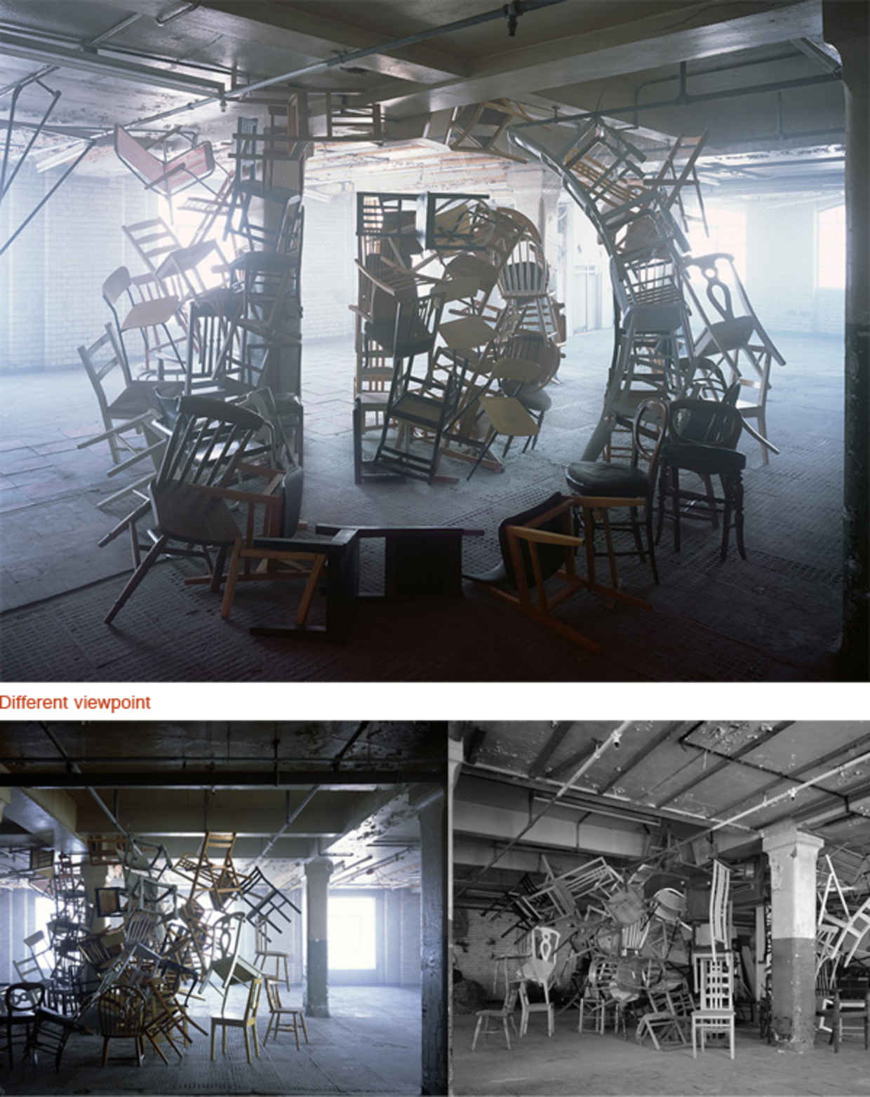
This sculptural typography piece from other angles can just be a cluster of chairs. But it is entirely different when viewed from another perspective.


Anamorphic illustration: Two sides to every story by Lex Wilson


Doyle Partners achieves the look of a 2d typography layout on top of an image in real life, with just the right amount of stretch and positioning for each letter. 

Below are some that experiment with how the use of light interacts with the type and shows the hidden message. 


Markus Raetz