
Tuesday, December 7, 2010
So True
Seeing this poster made me think "ah that is so true". It is amazing how, after learning about type, you begin to notice bad typography everywhere you go. It really is everywhere, billboards, logos, letters, packaging, posters, you name it. It's hard to go anywhere without wanting to fix everyone's type! 

Monday, December 6, 2010
Measuring Type

I also thought this was pretty cool. Two artists--Matt Robinson and Tom Wrigglesworth--decided to take some of the most commonly used typefaecs and see much ink each uses when drawn at the same point size. The artists drew large scale versions of the fonts with ballpoint pens and then measured the level of ink each took.
Kind of awesome!
Garamond is the most efficient, while Impact eats the most ink. Helvetica and Times New Roman are both in the middle of the list.

Know Your Type
The website idsgn.org has been running a series called "Know Your Type" that delves into the history and contemporary applications of famous typefaces. I particularly enjoyed the post about Futura, a personal favorite of mine.
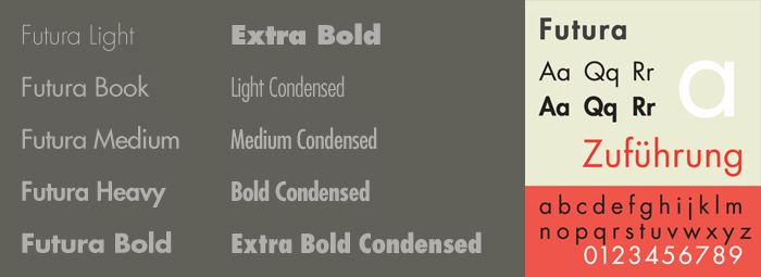
It traces the design from the Bauhaus philosophy and the designer Paul Renner's desire to avoid any unnecessary elements, making for a completely clean and modern typeface. Futura was the first typeface to land on the moon, as it was used for the commemorative plaque signed by the astronauts of Apollo 11 and placed on the moon's surface in 1969.
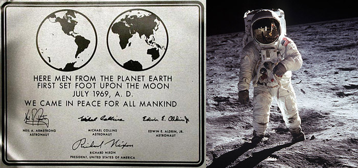
It has remained popular from 1924, when it was first conceived, up until the present day. It is used in many contemporary logos and products, including Red Bull (which I'm drinking as I type this--ah, finals), Louis Vuitton, Absolut Vodka and the Costco logo.
Altogether it is a font that has retained its relevance for nearly a century, and continues to look fresh and modern in today's design. Truly a remarkable typeface.
Two other typefaces in the series: Verlag and DIN.

It traces the design from the Bauhaus philosophy and the designer Paul Renner's desire to avoid any unnecessary elements, making for a completely clean and modern typeface. Futura was the first typeface to land on the moon, as it was used for the commemorative plaque signed by the astronauts of Apollo 11 and placed on the moon's surface in 1969.

It has remained popular from 1924, when it was first conceived, up until the present day. It is used in many contemporary logos and products, including Red Bull (which I'm drinking as I type this--ah, finals), Louis Vuitton, Absolut Vodka and the Costco logo.
Altogether it is a font that has retained its relevance for nearly a century, and continues to look fresh and modern in today's design. Truly a remarkable typeface.

Two other typefaces in the series: Verlag and DIN.
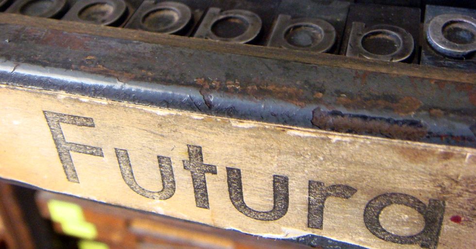
Interesting letterpress forms
Two images that I found particularly interesting are:


Saturday, December 4, 2010
Thursday, December 2, 2010
Saul Bass was not only a well known and highly sought after designer, but he was also the undisputed master of film title design. I got really sucked into watching his different videos on you-tube, and I wanted to share a few of his titles (some are really goofy). Not only are his ideas innovative and well-designed, but the type is playful and fun to read as it plays around the screen. Here are a few of his movie posters, he was very intuitive when it came to typography.


Here is one of my favorite movie titles by him:
his ideas were timeless, and are still copied today. here is a title I really enjoyed for catch me if you can, clearly saul inspired:


Here is one of my favorite movie titles by him:
his ideas were timeless, and are still copied today. here is a title I really enjoyed for catch me if you can, clearly saul inspired:
Type Wrap
Typography is everywhere and we see it so frequently we become almost unaware of it. Upon looking up different types of typography i found some images with typography incorperated in clothes and found it interested how the letter forms were able to adapt around the body as a canvas. Also how they were able to successfully translate some of the items into fashionable statements.


Subscribe to:
Comments (Atom)

