Tuesday, September 29, 2015

Hand Done Type, the Dying Art?

So there I sat at my desk, Monster drink in tow with no clue what to write. Finally, the Monster starts kicking in, I begin my research topic on the notion that hand done lettering or calligraphy was a dying art.  It is a statement that I recalled hearing since my first class in Tyler during my color foundation drawing class. For me, drawing was hard enough as it is, but hand doing lettering was a whole other league of its own. 


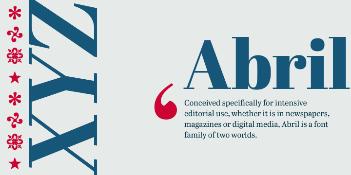
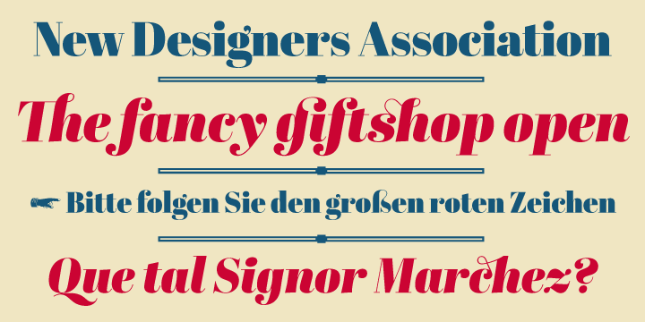
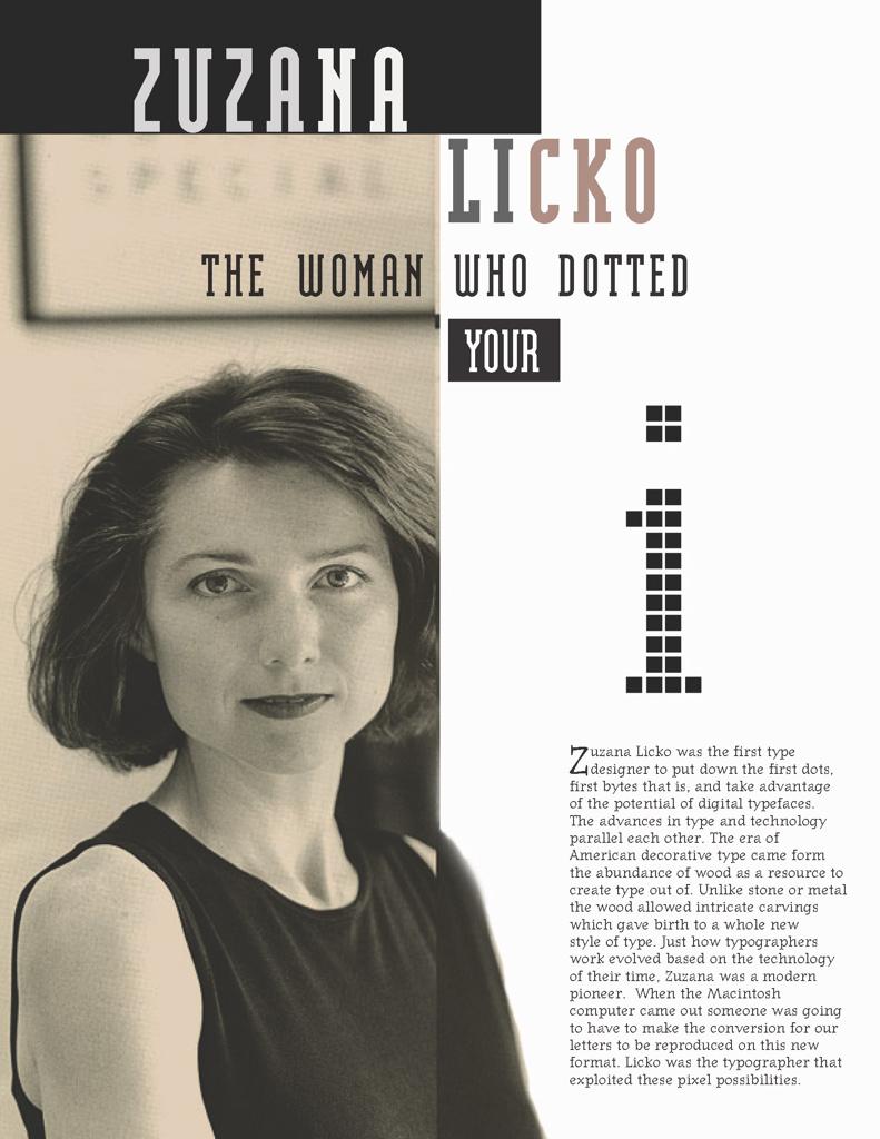
Through my graphic design courses, Jessica Hische’s name is often dropped as a prime example of typography, most of it being hand done. Using that as my starting point I went to her website and ended up in her FAQ. In the section, “what’s the difference between lettering and fonts” and “how did you become a letterer,” explains the difference between “fonts” and “lettering”. In Hische’s own words, “lettering is essentially illustrations of letters, words, and phrases” rather than designing a whole entire typeface system. With a basic understanding, I continued on my journey of discovery, with actually reading articles about why this art is considered dying. I mean, designers like Jessica Hische does not seem to be the only one around doing it.


As the article “The Dying Art of Handwriting” puts it, the reason for this art “dying” or fading is because of the technological advances. Attributing the replacement of a $300 calligraphy pen for graduation to getting a Macbooks or iPad, the “new writing tools of the digital age.” A good portion of this article is dedicated to talking about how handwriting is similar to a muscle, that it builds “hand-eye coordination and […] fine motor skills.” That there was even studies conducted with children who practiced cursive writing at an early age in contrast to children who do not. The children that practiced end up with higher academic success in the future. It is specifically cursive writing though in this study, apparently connecting one letter to another literally helps to connect the dots or nerves in our brains. 


Not only is practicing writing cognitively good for us, but it is also a good way of distinguishing a person’s personality. I found this to be interesting because the one-way type is used in design, is to express a certain emotion or atmosphere, and here this article talks about a person’s personality through their handwriting. It is also mentioned that writing versus just typing directly, people are able to express more ideas because of the direct correlation between writing and thinking. As a designer, reading these past few passages really made me want to try doing lettering myself. Especially since I struggle with expressing more ideas.


In the last few passages of the article, the author expressed what she believes to be the reason of declining numbers in writing. Simply that schools no longer are focused on teaching children handwriting. That emoticons are more likely used by kids of today to express themselves than to write a letter.


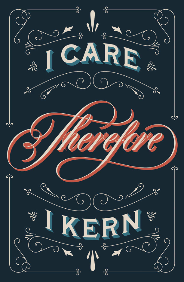
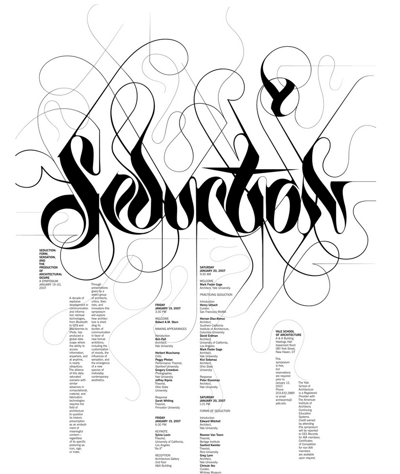
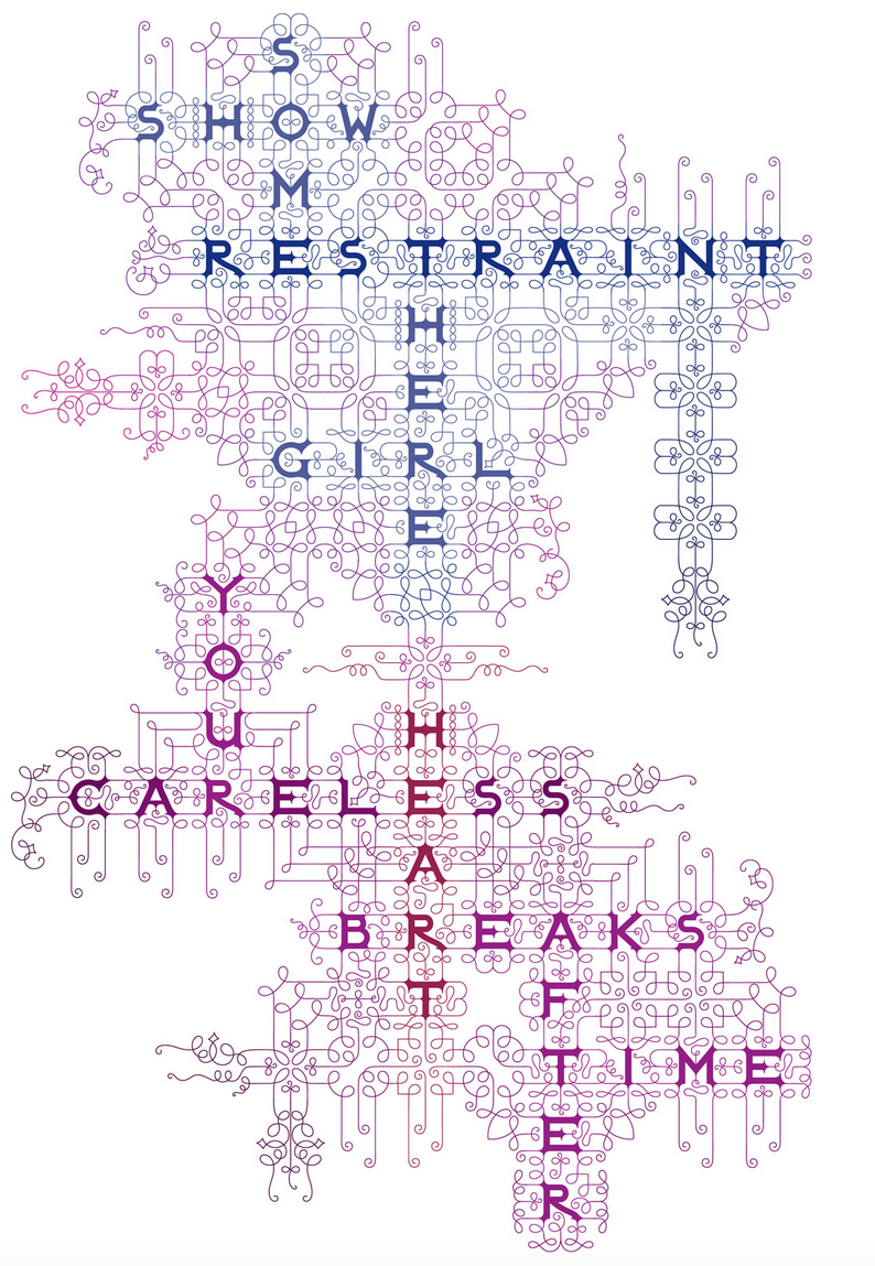
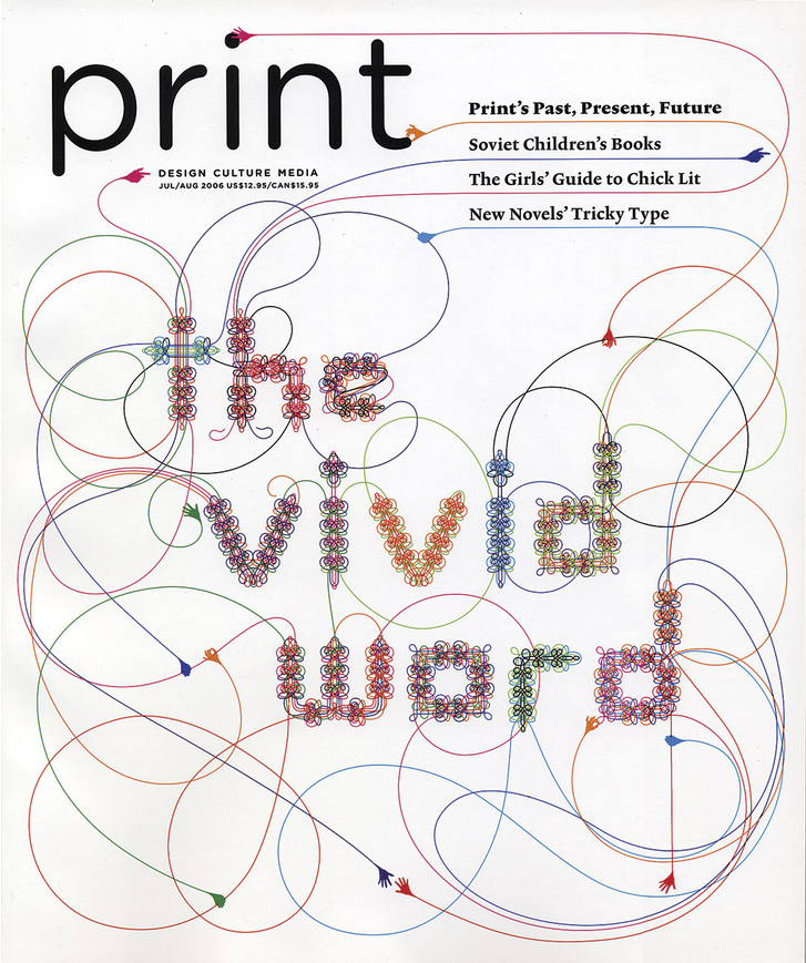
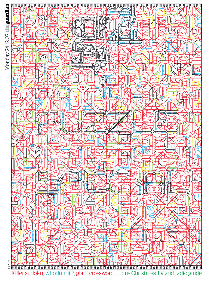
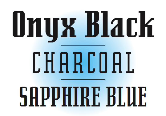
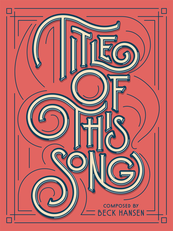
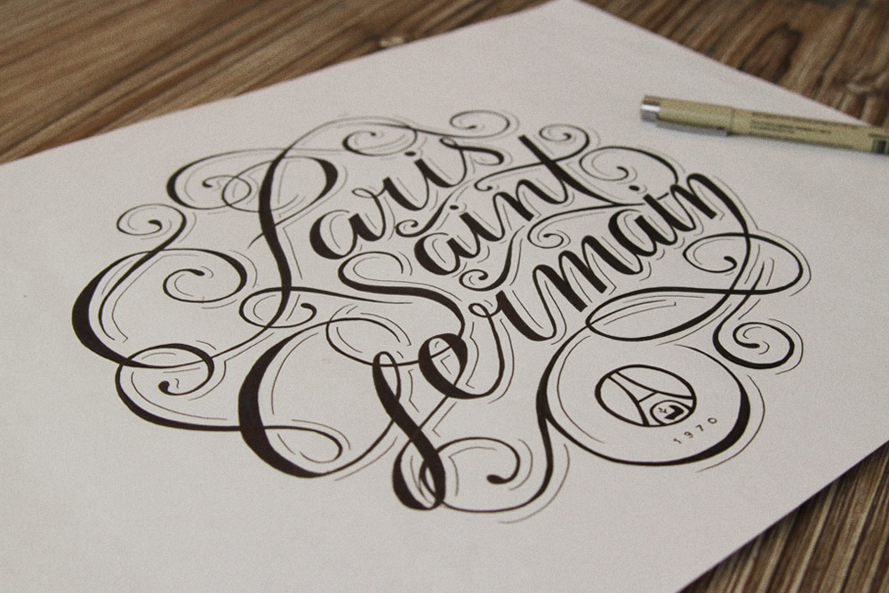
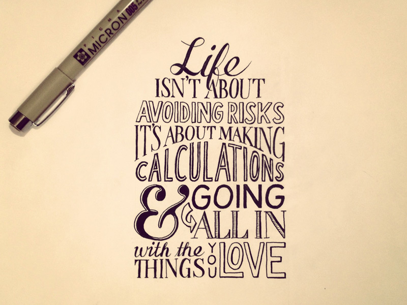
On to the next resource, from Claudia Pearson. Here is another fellow designer that heard of “the dying art of hand lettering,” who like me also is confused. The author states despite notions of this being a dying art form, there is “evidently a huge resurgence” (this article was written in 2014) going on […].” She follows up by posting a few images of lettering. It good to know that I am not going crazy thinking that lettering and calligraphy is matter of fact, not dying after all. 


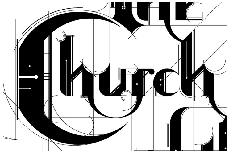
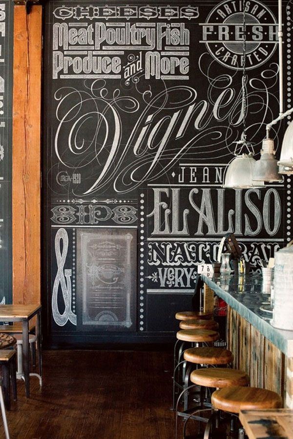
Lastly, the final article I read by Angelynn Grant, where she asks three “typography experts to weigh in on the recent hand-lettering boom.” She begins by stating that the past few years, as in starting around 2009, lettering has been exploding. Offering a quality that can “evoke the DIY/ craft,” and may relieve the sense from the “sterility of Modernism.”

One artist, Ale Paul, considers the different environment of the present to the past. At one point, the mass wanted to chase, perfect the modern/ machine cleanses. Now that the availability is accessible to everyone and is easily created, the majority is fixed on chasing the past. Seeing how designs from the past can fit into our own present period.

Another artist, Ken Barber, suggest that the “popularity seems to have risen among […] designers who don’t specialize in the practice.” 


As an end note to this assignment I just want to express that it is a relief to know that lettering and calligraphy are both not dying arts. Time to brush up on my lettering and maybe calligraphy skills!

Seb Lester talking about his work. (1:59)

Seb Lester recreating famous logos. Commence awe and drooling. (3:02)


Bibliography: 


Have a good one~


Monday, September 28, 2015

A Love Letter To You

A Love Letter For You by Steve Powers

Steve Powers
Powers, a West Philadelphian now based in New York, is a former graffiti writer who became a legitimate studio artist, illustrator, and Fulbright scholar. In Powers’ own words, Love Letter is “a letter for one, with meaning for all” and speaks to all residents who have loved and for those who long for a way to express that love to the world around them. He considers the project “my chance to put something on these rooftops that people would care about." The series all together expresses a love letter from a guy to a girl, an artist to his hometown, and from the locals of West Philadelphia. The series consists of 50 rooftop murals total. The Project was completed February 2010 and stretches on Market Street 45th to 63rd street. 


not part of Love Letter project


https://vimeo.com/10507724
https://www.youtube.com/watch?v=NZ5FcMrfmt0 <----- This one

"As part of the Mural Arts Project, we're not just painting murals to pretty the neighborhood. That's certainly part of it, but really the idea is to hopefully stimulate people to become more engaged and create change."

Do Murals Spark Social Change?
Another Germantown mural artist states, "If the mural is doing its job, it becomes like a keystone in the neighborhood; something to be proud of and something a landmark. Pretty soon, porches are getting repainted around it, trash is getting picked up, there's less graffiti and you can really see it becomes a rallying point for the whole neighborhood."- Nathaniel Lee

Founder and Executive Director, Jane Golden says "In the past 27 years, we have helped to show the dramatic impact that public art can have on neighborhoods, and we have demonstrated that Philadelphians across class, race and ethnicity want both beauty and artistic stimulation in their communities.”

Philadelphia is the second largest city in the world when it comes to murals. The largest mural in the world is housed at the Philadelphia International Airport. The Mural Arts Program of Philadelphia is a non profit organization that allows communities to come together are create something the surrounding neighborhood would enjoy. Their murals not only bring color and meaning to Philly neighborhoods but also help local artist and soon-to-be artist collaborate in designing and painting giant works of art. They have worked with artist all around the world, including Shepard Fairy, the well known created of Andrea the Giant's Obey brand. 
Steve Power's series of work is very typography driven. The color palette consists of bright, fun colors that have no business being in the surrounding area. The overall message of love is tame compared to other murals, whose voices talk of racial injustices and the famous icons that spoke the loudest. Power's series of typographic mural art is meant to be viewed with light hearted feelings and a generally sense of happiness. He sets the scene of  "a boy sends a love letter to a girl" with short messages that rhyme or use strong illustrations to get his meaning across.  
I agree that murals in general are a great way to make a community stronger. Steve Power's series of murals definitely brings a very positive feel. The juxtaposition of bright colors and strong typography next to dilapidated buildings brings a sense of regrowth to the area. My only criticism is that his work comes across as a Hallmark advertisement and paired with its surroundings might cause a disconnect to the average viewer. 
Spotting them on the Market Frankford Line would definitely bring the series as a whole together and it would make the scavenger hunt much easier to follow. But some murals as a single piece don't do it for me. Not every piece can be as powerful as the second image posted (the white wall with letter forms spread out to look like magnets). Some pieces are meant to be smaller and more intimate, and there is also the challenge of creating 50 different and unique murals, but I can argue that not all of Power's murals give me the message, or want me to research it further. 

With all that being said:
Is Steve Power's work decorative or can it allude to something more?
Do they mean as much compared to other murals of Philadelphia?

Type and image in 70’s horror posters

Type and Image in 70's Horror Posters

Thinking about current movie horror and how it doesn’t seem to a very interesting time for the genera, I figured I’d look back to some poster designs of older classics.

­­

The Texas Chainsaw Massacre

Huge condensed black and red type draws your attention immediately; your eye is drawn to the top of the first tagline, being the largest type. The tagline and title (all caps and red, being the most important in the end) frame a strong illustration of an impending murder, and the second tagline, in a similar shorter typeface. Under the title, the third tagline is a thinner version of the second tagline’s type.

The words themselves try to fill you with gruesome tension, “what will be left,” “bizarre and brutal,” “what happened is true.” After your eyes travel the poster, they return to the title in bright red, and the image interacting with it. It tells you what will happen, you are left to imagine how.

Alien

Bold, capitalized, tracked out, sans serif title followed by a strange hatching egg, and a smaller condensed tagline. Below is a strange metallic ropey floor and reflection of light from the egg. The entire poster tells you very little and places you in a strange environment. The title appears to drift in the vacuum of space, but the reflection of light makes the lower end feel contained and claustrophobic.  The smaller, tracked in type reflects this.

This poster, like the movie itself, takes the approach not telling you enough and letting you use your imagination. All you know is that you are in space, there is an alien, and you will scream. You are left to wonder just what will hatch from that egg.

Jaws

Strong, thick, blood red type that almost feels like it curves like the waves in the ocean. It lives as a part of the illustration of the impending giant shark and seems to foreshadow the violence of when he meets the woman swimming above. The tagline, read second, sits in the frame of the title and art. Its curved serif font feels reminiscent of the book origins it describes. The names of the three main actors, with the title are more important then the past posters, along with the following credits, maybe because this movie is more on the blockbuster end of horror.

The poster is short and simple; a big shark attacks, based on the book. It encompasses the fear people feel of what is in the water and how defenseless they are there.

Carrie

The first tagline brings you in with asymmetrical, capital type that seems to be not be kerned correctly, to it’s advantage. It comes off as off putting and wrong, like something in the uncanny valley. It’s followed by before and after photos of Carrie, one happy, one violent. The title waves and fades strangely like fog or a ghost. It’s warped, uneven and dirty. A small second tagline, same font as the first, gives you some more info, followed by the major credits.  All the major type is orange set on black, giving a sort of Halloween look to the poster. It is likely also referencing her orange hair, while the dirty darker spots call back to the gore.

This poster took the interesting approach of showing you the big ending scene, but, assuming you didn’t read the book, all you know is that Carrie goes to prom, and she can (and does) do something horrific. The poster shows a glimpse of the horror, and invites you to find out how we get here.

The Exorcist

The title is listed bold, capital, and with a slight serif. The purple against black gives off a twilight time feel. The producer and director are listed above and below in a thin, tall modern sans serif. “Directed by” is only half the height of the name, making it secondary. The image below is a man on the street at night, illuminated by light from a window. Below, a tagline of the same font as the director and producer, smaller and not in caps. The tagline gives context to the image, he is at the house, something from inside the house is projecting on him ominously, but we can’t tell what


This poster sets the mood, and gives you an idea and feeling of what is going on. It feels dark, cold, and strange. The strong white feels ominous as we anticipate what is in that house.

Friday, September 25, 2015

Contemporary Women Type Designers

Contemporary Women Type Designers

Although Tyler’s GAID students are predominately female, many of the great designers and type designers we learn about are men. Sure, Paula Scher and Jessica Hische’s names are dropped frequently, as they are both alumni. More often than not, however, we hear about the work of male designers. A Google search of “famous graphic designers” will provide a list in which the great majority are white men. Female designers’ names deserve to be recognized just as much as Sagmeister, Carson, Lubalin, and Rand. Unfortunately, the trend of underrepresentation/under recognition of women continues in the field of type design. Thus, I thought the ABCDEFridays Blog would be a great opportunity to feature a few contemporary women designers who specialize in type. Of course, many are missing from this list, notably women of color – but at the end of this post, I provide some extra links to more resources for folks to do some more research if they are interested.

Veronika Burian


Veronika Burian is the co-founder of TypeTogether, a type foundry in the Czech Republic that began in 2006. Although she studied industrial design as an undergraduate, her friend introduced her to type design, an experience she described as “like falling in love.” Despite her move away from product design, she’s noted the similarity between the two fields, as both typography and products are designed “to improve the experience of an object from the user’s point of view, be it a good piece of typography or a comfortable chair.” Today, she works fulltime in Spain on TypeTogether.

TypeTogether is known for their display typefaces intended for editorial use, while maintaining a sense of personality and a refined technical standing.


For instance, Crete is a typeface Burian designed after being inspired by a chapel wall’s lettering in, you guessed it, Crete. Notable are Crete’s serifs, which vary between being slab-like or curved upwards. Depending on the weight, the serifs add a touch of sophistication in Thin or strength in Thick. Crete is an interesting display type, and exemplifies TypeTogether’s reputation for creating unique typefaces that still function well.


Another notable typeface is Abril. If purchased all at once, Abril comes with an array of different weights that make the typeface multilingual in function. Like TypeTogether’s other typefaces, Abril is intended for use in publications, in print and online. The contrast between thicks and thins make Abril fun and compelling to look at. Similarly, the curves of the italic typefaces offer a contemporary take on a 19th century slab serifs. Burian and her partner have won several awards for Abril.

Marian Bantjes


Marian Bantje’s work straddles the line between design and fine art. Based on a small island off the coast of Canada, Bantjes is an established and respected graphic artist who has spoken at conferences worldwide. Her projects span across patterning, illustration, photography, typography, and design. For the purposes of this blog, however, I will focus on some of her type design work.


Bantjes’s Coexistence Poster was created for Alliance Graphique International (AIG) for an annual poster call. Bantjes designed the poster using her collection of sand, which she gathered from around the world during her travels. The poster exemplifies Bantjes’s eye for detail, pattern, and texture in addition to type. It reminds me of the current trend of using unconventional objects or materials and photography to create type, which Bantjes has explored in a number of projects herself.


Bantjes also makes great use of intricate line work in her typography. She’s internationally recognized for her ornate designs, and almost a bit obsessive exactness. Something I admire about her typography work is how apparent and significant her design choices/rationale are. Every corner of each letter appears intentional and thought-out.


Her cover for G2 in 2007 is a complex pattern that she designed to create the letterforms. If you can make it out, it says, “Puzzle Special.” Pretty amazing. And cool. Usually I stray away from work that’s too complex and confusing, but Bantjes’s work is different. In a time where popular design is flat, simplistic, minimal, and to the point, the eye candy that is Bantjes’s work becomes refreshing and unique. It holds my attention and only gets more compelling the longer I look at it. I’m not sure how many contemporary designers pull that off.

Zuzana Licko


Zuzana Licko is a typeface designer based in the Bay Area who is known for her early work designing bitmap type as Macintosh Computers first arrived on the scene. She and her husband co-founded Emigre, a type journal, in the mid-1980s. Licko designed an array of bitmap fonts for use in their magazine. Émigré became known for its experimental and unconventional use of type’s scale, leading, and column widths. Graphic designer Massimo Vignelli condemned Émigré’s aesthetic, calling it “garbage.” Eventually, however, Licko’s eccentric and unique style was accepted and praised over time. Today, Emigre exists as a typefoundry. Licko’s most well-known typeface, Mrs. Eaves, can be bought from Émigré’s website.


Mrs. Eaves, a remix of sorts of Baskerville, is named after Baskerville’s wife, Sarah Eaves. In her own words, Licko describes designing of Mrs. Eaves as “want[ing] to reinterpret Baskerville in a warmer manner, with less contrast, so it would be more fluid.” Indeed, reading text in Mrs. Eaves has a soothing quality to it. Its easygoingness is a significant difference from Baskerville, a typeface designed with high contrast in mind.

When the Macintosh Computer first arrived on the scene, traditional typeface designers shied away from it, calling it a “cute novelty” (Eye Magazine, 2002). However, Licko took to using the Mac as a type design tool immediately, describing it as like falling in love. Thus, Licko is remembered for being one of the first designers to see the potential in the pixel and embrace digital techniques. In fact, Licko works nearly exclusively on the computer. Aside from a few thumbnail sketches to figure out shapes of letters, Licko designs her typefaces using font software (Fontographer) and makes adjustments optically.

The influence of the aesthetics of the early computer is evident in Licko’s work. For example, her typeface Citizen is recognizable by its sharp edges and bitmapped appearance.

Citizen is merely one typeface that represents the dozens of unique typefaces in which Licko harkens back to primitive digital technology.


Typeface: Lo-Res

Typeface: Citizen


Typeface: Senator


Bibliography
Burian


Bantjes

  • http://bantjes.com/work/category/portfolio/

Licko


Extra Resources
http://womenofgraphicdesign.org/

http://www.alphabettes.org/

http://typequality.com/

Thursday, September 24, 2015

Ransom for your thoughts


RaNsoM nOtes...
Now and days, this idea is used as a playful method in design because of the visual impact it has to the eye. Our eyes are drawn to the stark contrast of color, size and fonts. To be honest I am not really inspired by this use of text, but I am more interested in the development of this idea and how over time it became a reference in the art field. 

While trying to find some research on ransom notes, I was able to find a story that dated America's first known ransom kidnapping notes. 


Here were the letters that were founded and published in 1876.


This note reads, 
“You wil have to pay us before you git him from us, and pay us a big cent to, if you put the cops hunting for him you is only defeegin yu own end.” 
Credit: 
Freeman's Auctioneers and Appraisers

I personally thought this story was actually pretty cool in my search to understanding the use of ransom letters because those letters represented a direct link to a disappearance that had remained unsolved for 139 years. What is also weird is that how did these letters end up in their basement of family artifacts. That's another story for another day perhaps. 

Building off of this information I was then curious to know why the use of a ransom letter anyway. From my knowledge, I always thought it was to disguise the criminals identity, which make sense, but if the criminal was already a mysterious suspect to the police and family why still disguise your hand writing. SO... I tried looking up possible facts on this matter and found no great explanations just theories which led to a more physiological understanding which i wanted to stray away from. 

but for the sake of satisfying everyone else curiosity as to "why" here is a useless link to people's comments and opinions, which are always quite funny.


Moving on, I started to think about how did ransom letters evolved over time especially to the iconic stage it is at now. You know, with the cut and paste magazine letters.

yea this one.
 Sadly I struck out once again with finding some answers. The closest I got to an answer was this quote from this brief article that stated, they exists only in the imagination of Hollywood screenwriters. http://16sparrows.typepad.com/letterwritersalliance/2013/03/the-case-of-the-cut-paper-ransom-note.html

Trying to avoid the inevitable that this style of type is a lost cause, I wanted to see if any artist were influenced in mimicking this style and I lucked out for once. The cut-and-paste ransom-note style was made popular by Jamie Reid's. Jamie Reid was born 1947, an English artist and anarchist with connections to the Situationist. His work, featuring letters cut from newspaper headlines in the style of a ransom note, came close to defining the image of punk rock, particularly in the UK. His best known works include the Sex Pistols album Never Mind the Bollocks, Here's the Sex Pistols and the singles "Anarchy in the UK", "God Save The Queen".


Jamie Reid became one of the results of this Postmodernist movement which began as a reaction to the rigid restrictions of Modernism. Punk first exploded in the 1970s in which it just looked like youthful rebellion. for more info on this movement here is its link. 
http://typetastingnews.com/2013/10/24/how-punk-changed-graphic-design/

Another possible inspiration is that around the 18th and 19th century as well, is that an Earlier version of Macintosh system software, up through System 7, included a bitmapped font called San Francisco that replicated the ransom note effect. Only not to be carried over into later versions of Mac OS.

Because we are in an era were we are ruled by technology everyday, criminals has no need to cut and paste ransom notes anymore, let alone be stupid enough to leave their finger prints on it in the process. All they have to do is type in their ransom letter at this playfully website called "The Randomizer" (http://www.ransomizer.com) and they will achieve that similar cut and paste style, in a sense of course. 

Here are some other cool ransom note style I found on a simple google search;