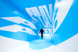
Anamorphic type is basically this - 3D typography created
using only 2D methods. Kinda hard to
picture right? Here’s an example:
Of course this is an interesting technique
to execute any typographic work just because it is so innovative and different
from usual 2D prints, but that is not why it caught my eye. Anamorphic type can be used to reinforce the
message the type is trying to communicate by the way a viewer is forced to
interact with it. Moving towards, away,
or around the piece in a gallery completely changes the composition of the
project, making it completely illegible most of the time. Unless you are standing in the perfect
position you are not going to get what all the fuss is about. THAT’S why it is so fascinating, especially
when it conveys messages like this one, by Thomas Quinn.
Joseph Eagen and Hunter Thomas
Here’s how
anamorphic type artist Lex Wilson (http://www.lexwilson.co.uk)
was inspired to try such a strange approach to his typeography,:
"I
loved Escher when I was a kid, especially his 'Waterval' and 'Ascending
and Descending' pieces," he explains. "I had some cool optical illusion
books and I was fascinated with the idea that you can't always trust what your
eyes are telling you. Felice Varini's work is completely mind-blowing to me -
he's a major inspiration. I guess my 3D
typography work is a reverse of that - representing something 3D in 2
dimensions. So, that's kind of like drawing something 3D in 2D, then
representing that in 3D across different surface-planes."


No comments:
Post a Comment