Friday, October 25, 2013

Playing Cards

I was looking around online and saw this picture of beautiful playing cards. It got me thinking about how something as simple as playing cards can be turned into beautiful typography.  I then started looking for other playing cards and the different and creative ways designers have put twists on them and used really nice typography.

This is the deck that I saw first and got me thinking. It's design by Simon Frouws, and was picked by David Copperfield as one of his "necessary luxuries" in Departure Magazine in 2013.


I love the branding of it all. The very decorative elements, especially the spade on the back filled with all the awesome flourishes.

This one is by Chris Cavill, an english based designer.


I love the beautiful ligatures on all of the cards. The designer made them very elegant. I also love the small detail of the pattern on the back of the cards, the image on the face cards, the slight texture on the others, and just how all of it works together but there's still some big differences between the far cards and number cards (not sure if that's the right terminology). It's really the very subtle details in the type that make it so elegant and beautifully done. 

Wednesday, October 23, 2013

Type Camp

For those of you who love typography and want to explore it further, never fear, there's a Type camp available for you to attend! There are several locations, including camps in Vancouver, California, Ireland, India, and Ashville. Each camp specializes in different things relating to typography. For example, the camp in Vancouver focuses on calligraphy and hand lettering, and the camp in California focuses on creative typography. Some of the camps try and incorporate the local culture into the lessons about typography. The sessions range from two day workshops to about weeklong camps.
There are three camp formats designed to fit what kind of experience you would hope to have. First off, there's a relaxing countryside retreat setting which provides housing and meals. Type Camp claims on their website, "We create a relaxing environment for learning that is specifically structured to reinvigorate your creativity." For those who are hitting a roadblock on their creative highway, this peaceful setting could be just the thing! At this kind of camp, there are type related activities all day with little outings and other activities thrown in the mix, such a trip to the local vineyard.
The second kind of camp is a cultural immersion camp that is a little less serene and strives to introduce a cultural context to the knowledge and design of the participants. There are more excursions around the area of the camp and local design experts are brought in to help guide the workshops. The website states, "A dedicated experience of the area's typography and design culture is created through workshops, seminars, and demonstrations with the Type Camp staff and visiting instructors.
The third kind of camp is called a professional urban training camp and is only a few days long. It consists of seminars and workshops in cities for those who don't have the time to go to a full-length camp. These camps are more specific and according to the Type Camp website, "These events are focused on specific subjects such as complex typesetting, hand-generated lettering, or the burgeoning world of web type." The camps are 8 hours of instruction time each day with lunch and snacks included.
http://www.typecamp.org/


Top 5 iPad Apps for Typography (in my opinion)


Alright, so since we are all forced to buy ipads for our portfolios, I figure, we may as well use them for our full benefit. The ios apps can be extremely helpful to making research and production easier and funner for us designers. Here is a list of my 5 favorite Ipad Apps that deal with Typography.

Fontbook
The first is called FontBook. It cost me $4.99 to buy and oh boy, is it worth it. FontBook is a useful tool  for designers to find typefaces. It offers an up to date library of typfaces ranging from over 134 international type foundries (in many different alphabets may I add)... that mean around 730,000 typefaces for us to drool over. Another great feature of this app is how you browse. You can begin by class, foundry, designer, year, name or even designer. Plus, there are Font Lists that let you search by criteria such as genre, stylistic period, similarity or popularity. It also takes you to a page where you can purchase these fonts. You can take save your fonts as your favorites and come back to them when you are ready to use them. My favorite part of this app is it’s design. It is so user friendly and so nice to look at. 


LetterMPress
I was a little weary with whether or not I should include this app, but then I played with it and I couldn't leave it out. LetterMPress shots you back to a time before digital space. This app is very cute and pretty addictive. For $4.99, it enables you to work with and learn about vintage wood type and hand driven printing presses. You select what kind of font of type or art you want and lay it out on a board. You can add furniture and lockups, even rulers to your board to create a really cool typographic image. You then go to the print option, select your ink, your paper and then the app prints your letters for you. The high-res output ensures that its not just a silly app, but could really help those of you working on wood type projects. Again, its super addictive, so beware you don’t spend more time in the app than in your typography projects. 


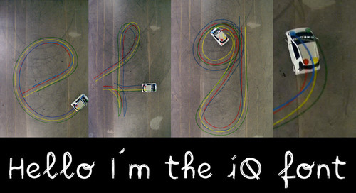
^that's what you can make ^


ifontmaker
This app is so great. For $6.99, this app is a fast and easy way to create your own typefaces and fonts. IfontMaker is a straightforward interface for hand drawn type that can emailed and converted into a TTF file. You begin by choosing an “example font” so you can use it’s dimenstions if you want. You then choose a grid for the background so drawing can be more precise. You can even choose to have labels seen of where your ascender, cap height, x height, baseline and descender is. At this point you choose your brush and radius and draw your own type for each character in the alphabet. The program conveniently saves it for you. You can create as many useable fonts as you want in record time. Of course, you can always put them into illustrator to refine them, but this certainly creates a shortcut. 


Whatthefont
Everyone who works with typefaces and fonts at some point sees a piece of lettering and wonders what font is being used. WhatTheFont enables you to take a photo and - with a little luck - identify the font you’re looking at. Does it always work? No. But when it does, it's a little slice of fried tech gold. You begin by taking a photograph of typography or selecting old photos you have taken. Then trace a box around the type, upload it. Then the app finds individual characters and if it can’t recognize all of them, it asks you to identify them. Hit identify, and the app will identify that font or fonts that are very close to it. How freakin’ sweet is that?!


Fontly
This app is Free!  Fontly is a bit like Instagram but just for type geeks, enabling you to "capture, map, and explore the world of vintage typography". You take a snap of some lettering, then title and tag it, whereupon it's geo-tagged and added to the website. This is so useful for inspiration or procrasta-working between projects.  You can add friends and follow certain people or groups. You can also make your own profile and add photos of your typography, or typography you find around you. Again it’s free, so if you have an ipad, get it, you have no excuse.


That’s all I have for now. If you want to play around with these apps, I have them all. Just ask me and I will be more than happy to show you these fantastic apps.

Thursday, October 17, 2013

Giambattista Bodoni - Manuale Tipographico

Bodoni created a series of typefaces that were considered didone modern. He is most famous for the  beautiful typeface, Bodoni.  Bodoni drew inspiration from French type designers like Pierre Simon Fournier and Firmin Didot. Also, he thoroughly enjoyed the work of the English gentleman John Baskerville and based a lot of the typography architecture from Baskerville. There are some distinctive characteristics of Bodoni's letter like the round dot over the letter i, or the double story lower case a. As far as upper case the distinctive characteristics are the tail of the Q, the slight hook in the J, and there are 2 versions of R. 

I find it quite amazing that someone put most of there life building a type face and not knowing how famous it actually became. For the ABCfriday blog I have some pictures that I would like to show of Giambattista's book, Manuale Tipographico.


In honor of the Print King Giambattista Bodoni

Car-Driven Typography


http://digitaltools.node3000.com/blog/1479-iq-font-car-driven-typography

As I was looking for inspiring typography, I discovered something I had never seen before; the first font ever to be created by a car. Two typographers known as Pierre and Damien were hired by a Belgian ad agency to promote the new European car, Toyota iQ. They wanted to show the car's agility and perfect control in a unique way, so they designed a typeface by tracking a moving car using special software, and choreographing the movements ahead of time. The designers told the driver exactly what kinds of skid marks they would need to create the strokes in order to create the entire font. I thought this was a pretty clever and unique way to market a product, as well as a great example of thinking outside the box when it comes to creating typography.