Friday, January 30, 2015

Classic Rock - the branding of bands and custom typography

Think of your favorite classic rock bands--The WHo, ACDC, Led Zeppelin, etc.  The list goes on and on.  Each of these bands has an iconic typographically driven logo that has become an integral part of their branding.

Kiss


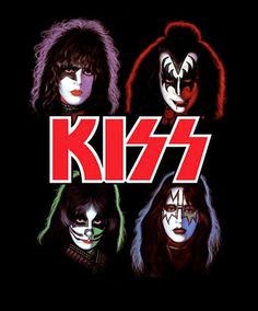
Designed by lead guitarist Ace Frehley for their second album, the custom type has become as recognizable as the bands outfits. The most iconic part of the logo is the treatment of the "S"s as lightning strokes.


The Sex Pistols


 Designed by Jamie Reid for the Sex Pistols single "God Save The Queen", the rough cut out treatment of the type helped found the gritty punk rock aesthetic that still defines the music culture to this day.


The Beatles

Originally created in 1963 by Ivor Arbiter, the man that sold Ringo his drums, the type logo became a defining element of the band's identity with its small caps and "T" that drops through the baseline.


ACDC


The band's logo debuted on their album, "Let There Be Rock." It was originally designed by Gerard Huerta who had based the letters on the blackletter type from the Gutenberg Bible.


Metallica


Another internally designed type face, Metallica's signature jagged M and A came from their singer and guitarist James Hetfield for their first album cover.  Since its creation, the logo has been an important part of their branding except for their '96 album, "Load."


The Who


Oddly enough, the iconic pop art logo never appeared on any of their albums, or was commissioned by the band or record label. It was created by Brian Pike in 1964 for a poster advertising the group's gig at London's Marquee club. Since then, the image was proliferated thousands of times by fans until it became a defining element of the band's branding.


Bands and musicians from past decades and genres had branded themselves with a single custom typeface and a few icons or illustrations that remained present in all of their work. Oddly enough, it seems the current trend for bands when it comes to branding themselves is to change aesthetics, type, and imagery from album to album, and even from show to show.  This presents more opportunities for designers and allows for more creative solutions to their branding needs.


Thursday, January 29, 2015

Typography of Street Graffitii


Graffiti has moved from illegal markings and tags to a famous art form that has spread across the globe. Graffiti is full of beautiful free flowing forms that make up letterforms. Theres hundreds of styles of these letterforms. Each graffiti artists puts their own flow into these styles as well creating each piece and letter form unique. Graffiti has be come so popular that typographers have even created typefaces for programs that are based on these free form styles.


Videos

Thursday, January 22, 2015

REBRANDING EXISTING DESIGNS


SURF MAGAZINES
Black and White images with bold type recently has been the trend with surf magazines. The type is bold and stands out against the photo that is exaggerated in the light and darks. This magazine in particular is heavily relying on aesthetics rather than "clever" typography that uses tricks.
As can seen below this surf magazine went through rebranding for the better. The image is more captivating on the right than the left because it makes the viewer hone into the surfer and creates depth. The image on the right on the other hand seems like it was taken by an amateur photographer who was lucky enough to capture a mildly interesting moment. Type treatment on the right is 
cleaner and echoes the image it's self with similar color to the image. The restraint in over designing and the clear direction in design is what sets these two magazine covers apart.   https://www.behance.net/gallery/13052023/Transworld-Surf-Redesign
JAPANESE TYPE
Incan is a type of seal that is used for official documents in Japan. A guy from Germany decided to completely redesign this ancient Japanese ornamental font into latin fonts with the appearance of Japanese fonts.  
The bottom book includes 24 different fonts. The lettering is a much more modern approach and uses strong vertical and horizontal lines. The cover below says the word "NIHON" which means Japan in Japanese. https://www.behance.net/gallery/19004863/Nihon-Typeface 

Typography-Inspired Instagram Feeds


As technology becomes more and more prominent in our lives, designers are finding more ways to showcase their art digitally. Many typographers have started creating Instagram accounts and have begun posting their work on this booming social media site. Being one of many smartphone users, I often look up things on my iPhone for inspiration. So when I discovered that typographers are using Instagram as a new form of digital expression I quickly jumped on board and began researching the most popular and interesting accounts. 


1. Typography Inspired


With over 100,000 followers, this popular Instagram account is filled with inspiring typography. What I really enjoyed about this account is the fact that it is a collection of many artists work. The site is overloaded with a plethora of uniquely illustrated fonts for everyone to enjoy. There is a wide range of work stemming from pen drawings on napkins to fully illustrated pieces. What’s even better is to submit work to this account, all you have to do is upload an image to Instagram using #typographyinspired. 


2.  Jackson Alves


Jackson Alves is a letterer, calligrapher, and teacher from Brazil. His Instagram account is filled with beautiful calligraphy as well as amazing videos that show exactly how he created his masterpieces. His work is unique and inspiring, especially for the aspiring calligrapher. Jacksons latest project is a calligraphy collaboration with Tiffany & Co., which he has been showing off on his Instagram! 


3. Goodtype


Goodtype is a trending Instagram account that features the world of a wide variety of typographers. The creators started this site in 2013 and now they have over 100,000 loyal followers. Goodtype not only features some gorgeous letterforms, but it also includes products that are covered in beautiful typography. This community of artists and admirers is currently creating a book based on work that was submitted to the site. You can submit work for the Goodtype Book on their website. 


4. Mike Perry 


Mike Perry is an artist that works in a variety of media including books, magazines, newspapers and films. Besides being the amazing typographer who created the title card for the popular show Broad City, he also has an Instagram account that features a multitude of his work. His color palettes on the account are all bright and fun and his hand drawn art is quite inspiring. Mike’s Instagram features not only his work, but work that inspires him as well. Make sure to check him out! 


5. Jessica Hische 


Jessica is a young illustrator, letterer, and type designer who went to Tyler School of Arts not so long ago! She is very widely known for the website, “The Daily Drop Cap” and her Instagram is simply an extension of her inspiring work. I really appreciate how although her Instagram has tons of beautifully illustrated type, it also has many pictures of her cat as well as her life. Her Instagram is a perfect balance of design and her everyday life.    

http://instagram.com/jessicahische


6. Spencer Charles


Spencer is a typographer and letterer who is now living in Brooklyn, New York. His Instagram is filled with beautifully rendered typography as well as many interesting patterns. Spencer posts many beautiful letterforms as well as many videos of inspiring product design. Check out his Instagram account!    


7. Louise Fili


Louise works in New York at her own graphic design firm. She specializes in food packaging, restaurant identities, logos, and book design. Her Instagram is an extension of her work and features logos and design that inspire her. Many of her posts feature European restaurant design. Louise posts many images of restaurant names, all of which are very inspiring! 

http://instagram.com/louisefili