Friday, November 22, 2013

Old is The New Black


Old is The New Black
 So I was surfing through the internet when I cam acrosswww.oncenewvintage.com, I could not believe the stunning visuals I found on the site. Once New Vintage’s blogs photographs of typography and they list them in two categories: vintage and modern vintage. They list the time period of the vintage art work, I like to learn about the different time periods so I can compare, contrast and gather information about the time periods based off the design. 
As an artist and a designer these were almost shocking to me. I never knew such elaborate, ornate and intense design even existed in the 1800 and 1900’s. Not only are they beautiful but also extremely difficult to create. In a world where Adobe Illustrator and Photoshop don not exist I would go crazy. To be honest, I have no Idea how half these images were made.
Sanborn Fire Insurance Map Typography from 1880-1920, Pt.1
This is one of about 15 Map posters on Once New. I like them a lot because they are so extraordinarily intense but yet elegant and beautiful. I think getting work to have a perfect equilibrium between polar opposites can be quite fantastic.
5 Cigar Boxes with awesome labels- from the late 1800s-Early 1900s. Via the Canadian Museum of Civilization.
The Fulton Self-Inking Stamp Pad and Camel Ink Pad are via Flickr. The David’s Excelsior Self-Inking Stamp Pad is via Etsy. All are American made brands from the early 1900s.

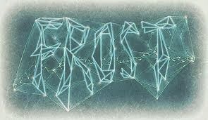
What I thought was really interesting was that many of these designs have typography that resemble those of the up and coming designers. Some well known designers like Jessica Hische, Erik Marinovich and Louise Fili all have work that resemble typographical elements from some of this vintage work. 
For instance, 
Vs
I mean they do not look exactly the same, but the flourishes feel very similar. I would not be surprised if Louise Fili looked at some typography similar the image above this one. 
Vs
 
The serifs are are similar and they both have a similar time period feel. Jessica’s letters are more modern and not as full, but her flourishes and type serifs are so similar.

Wednesday, November 20, 2013

Wintography

OK, so its getting really cold outside and its only November.
Here's some type that has icicles.


Typographic Buildings

Typography is incorporated into recent architecture here: 


But can it compare to Alhambra, in Granada, Spain? These guys have been doing it for years and, old as it might be, it still holds up. Gorgeous, right? 


type in Japan

I studied abroad in Tokyo during my Spring Semester of 2013, and right away I realized how little I knew about Japan. The alphabets themselves (yes, alphabets -- hiragana, katakana, and kanji) were unreadable. To me, these weren't posters and signs, they were just forms.
Asian design wasn't something I was familiar with at all, and it took a trip there for me to finally understand that and open myself up to it. I found a few examples of Japanese typography to share, hopefully it will inspire some research of your own!


collaboration is awesomeememe

So, it's pretty amazing of course to see incredible work from one person, but don't forget about how important it can be to collaborate. One person who has incredible talent meets another person with a different, but equally incredible, talent and you get something entirely new and fantastic. Rome wasn't built in a day, nor was it built by just one person. It's easy to hole up and do your own thing, especially when we're here to focus on ourselves and our looming portfolios, but keeping your mind open to everyone around you (regardless of major!) is important to help you develop as an artist and as a human being. And you know! It's okay if it doesn't look totally perfect, or totally finished, or totally anything! Some of the most valuable lessons to be learned are through experimentation and collaboration. I think sometimes there is such a focus on cranking out a ton of work that it's easy to forget about learning. We have a ton of crazy resources to pull from, but the most valuable resource we have is ... each other. (As cheesy as that may sound!) 

So anyway! Here are some examples of collaborative efforts in the world of typography! Even if you don't like all of them, who knows, maybe it'll help spark an idea anyway!

A project between two brothers -- one is a designer, the other is a "car guy"


These are between a designer and a photographer


Illustrators / designers


"Submit Your Own" blogs 


Two designers 


Now I know that everyone has seen the typical Pinterest home craft project where you spell a word using found images of letters. Instead what I realized while looking up these amazing photographs is that this is typography too and shouldn’t be ignored. Lately, I’ve been striving to find a way to incorporate photography more into my designs, so when I came across these letters my attention was instantly caught.  I am personally challenged by these images to look beyond the typical fonts we find on the computer and instead look to nature (and or man-made structures) to find letters that are naturally built around us. If anything, it is at least inspiration to a future project, seeing new ways to incorporate type more naturally into a design.

Impressive Typographic Portraits

Chances are, you have seen a portrait created out of typography at some point in your life. Personally, I did a typographic portrait project in a high school graphics class. The ones we did were something like the basic ones below, using (usually) black type to create a flat image by outlining key features of the person/image.


While these basic ones are impressive on their own and do take some time and skill, I came across some more impressive ones. Many of these use varying shades of gray to show depth, or do so by altering and warping the type. The 3D quality of some of the following portraits are really cool and inspiring.


In the midst of finding these, I came across some typographic portraits that use color in the same way, to create a dimensional image. Some of these are really impressive.


Then I found a couple that aren't actually people, and these may be some of my favorites that I have come across.