Since I'm pretty ignorant about typography and I tend to have pretty gaudy and unrefined taste, I realized that I needed to do a bit more research to figure out why I should choose these more classic and established typefaces than just randomly selecting some free font that looks cool. However I'm not one for much research. Even with the best intentions I tend to give up reading heavy copy after one or two chapters if it doesn't immediately grab my attention.
Enter Type: Rider.
Somehow I came across an article detailing a strange game for the iPhone that teaches you the history of typography while playing. Since I'm new to the iPhone world I figured it was an app worth investing in; fun while learning! It's around $3-$4 dollars, but for any graphic design student, I highly recommend it, regardless of your personal feelings towards type.
The game is not only an interesting and different approach to the history of typography, but it's absolutely beautiful. The best part? It's addicting and fun!
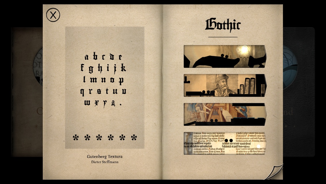
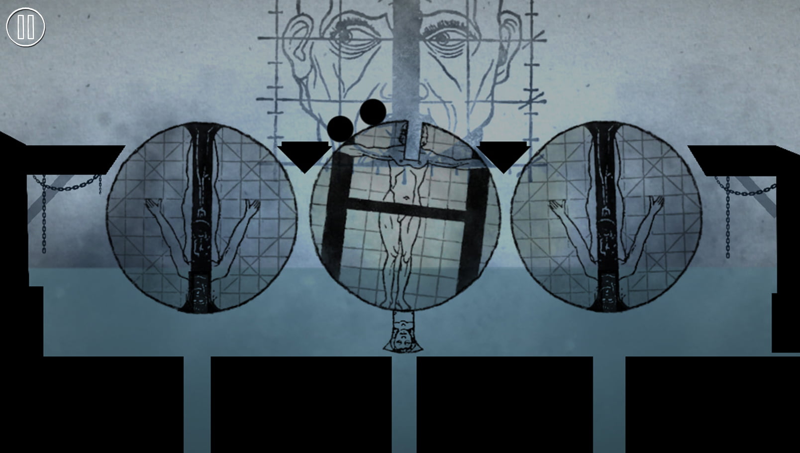
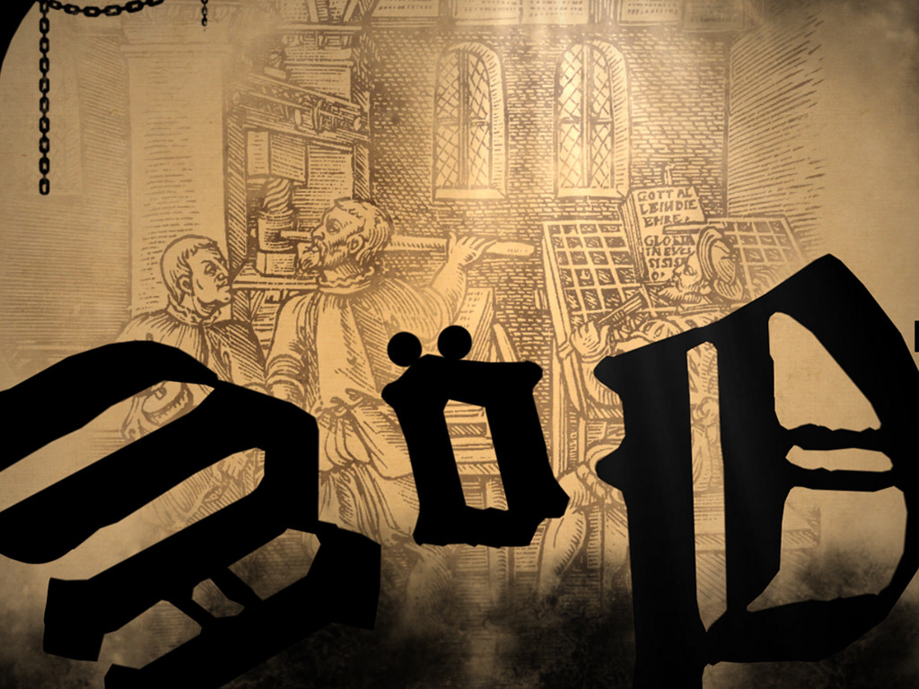
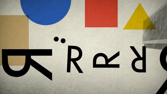
You play as a pair of colons that roll around and hop over beautiful type filled landscapes that would make any designer drool. The game play similar to the original Super Mario Bros., but you must find and collect the alphabet to whatever typeface of the level you are playing. You also unlock different passages about the history of the time period, starting from cave drawings and hieroglyphics, onwards.
This is by far a worthwhile investment to learn a little bit about type and respect it more. I'll definitely be playing this over break so I can come back to Typography with a little more knowledge on type to put into practice.


No comments:
Post a Comment