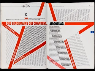
As I've been spending most of my time laying out books lately I've become fascinated with editorial design. knowing now how hard it is to make white space look intentional and be conceptual with magazine design I am highly impressed with spreads that are really able to pull it off. Sometimes it is something very simple like a text wrap and other times it's just the right combination of fonts to make a delicious headline. Also, the balance of Imagery, body copy and white space are immaculate in the pages below. Features like tables of contents, that you never thought to look twice at, are now somehow begging for attention. The main article, a vibrant ruby in a bed of jewels. Something else I found interesting is the ability to abstract text and skew perspective within a spread without loosing the legibility of the article.


No comments:
Post a Comment