Sunday, September 30, 2012

Louise Fili

For those of you who haven't heard of her before, I wanted to introduce a designer that I recently found out about named Louise Fili.  Just to give a brief description of who she is: Louise Fili, owner of Louise Fili Ltd. founded in 1989, specializes in logo, packaging, restaurant, and book design. She started her career as an art director for Pantheon Books from 1978 to 1989 where she designed almost 2000 book jackets.  Her work is held in permanent collections at several museums and she is co-author with her husband, Steven Heller of a number of books on typography and graphic design.  


Her work is heavily type based and the most amazing part about it is that it’s all hand-done.  One of the most interesting things about her work is that she always incorporates the right type in context.  I think that one rule that’s always important to keep in mind as a designer, specifically when working with typography, is to use type that makes sense in relation to the concept of the project.  The kind of font a designer chooses can definitely help or hurt a design because of what it may reference.  Fili knows exactly what type to use to give her work the right look and feel.  It’s too often that people use fonts that don’t make sense with the style that they are trying to replicate, but Fili’s work is a prime example of what type makes sense stylistically and what doesn’t. 

Fili is largely influenced by anything French or Italian from the 20s and 30s.  She loves traveling to Italy and photographing shop signs and food markets wherever she goes.  She is also a huge collector of orange wrappers, vintage perfume and soap labels, letterheads, and coffee bags, which are all a basis of where her inspiration comes from.  All of these things are very obvious when looking at her work and you'll see why:


This makeover of Bonnie's Jams in Cambridge, Massachusetts referenced alphabets and handwriting samples from the 1930s.

This logo, which was designed for the printing company Darby Litho, references letterhead designs from the early 1900s.

Designed for the Chelsea Market, this logo was inspired by Italian packaging from the 1930s.


To check out more of her work, visit her website: http://www.louisefili.com/

Thursday, September 27, 2012

The Brothers Quay

The Brothers Quay Hi all,

For my blog entry I would like to introduce (to those who may not be familiar) the work of Philly natives, Stephen & Timothy Quay, otherwise known as:

The Brothers Quay


Known foremost for their influential stop-motion animation films, these lads (Did I mention they were identical twins? No?) are also well known in avant-garde circles worldwide for their exquisite calligraphy, graphic design and illustration work. In fact, they (yes, both) majored in illustration over at UArts, but I won't go too far into rival matters, naturally.

Personally, I find their use of typography very inspiring in that it invokes a sense of elegance and refinement which I hope to achieve in my own projects. I think it is very easy for our design community to appreciate the hand-drawn lettering and unconventional layout (reminiscent of El Lissitzky and Expressionist cinema titling) that they often utilize. Admittedly, I can't help but also enjoy how eccentric and strange they both are, but that's also another matter.

Onto the work!


I urge you, if interested further, to take a trip to the MoMa to see the Quay's fascinating retrospective currently exhibiting. It's a wonderful exhibit and happens to feature much of their unpublished (and entirely relevant) work to date:

Quay Brothers: On Deciphering the Pharmacist's Prescription for Lip-Reading Puppets. August 12, 2012–January 7, 2013

Kinetic Typography

Kinetic typography—the technical name for "moving text"—is an animation technique mixing motion and text to express ideas using video animation. This text is presented over time in a manner intended to convey or evoke a particular idea or emotion.

http://www.youtube.com/watch?v=D91xdNwRfHI&feature=related

http://www.youtube.com/watch?v=iwIy0enG6uU&feature=related

http://www.youtube.com/watch?v=ui4umNt72RY&feature=related

http://www.youtube.com/watch?v=4FlcS9_LXho&feature=fvwp&NR=1

http://www.youtube.com/watch?v=PaM5CXIVGiE&feature=related

http://www.youtube.com/watch?v=O6aWSBSEgVk&feature=related

MY DREAM PROJECT....

....is to do a hand done typographic video like the 3 designers I am about to show you. I love watching videos on Vimeo of calligraphers and designers as they draw or paint type, and being able to see their process of creating some amazing work. It is a bit of an obsession of mine, mainly because I want to do that too!

Here are 3 (of probably many) talented designers doing these kinds of videos that allow designers such as myself to sit and gush over their talent and be insanely jealous of them.

1. Luca Barcellona.....

.....is a 32 year old calligrapher master. His studio is located in Milan, where he works as a freelance graphic designer and calligrapher. Letters are the main focus of his designs.....and beautiful letters they are. He teaches calligraphy and hold workshops in several European cities. He is a very classic calligrapher, and brings a modern spirit to this old method of creating type.


Lets get to the video shall we?

This video was posted on Vimeo 2 years ago. Yes 2 years is a bit old, but ever since I saw this video (which was at least a year ago) I coud never seem to get it out of my head. His level of skill is unreal.

Original video here.


You can see more of Luca's videos on Vimeo by clicking here.


----------------------------------------------------------------------------------------------------------------------------------


2. Dan Madsen (Dusty Signs).....

......is a 3rd generation sign painter. He was born and raised in Minneapolis Minnesota and began painting his own typographic signs in both Minneapolis and California. What interests me about his work is how clean and graphic his signs look, but they are all hand painted by him that still give them a vintage quality. Also, I love the scale he gets to work on. I would love to someday try to paint type that large. I bet it is harder than it looks, but he makes it look so fun. You can see photos of his work on his flickr here


I think Dan only has one video of his process (he needs to film more!) 


Original video here.


----------------------------------------------------------------------------------------------------------------------------------

Last, but not least......

3. Leandro Senna........

.......does some great hand done type. He is a graphic/package designer from New York, NY.
My absolute favorite work of his is the one I am about to show you. He did a personal project inspired by Bob Dylan's Subterranean Homesick Blues music video in which he flips cards with the lyrics. He took that same idea, but decided to recreate those cards with handmade type. He made 66 cards in 1 month, and never touched the computer to create this project. Therefore, if he messed up, he would have to re-draw the card. He also did all of the lyrics to the song, as Dylan did.


Leandro's video is awesome. He showcases so many different ways to draw type.

Original video here.


And check out a little bit of his process here


Hope you guys enjoys these three artists works and their videos as much as I do.


Wednesday, September 26, 2012

Typographic Cliches

Over my last few years in college as a design student, I've picked up on the common trends and techniques used in typography. Design, and specifically typography, has seen a return to hand-done and ornamental styles, rejecting the machine-like, crisp, and simple Swiss approach that was so dominate during the 90's and into the 00's. However, our new era of design is not without its own handful of cliches. In particular, there are many overdone cheap tricks that I've seen circling the design field. Today I thought I'd call out those typographic cliches that are muddying down modern design and enabling designers to ignore concept and content. Here are the top 5 offending cliches I can think of.

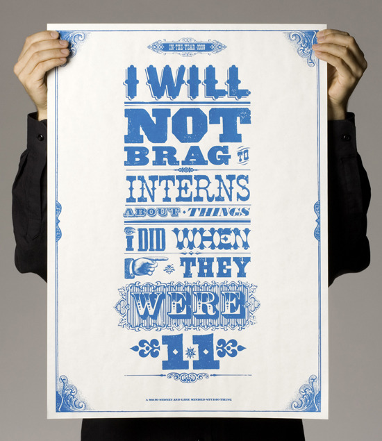
I. Too Many Typefaces
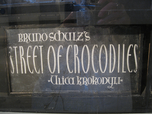
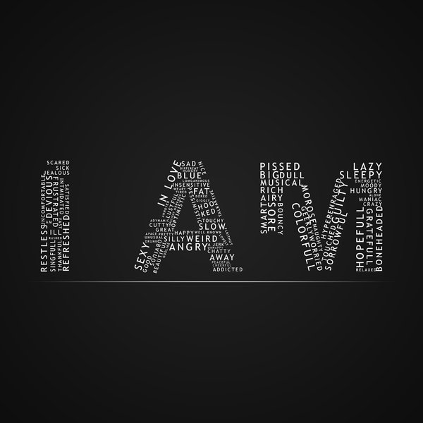
A different typeface for every word! Wooo! I love typography!
The idea of excessive and loud typefaces comes from the industrial revolution when companies had to try to outshine other companies with bold, ornamental, and eye-catching type in order to draw viewers to their ads. Today, many designers try to replicate that style. However, just because the vintage reference is heavy-handed doesn't mean we have to be! Too many typefaces can be overwhelming and often (like in the image above) doesn't have anything to do with the content. In order to avoid overdoing it, stick to just a handful of typefaces (3 or 4) and make sure they complement the content!

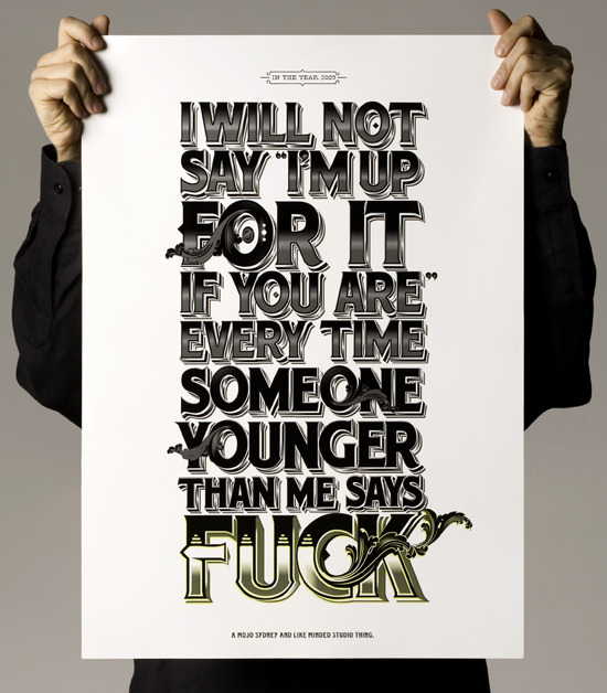
II. Excessive Effects
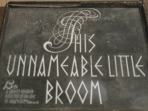
This poster uses outlines, shading, ornamentation, drop shadows AND gradients! COOL!!!
Recently there's been a trend, especially in Tyler, to use lots of effects and ornamentation in Typography. I won't lie; I'm guilty of it, too (I mean, doesn't everything just look so much better with some dimension?) But as young designers, we should probably steer clear of using too many effects until we really nail down the concepts and basics of design. Especially when many of these effects don't actually do anything to complement your concept.

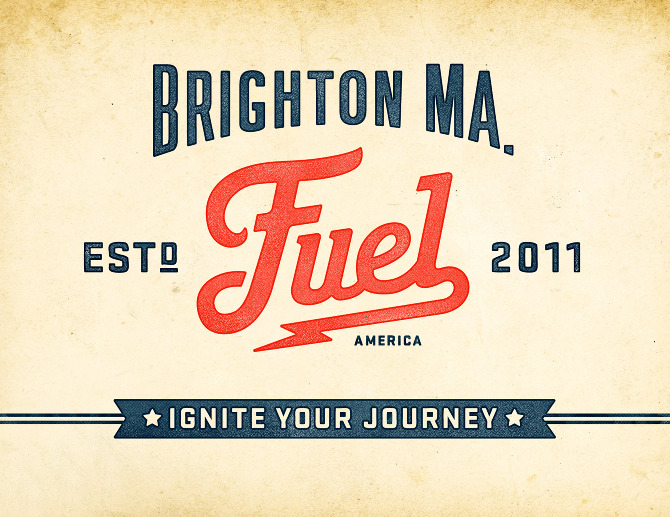
III. Let's (Not) Go Retro
A retro design for a company from 2011! Makes total sense, right?
As mentioned previously, there has been a reactionary return to retro and vintage styles in design. While the vintage look definitely has a more inviting and personal aesthetic, it doesn't always work with the concept. A fuel company from 2011 set in a vintage typeface on a textured background doesn't really make a whole lot of sense. Reserve the vintage look for things that suit your assignment.

IV. Foreign Faces
Typeface so Russian it's almost offensive!
Now I'm probably going to sound like I'm contradicting myself here, but it is possible to be so relevant to your concept that it becomes cheesy. Being art students, we tend to try to find our fonts on free websites that offer a vast plethora of stylized typefaces. However, a lot of these typefaces are stylized to the point where they become parodies of styles they're trying replicate. Common offenders are fonts for Russian, Western, Asian, and Old English/Irish style type. Take, for example the image above. Aside from the fact that Batman has nothing to do with Russian Constructivism, the font used for the poster is so Russian that it becomes kitschy and tacky. Instead of trying to replicate certain styles completely, it might look better to draw elements from those styles and create a more modern rendition, like La Boca did for their Black Swan Posters
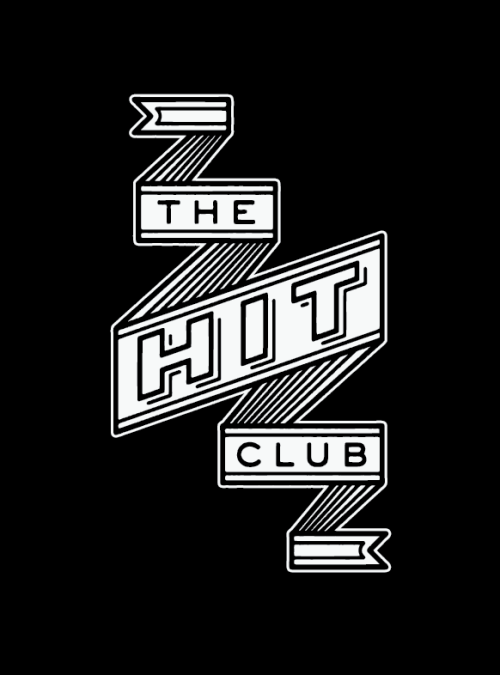
V. Rampant Ribbons
Oooo Ribbons make everything so schnazzy
Ribbons are becoming increasingly popular in design, probably thanks to Jess Hische. But if you're not Jess Hische, you probably shouldn't be using ribbons. Or at least not so many. They're an easy way to make something look fancy and dimensional, and honestly, I think they look great most of the time. But they're also starting to litter the design world, and they often have very little to do with concept. Not to mention that they're a fad, and like leopard print and cargo pants, all fads tend to look absurd in retrospect. For desgns that transcend time, it might be better to avoid framing type in ribbons.

With all that being said, rules are often made to be broken. As young designers, it's easiest for us keep out of the design gutters if we avoid the things mentioned, but sometimes breaking the rules just works. It's up to your discretion. Hell, if you can make a vintage Russian poster with 14 typefaces in a column of ribbons, kudos to you! Hopefully, though, this article will help you make those choices consciously and with great intention. And if not, well, you can't say I didn't try to warn you!

Tuesday, September 25, 2012

Graffiti as type

I am really into graffiti. The kind of graffiti that takes time to make not a gang sign or crappy vandalism. Im talking about what a graffiti artist calls a piece; short for masterpiece, it is the expression for a spraypainted letter oriented picture.I enjoy "pieces" very much and I wonder if graffiti is excepted among the typographers of the world. Do typographers and others see graffiti as a serious endeavor to transform the alphabet into something beautiful.


Some of these pieces are readable and some are not, but either way they are still interesting. The is some sort of design skills in doing these pieces. I say "some sort" of design because graffiti tends to break many of the rules set by typography. The design, that I cannot define, in the end holds a piece together and makes for something nice to look at. There are many aspects of graffiti that are different from typography, but in the end  its an evolution of what people have been doing to type since Johannes Gutenburge made it possible to change type.

Text as Image

While browsing the Internet, I came across beautiful images that caught my eye. These were no ordinary images, they were entirely made up of text.


A typographic illustration takes ordinary straight font and places it it in a way that is interesting and illustrates an image, movement or expresses a feeling. The way a font is shaped, sized and placed throughout the page makes a big statement. Although the point is to make an image or shape of some sort, you have to be aware of the legibility of the text.


There are endless opportunities to make a unique and exciting typographic illustration. You can play with the sizing of the text or change the fonts. You can also warp text around an object, curving and bending it as well as pulling text together or spreading it apart.


Seeing these types of designs gave me many new wonderful ideas and they inspire me to try things like this for upcoming projects.
 

Monday, September 24, 2012

We love typography


   We Love Typography is an extension of I love typography but instead of just showing fonts they show actual designs. is a great source for inspiration. It features excellent works of typography and illustration. It is pretty sweet because you can see all the different styles and possibilities in design. plus the site can be search by color.


   Ex. Color red, this great vintage design by Timba Smits, which shows great contrast between fonts and between the colors.


      Or like Dana Tanamchi's chalk lettering, which after spending a lot of time trying to do myself  I can say she is awesome. Her handmade type is gorgeous and the way she can make it so crisp is fantastic. Her compositions have a great flow and the different typefaces work great together.

We Love Typography is a great site to get inspire or to just look around on your free time.


Typography In Headstones


While searching around the Internet I came across a popular place for type today that people do not notice as much. The Headstone.  The modern headstone is usually a large engraved name and set of dates fallowed by a quote on some sort of stone, most commonly granite. When putting in an order for a headstone you are confronted with several typographic and stylistic choices. First you choose which typeface. Most commonly used today is Roman serif fonts, giving the headstones a solemn serious feeling. There is however many other options that companies give you including some questionable script fonts and some san serifs for smaller text. 


Some of the more common stylistic choices deal with how the stone itself is treated. These options deal with both the text on the stone and the stone behind the text. Some people prefer a frosted panel for the type to sit on or a polished surface while others have the text cut straight into the rough stone. How the letters are cut into the stone is another choice with the leading styles being a V cut, skin cut or a polished or frosted outline.  While this outlines the most standard rout to take other people have come up with more creative ways to be remembered. Brooks Wheeler for instance decided to make a unique headstone for his self where he carved doodles and friends names into the stone saying it was a “fun stone”.


Chalk Board Typography

A few weeks ago an artist by the name of Dana Tanamachi was pointed out to my by my web design teacher. Upon looking at her work I was just shocked at how amazing it turned out to be. I have seen beautiful calligraphy, but this was something different and special. The scale in which these are done must make hand drawing all of the letter forms very difficult. The variety of different type faces in her work must have taken years to learn and perfect. Tanamachi must have taken such a long time at her craft to create such an impressive body of work.

The examples that I found most interesting were when her work interacted with other elements. For instance the example below was a spread I found from West Elm's 2011 holiday catalog. Seeing her typography interact so well with the products displayed is just what made that spread stand out amongst  any other typical spread. Not only does it maintain that hand done feel but it shows off precise hand skills and typography knowledge. 
Another example that I enjoyed is O Magazine feature story opener spread done in February 2012. I found this example to be unique because not only did it display her amazing hand done typography but her use of color as well. Tanamachi doesn't seem to have much color work, but clearly she is very capable of it. The interaction I see in this piece is the one between the dog, model, and the typography. The whole spread looks so fun and exciting. There are many type faces being showcased in this piece, but they all work together and unite as one. I also think there is something great about showing the floor with all the little pieces of chalk and the dust everywhere. It is also nice to see the smears around the carefully drawn type. It feels tangible and accessible. 


In a world of digital advertisements this is such a refreshing display of what typography once was. It pays homage to a handcraft and a skill that is now showing its face again in the design world.

Check out more of Tanamachi's work at her portfolio site here.

Designers of Tumblr

The Designers of Tumblr blog consists of many diffrent design subjects. The blog was created for desingers to have a chance to post their work and be viewed by a large audience. On the blog, I can look for variouse types of inspiratuions on illustration and typography. When looking at the Typogtraphy aspect of the blog, i enjoyed how in many cases the surface the type was on would vary showing t-shirts, buisness cards, posters etc. I found one post this week that particularly caught my attention. The Project was created by a desinger that wanted to portray the feeling of a story they wrot by reading the text and also looking at it as a whole. They a wrote out a story about the relationship on a computer and how you can get lost within it in search of somehting. The artist wrote it all on one page and applied it to a wall. Insted of haveing the story in book form the viewer now gets lost within the text similarly to the character in the book. Alhtough the words in this piece tell the story the artist created, it is how the artis presented the work that really makes the piece strong. As the Viewer gets caught in the confusion of all the text and information, they begin to experience that feeling of being lost and ovewhenlmed in the body and depths of information.
By seeing this post I appreciated a good example of how a designer should think in terms of the layout of type. How this can evoke feelings similar to the ideas of the actual text. http://designersof.com/search/typography+