Friday, March 30, 2012

Live the Language


EF (Education First) produced a series of videos advertising their study abroad programs which are a perfect combination of great advertising and unique use of typography. EF is an international travel company known for their language training and educational travel programs. Live the Language Campaign was created by Camp David, a Swedish agency and the lucky typographer hired was a Stockholm based art director and designer Albin Holmqvist - they do a wonderful job of conveying the language and culture through typographic treatment. These are beautifully shot videos that sell the city without getting too cliche. They employ very catchy music, fantastic imagery, and most importantly, typography that highlights what you will experience if you study abroad in one of these cities. (Ignore the cheesy romances in some of the videos!)

So far, they have produced videos for Vancouver, Paris, Beijing, Sydney, Los Angeles, London, and Barcelona. I absolutely love the ones for Barcelona and Paris. Notice how differently the type is used between the two cities. Holmqvist uses script fonts, art deco style fonts, and decorative motifs for Paris which are unique and appropriate for only Paris - these fonts would not work in Los Angeles or Vancouver. Albin got his fonts from many different type foundries including Lost Type, Hoefler & Frere-Jones, House Industries, and Sudtipos. The typography clearly illustrates the local language and new vocabulary that each of these travelers experience during their study abroad experience.

This campaign makes me want to pack by bags and hop on a plane to any one of these incredible destinations. Barcelona, here I come!

Here are my favorites. You can view the rest on vimeo here.


This is a video is just for fun (only design nerds like us will understand) - a monologue from the perspective of the most hated font out there: comic sans.

Thursday, March 29, 2012

Stefan Sagmeister


Back in December, I was able to go see Stefan Sagmeister at the ICA. Penndesign was having the lecture because on April 4, Sagmeister's The Happy Show exhibition is opening. (It's a documentary movie about happiness.) He talked about his past and his work, but how he uses and creates typography is what captured my eye the most. 

Stefan Sagmeister was born in Austria and attended the University of Applied Arts in Vienna. In 1987 he was awarded a Fulbright Scholarship to attend Pratt Institute in New York. He then moved back to Austria to work and later moved to Hong Kong. Years later to returned the New York to work under Tibor Kalman and eventually opened his own studio Sagmeister Inc.

I find Sagmeister's use of typography inspiring because he takes risks and pushes the idea of what type is. His type work is innovative and contains a special handmade quality.  His motto really says it all, "Design that needed guts from the creator and still carries the ghost of these guts in the final execution."


Wednesday, March 28, 2012

HAND-done type

Like most designers should, I have a list of design blogs that I check frequently for inspiration and to stay up to date with trends. While check Colossal last week (a favorite blog of mine that covers all ranges of art from instillations to photography) I came across this nifty piece of hand-done type. Literally, HAND-done type.

I instantly thought about this blog and thought the class would enjoy it. Talk about learning all the physical parts of letterforms! This project captured them all, both upper and lowercase. It is created by designer Tien-Min Liao. She used paint on her hand to gesturally transform the shapes into the type. Sounds easy? But here is the catch..


"I created 26 sets of these inked shapes and drew them on my hands. Each set is made to create both an upper-case and a lower-case letter, such as A and a. I also created some italic letters, hand-writing letters and some new typefaces with the same shapes."

Tien-Min Liao used the same exact markings on her hand to create all of the variations in the letterform she created.

This reminded me of sign language, but to a more literal extent. So here is a clever way to portray sign language out of the ordinary, by JK Keller. If you want to see the worst designed website ever, click the homepage...


Friday, March 23, 2012

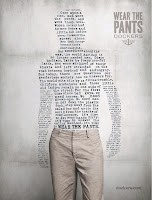
Wear the Pants

Dockers has started a new campaign to make khakis popular again. They are trying to take khakis away from the pencil-pushing cubicle stereotype they have gotten and rebrand the pants as a masculine garment appropriate for all different occasions. The campaign is text driven and uses copy that shows the manliness of the pants. Credit: The campaign was developed at DraftFCB, San Fancisco, by copywriter Desmond LaVelle, art directors Julie Scelzo and Dana Johnston. “Face It You’re A Man” was written by freelance copywriter Dimitri Ehrlich. The online ads were produced by Razorfish. Typography and design was by Craig Ward and Julian Quale and Am I Collective. Photography was by Kevin O’Brien.


Letter Press & Design - Philadelphia Area

Briar Press Listings:
http://www.briarpress.org/yellowpages/browse?y=Philadelphia&s=PA

CleanWash


Pre55ed


Pointed Press


Two Paper Dolls


Huldra Press

Friday, March 2, 2012

TypeFACES


These Portraits bring a whole new meaning to the word typeface.  Designers have explored their artistic side by using type to create portraits. Using type as a way of creating art is a good exercise to build up your understanding of the anatomy of type.  It allows you to pay attention to line way and the bends and curves of certain letter forms and fonts.  It is also allows you to think outside of the box and use type to create 3D forms.  Type does not always have to be admired for its readability but can be considered a piece of art work on its own.  So try creating a self-portrait of your own and use type in a whole new way.


Me :) 


Some Sites of TypeFACES 


The Dynamic Art of Kinetic Typography

Thanks to the modern age, typography has become something less fixed and stationary and more of something to play with. No longer to words have to just sit on a page or be compressed into tight blocks to run through printing presses. One YouTUBE search for kinetic typography shows the inspiring and beautiful word of moving, dancing, spinning type.


Much of the kinetic type serves as a complement to some great speeches, making the the content of the words almost as visible as images. One of the design teachers, Scott, has even made an app out of the tale of the Jabberwocky with interactive type. I don't think he released it yet, so go pester him to look at it because it's really interesting. You can touch, tickle, and manipulate the type while you read, and he uses some pretty outrageous fonts from free font websites.


I really enjoyed this next one, but it's kind of long. The interesting part with this one is that the words in the end show to have formed a word.

Hatch Show Print


I really love typographic posters, and sometimes for inspiration I like to check out Hatch Show Print, which is "one of the oldest working letterpress print ships in America." Their style is mostly the sort of style you might see on old cowboy posters or posters from the south, and the create a lot of imagery for country music performers. However, they also make some really beautiful posters for other clients.
Hatch Show Print


They're located in Nashville, Tennessee, so a lot of times when bands come to the Nashville area, they get specially design Hatch Show Print posters just for that show.


Because Hatch Show Print is a letterpress, people can design their own posters and have Hatch Show Print print them out, giving them that instantly vintage old western rugged American look. It's actually really suprising sometimes how the style fits outside of the context of western themes.


Casey Cannon

Thursday, March 1, 2012

Typography in Motion

Last semester for the Process magazine assignment I chose to research Saul Bass, and from researching dozens of his fantastic film title sequences I rekindled a love I've always had for movable type. Saul Bass is credited as the father of movable type, and in his lifetime he created some of the best sequences out there. His work still holds up today even against the use of rapidly-advancing technology. If you happen to enjoy movable typography, I highly suggest you check out more of his film title work.


The sequence for The Man with the Golden Arm is one of his most famous 

While Saul Bass was the forerunner of creating movable type and his style is often emulated today, there are tons of films and television shows that use movable type. I found a great website that showcases a lot of such type. That website is Art of the Title. The website has a lot to offer and it has a great index of sequences from various films and television shows. You could spend hours on the website becoming inspired. Some of the entires even have interviews with the title creators and/or links to other interesting resources.

I'm not sure if anyone finds this movie funny or relevant anymore, but I admit I always enjoyed the title sequence. 
I like the mix of materials and the use of hand-done type and the overall playfulness. 

There's a lot more out there to find since movable type is not used just for opening sequences. I recently discovered some great use of type in the BBC's Sherlock Holmes series. They use movable typography in tremendous ways throughout the entire show. I'll end this off with two clips of my favorite sequences: