
As we are begin our Fall Semester, desperately
trying to finish assignments while finding time to goof off, I am reminded of
one of my many hobbies that I would spend hours tinkering around with back in
high school, Magic the Gathering. For those unfamiliar, Magic the Gathering was
the first collectible trading card game created back in 1993 by Wizards of the
Coast, and continues to grow with approximately 20 million players buying their
products to this day.

I was introduced to Magic the Gathering back in 2003,
and looking back at all of my old cards, I have noticed some great changes in
the design and typography in the cards over the many years.
Here are some examples of the cards I originally played with.
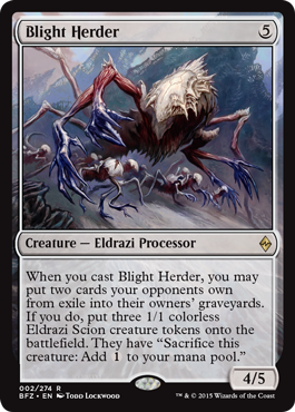
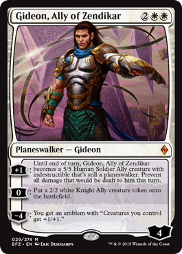
And here are some cards from the most recent edition.
Can you tell the differences?
Before we get into any specifics, let’s take a look
at Magic the Gathering’s very first set
Just look at that TYPE
Just taking a quick glance at this set, we see that
Wizards of the Coast was in the right direction, setting the theme of the game
with their type, but holy moly the type is all over the place. Given the
benefit of the doubt, Wizards of the Coast wanted to give each card color its
own unique visual ranging from the fluidity of water to the grit of trees. In
reality though, it makes it way too difficult to read the body type on each
card, especially when you try putting black type on top of a brown background.
Visuals aside, the biggest type crime of these cards
is the sheer inconsistency between most of the cards.
First, we have type that are justified left, which
looks pretty normal
But then we have type that is center and blown up
just to fill some space
Now we have huge centered type that leaves a bunch of space
Flavor text crammed too close to game mechanics
type!
What am I even looking at?!
After 5 months of this hell, Wizards of the Coast
finally changed the color palette slightly to make the black text more readable,
but the issue of inconsistent type continues to be an issue.
Here have some more examples of INCONSISTENCY
It wasn’t until 1995, when Wizards of the Coast
finally made all of their body type justified right.
It’s a good start
But how about that font size
While much better than where it was originally, the
same issues continued until Magic’s Core Set Eight Edition, where the designs
of the cards were revamped to be more legible.
Type was finally being divided into their own sections
instead of being awkwardly crammed in between image and text box. On top of
that they made the headlines of each card have a bold black typeface instead of
their former light white type, making it much each easier to read. Other
positive changes I really liked was the addition of a drop shadow on the icons
located on the top right of each card. It makes the icons pop out instead of being
lost in the border color.
This card design continues to this day with only a
few minor changes between sets, just to give each edition its own identity.
In October 2015, Magic the Gathering will be
releasing its 84th set, and personally I think that designs look
absolutely beautiful. What does everyone else think?

No comments:
Post a Comment