The Layers of History
By Kate Scullion
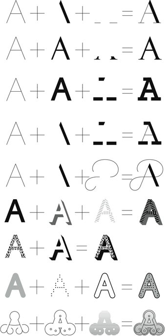
History, Typotheque’s Multi-Layer Type System, was designed
by Peter Bilak and released in 2008. The typeface is based on a skeleton of
Roman inscriptional capitals, and includes 21 layers inspired by the evolution
of typography. These elements span a wide variety of type catagories including
humanist renaissance, transitional, baroque, script, early grotesque, 19th
century vernacular and digital. These 21 independent typefaces share widths and
other metric information so that they can be recombined. Thus History has the
potential to generate infinite combinations of typographic styles.
21 layers of History:
Layer Combinations:
History remixer is a sophisticated web application software
designed as a supplement to History. The program enables designers to choose
and order the layers, as well as to assign colour and transparency to each,
producing an immense number of unique styles. Instead of entering text
separately for each layer, you enter it only once, after which you can adjust
the layers’ colour, visibility, opacity, etc.
https://vimeo.com/1460609
https://vimeo.com/1460609
history remix samples:
The Evolution of History:
The History
type system was in development longer than any other project released by
Typotheque or any other project by Peter Bilak. Its beginnings can be traced to
the early 1990’s when Bilak experimented with decorative layering systems
inspired by 19th century types, trying to dissect Tuscan typefaces into their
structural components.
Specimens of 19th century wood type manufactured by the Hamiliton Manufacturing Company.
In 2002, the concept of History morphed when Bilak worked on a proposal for a new typeface for St.Paul and Minneapolis. He presented the idea of a typeface system inspired by the evolution of typography, a conceptual typeface that reused existing fonts. A user would select ‘History’ from the font menu, not knowing what font would be used. History would be linked with the computer’s calendar and with a predefined database of fonts, presenting a different font every day. For example, one day it would use the forms of Garamond, but the next day when you opened the same document, the font would change and present the text in a new typeface, say Granjon, that was created later than Garamond. The concept behind the proposal was that the constant changes would confront the user with the continuous development of typographic history.
In 2004, History morphed once more when Bilak started work on a system of layering letterforms that could be recombined. New styles were continuously added, and because every style had to use the same proportions as the previous one, the typeface design became increasingly more complicated to draw. Finally, in 2008, Bilak made the decision to limit the number of styles to 21. The number reflects the 21 centuries of typographic history encompassed by the project.
In the Name of History:
"The name 'History' is a direct reference to the fact that I embraced
no single point in the past, but rather a very large part of history of
typography. My sincere intention was to participate in the sequence of
typographic discoveries and allow the user to actively engage in this process
as well."
History in Action:
"While careless use can generate freakish results resembling Frankenstein’s monster, more careful experimentation can produce not only amusing, but surprisingly fresh and usable typeface samples. With History, one can replicate typographic history or, on the other hand, extend it." —Peter Bilak
Promotional poster for Portland State
University's lecture series using a range of History fonts. Frank Chimero. 2011
designer: Cécile Binjamin / illustrator: Susan A. Quinn, 2013
Designer: Didier Lechenne/ Project: Rosa B is the web application of CAPC Museum of Contemporary Art and the
School of Fine Arts in Bordeaux, France. 2009
Designer: Cécile Binjamin/ Project: Fête des tulipes, 2013
Designer: Caroline Fabès/Project: Annual booklet for the
Rennes School of Art. 2011
Designer: Demetrio Mancini/Project: Civico/2010
Designer: James Langdon/Project: Invitation for the Birmingham artist-run public
gallery space Eastside Projects. 2008
Designers: Sulki & Min Choi/ Project: Book, 'Unbalanced and Incomplete Guide to Dutch Design', assemblage of
personal memoirs and objective analysis on graphic design in the Netherlands/ 2008
Designer: Pentagram (Abbott Miller) / Project: Exhibition at the AIGA National Design Center in
New York / 2009
"One thing that I’ve learned from this project is that
despite the ubiquitous market research in design and the calculated decisions
of designers, it is still worthwhile to do projects that you personally believe
in."—Peter Bilak


No comments:
Post a Comment