Thursday, September 10, 2015

Type in Magazines–the 70's vs now


Looking through photos, it’s easy to see that things were MUCH different back in the 70’s when compared to today. What most people born before the 70’s do not realize though is how much advertising and the use of typography has also changed from a print perspective. Using Playboy as an example for then and now comparisons, this post will showcase how much the times have changed.

Covers

Here we have two very different covers for Playboy. The cover from the 70's is much simpler in design with flat text and more of a focus on the image.

  The modern cover on the other hand is much more dynamic with its type, calling out attention to each feature inside. The modern cover also emphasizes the sexuality of its contents more openly.


The modern cover is designed much like other magazine covers–dynamic variations is type size and weight and imagery that are intended to be seen quickly to entice readers.

Articles


The layouts of magazine articles also changed over time. The articles in the 70's are locked up tighter, and are conservative in the way they rarely break out of columns with little overlapping of the images on the spread. Even though the layouts get repetitive, they rely on the content's quality to keep readers engaged.


This article is pulled from Cosmo, but represents many current layout and type trends. It utilizes many different variations in hierarchy with color, size, and font styles. It uses its typographic elements to balance the image on the opposite spread while also showcasing evident use of the grid (and the breaking the grid).

Advertisements

This is where the typographic differences get really wild. The trend in the 70's was to include fairly significant bodies of text with a heavy image present, but little graphic design. Often these bodies of text were wrapped around the image/product being advertised. The hierarchies utilized weren't terribly interesting, but the messages delivered in the body copy was. Rather than trying to grab a reader's attention as quickly, the ads were more like persuasive letters or conversations with the reader explaining what they were and why they were the best. This might be because our current generation has an incredibly short attention span thanks to technology.

Current print ads are created with the intent to grab attention as quickly as possible in a unique way. To do this, text and imagery need to be as harmonious as possible to establish a feeling/concept. They don't have enough time to tell you why they are "cool" before you get bored and flip the page, so they just have to BE "cool" from the get go.
Booze


The only thing more advertised in antique Playboys than cigarettes is alcohol. 


"Black" is cool and edgy in nature, so a more mystical and darker typeface is used to match the imagery.

Fashion


I think you can still find these at Urban Outfitters


So much denim, but so quick and to the point.

Electronics


8-tracks


to Ipods


Jewlery


 Outlier: Bulova is still in business with the same approach to marketing their product.


Other fun ads from the 70's


the source for all vintage images is from the April 1972 Playboy Issue

Optical Illusions Surround Us

In our everyday lives, we are surrounded by optical illusions whether we realize it or not. Not all illusions are obvious but some serve a purpose.


The photo above contains an optical illusion that isn't really visible to the regular eye, but to a graphic designer, the illusion serves an extremely important purpose.


Maybe the photo above will give you a better look. In the photo you can see that the bottom of the "C" hangs below the baseline and the top of both "C" and "A" extend just above the "L", or the cap-height. When a letter extends past the cap-height or baseline it is called "overshoot" or "overhang".

Although this is not your typical optical illusion, it is extremely important to every designer because it makes words appear optically pleasing. Without overhang from certain letters, some words would look very strange and become difficult to read in a fluid motion.

Franz Müller-Lyer, a German psychiatrist, performed an experiment in the 1880s, in which he asked people whether they thought the three lines below were all of the same length or whether one was longer than the others. He realized that by adding two chevrons that pointed inward at the end of a line segment made the line appear longer than a line with two or one outward pointing chevrons.

This became known as the Müller-Lyer Illusion. Letters form an overall shape, for example, an "H" forms a perfect square, but an "O" forms a square in the counter which appears smaller than the square that is created by the "H", which is why the "O" needs to have overhang to make the shapes optically appear the same size.


Here Kevin Larson shows the Müller-Lyer Illusion in action at the Seattle Nerd Nite Presentation last year.


Watch Kevin Larson's entire Nerd Nite talk here: https://vimeo.com/79720653 

Monday, September 7, 2015

Megan Anderson's Blog Post

Nowadays eco friendly products are all the rage. There seems to be an eco friendly version of everything, from water bottles made from recycled plastic to shoes made from bamboo. And if there’s an eco friendly alternative, people will look for ways to use less of that product. There has been a big push to use less paper either by using email or sharing documents through the cloud, printing double sided in order to use less paper, and of course recycling the paper you are using. By doing this, not only are you saving the earth, but you are also saving money. The cost of paper is continuing to rise. Not only is paper expensive, but so is the ink that goes on the paper. According to Suvir Mirchandani, ink is almost twice and expensive as French perfume. Ink is expensive and made from harmful chemicals. The ink itself might not be extremely harmful to the environment but it’s the plastic packaging, boxes, and envelopes that that can really accumulate to do some damage to your wallet and the environment.
Suvir Mirchandani is a middle school student from the suburbs of Pittsburgh. In 2014, during a science fair experiment he did research project to see which font uses the least amount of ink in order to help his school cut waste and save money on ink and printing.
By reading through his class handouts, he determined that the most used letters are e, t, a, o, and r. Using these five letters he tested the fonts Garamond, TImes New Roman, Century Gothic, and the dreaded Comic Sans. Because of Garamond’s thin strokes, it uses the least amount of ink. According to Suvir Mirchandani, his school would be able to use 24% less ink, which equates to about $21,000 a year.
An article on the BBC news reported a similar finding. In that experiment  a researcher tested Garamond, Courier, Brush Script, Times New Roman, Helvetica, Comic sans, Cooper Black, and Impact. There’s no surprise that Impact, with it’s condensed bold letters, used up the most ink. Similar to Suvir Mirchandani’s findings, this researcher also found that Garamond used the least amount of ink.
Designers have also done research into this same topic and have started to create fonts that address this problem. In modern, everyday printers, the ink tends to bleed, and move around. New fonts are being created that use this to their benefit. These fonts also rely on our brain’s ability to connect shapes that are close together. They focus on how much of the letterform can be taken out, while still having the letterform remain recognisable and readable as everyday fonts. Two fonts that I have found that are attempting to do this and move typefaces into a new era are Ecofont and Ryman Eco.
Ecofont takes a swiss cheese approach, it adds tiny holes in already existing letter forms. It claims to use twenty percent less ink than Arial. On ecofont’s website, they reference a study from the University of Wisconsin that says Century Gothic is the most economical font, uses the least amount of ink. Ecofont admits that their font may use slightly more ink, but Century Gothic’s wide letter form makes it less eco friendly by forcing it to use more paper. Ecofont is based off a thinner font, therefor allowing it to use less paper. Also, ecofont’s punch hole style can be applied to other, already existing fonts, so Garamond could be extra eco friendly.
One of the downfalls of this font is if your printer’s resolution is not high enough to support the accuracy this font needs. Treehugger.com tested this font to see how practical it really was. Their findings were less than stellar. They concluded that yes, you will use about twenty percent less ink if you switch to ecofont, but the crispness and quality of the letters will suffer. If the font is above twelve points, the dots become very noticeable. Also because the letterform incorporates bleeding, the lines become very fuzzy, like in the picture below of a scan of ecofont. Another downfall for this font is that when printed out, it looks like it was printed in gray ink.


Ryman Eco is another typeface to consider when investigating this idea of ink saving fonts. Instead of dots, it uses lines that work as canals to channel the bleeding ink into the correct place. This typeface seems to consider style, personality, and design more than Ecofont, which simply adds holes into an already existing font.

Videos
https://www.youtube.com/watch?v=M2vU-FshEjo
http://www.rymaneco.co.uk/?gclid=CJGbpee2v70CFaoewwodK6UAVA

Sources
http://www.cnn.com/2014/03/27/living/student-money-saving-typeface-garamond-schools/
http://www.ecofont.com/en/help/ecofont/faq/0030.html
http://www.ecofont.com/en/products/green/printing/saving-printing-costs-and-eco-friendly/why-ecofont-saves-more-ink-than-century-gothic.html
http://www.treehugger.com/corporate-responsibility/ecofont-takes-the-swiss-cheese-approach-to-saving-printer-ink.html
http://www.bbc.com/news/blogs-magazine-monitor-26835560
http://www.rymaneco.co.uk/?gclid=CJGbpee2v70CFaoewwodK6UAVA

Megan Anderson 9/8/2015


Thursday, September 3, 2015

Typographic Street Art

Typography is a vital component of communication around the world. Depicted below is the street art of Ben Eine, a graffiti artist and typographer from London. Specializing in painting huge single letters on shop fronts, Ben's bright and colorful letters have transformed streets around the world. He's most famously known for "Alphabet Street", which are painted shutters and murals in Middlesex Street, London.

Ben Eine. Alphabet Street :


This summer, Ben Eine visited Philadelphia to paint the alphabet and much more on store-front roll down shutters around Fishtown and South Philly. This project was started by the Philadelphia Mural Arts Program and greatly impacted those neighborhoods.

 Ben Eine. A to Z. Philadelphia Mural Arts :


While street art can sometimes be seen as a tool for vandalism, I feel that this art connected these neighborhoods and brought something positive to Southern Philly. What do you think?


Learn more about Ben Eine:  http://www.huffingtonpost.com/jaime-rojo-steven-harrington/ben-eine-philadelphia_b_7936952.html

Magic the Gathering: Typography Over the Years

As we are begin our Fall Semester, desperately trying to finish assignments while finding time to goof off, I am reminded of one of my many hobbies that I would spend hours tinkering around with back in high school, Magic the Gathering. For those unfamiliar, Magic the Gathering was the first collectible trading card game created back in 1993 by Wizards of the Coast, and continues to grow with approximately 20 million players buying their products to this day.


I was introduced to Magic the Gathering back in 2003, and looking back at all of my old cards, I have noticed some great changes in the design and typography in the cards over the many years.


Here are some examples of the cards I originally played with.


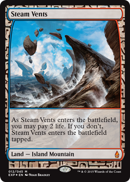
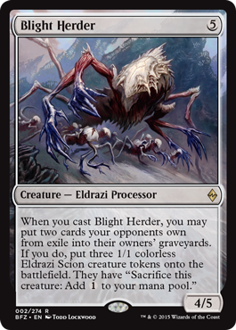
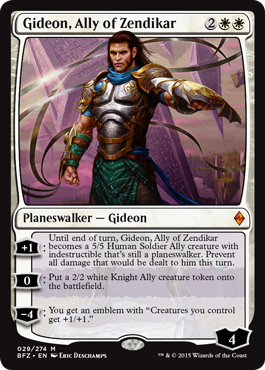
And here are some cards from the most recent edition.

Can you tell the differences?

Before we get into any specifics, let’s take a look at Magic the Gathering’s very first set


Just look at that TYPE

Just taking a quick glance at this set, we see that Wizards of the Coast was in the right direction, setting the theme of the game with their type, but holy moly the type is all over the place. Given the benefit of the doubt, Wizards of the Coast wanted to give each card color its own unique visual ranging from the fluidity of water to the grit of trees. In reality though, it makes it way too difficult to read the body type on each card, especially when you try putting black type on top of a brown background.


Visuals aside, the biggest type crime of these cards is the sheer inconsistency between most of the cards.


First, we have type that are justified left, which looks pretty normal


But then we have type that is center and blown up just to fill some space


Now we have huge centered type that leaves a bunch of space


Flavor text crammed too close to game mechanics type!


What am I even looking at?!

After 5 months of this hell, Wizards of the Coast finally changed the color palette slightly to make the black text more readable, but the issue of inconsistent type continues to be an issue.


Here have some more examples of INCONSISTENCY

It wasn’t until 1995, when Wizards of the Coast finally made all of their body type justified right.


It’s a good start


But how about that font size

While much better than where it was originally, the same issues continued until Magic’s Core Set Eight Edition, where the designs of the cards were revamped to be more legible. 


Type was finally being divided into their own sections instead of being awkwardly crammed in between image and text box. On top of that they made the headlines of each card have a bold black typeface instead of their former light white type, making it much each easier to read. Other positive changes I really liked was the addition of a drop shadow on the icons located on the top right of each card. It makes the icons pop out instead of being lost in the border color.

This card design continues to this day with only a few minor changes between sets, just to give each edition its own identity.


In October 2015, Magic the Gathering will be releasing its 84th set, and personally I think that designs look absolutely beautiful. What does everyone else think?