Sunday, September 23, 2012

Bureau Bruneau

Bureau Bruneau, a 24 year old designer from Oslo, Norway, specializes in print design ranging from visual identities to packaging and editorial design. The majority of Bureau's work includes type, but perhaps one of the most interesting projects is his "Train Set Typography." 


This self directed project was made from an old train set Bureau found in his grandmother's basement. 
The train tracks offer an easy assembly of straight and even round letters. 


As designers, we look at type faces and see if they are functional and how they communicate visually to our audience. What is interesting about Bureau's Train Set Typography is that he turned a functioning object into a functional readable typeface.  


The idea of crowding the letter forms with trains and extra buildings is concerning with how it may effect the spacing and kerning of certain letters, but in these images, the spacing seems pretty well executed. 


Bureau Bruneau's other work reflects a strong knowledge of type. Check out his other work and portfolio here. 


Shadow Typography

Browsing the internet, I discovered a Belgian artist named Fred Eerdekens. His installations use light and purposefully placed objects to create typographic spaces. I found his work very interesting because of the relationship it creates between the 3D object and the 2D letterforms. The interaction of the projected lights and the solid materials create a multidimensional message that is formed from either negative or positive space. 


The words created from the light provide the viewer with the meaning of the installation. It's interesting to see different methods of forming letters and words. 

Saturday, September 22, 2012

Kinetic Typography

 Running arcoss this video of Kinetic Typography with the inspriation of Lauren Beuten and her video of Magic. Her skills have made her very talented in making a type into 3D and massive bright colors. She owns her own website call Mister Magic. Her works includes website design for Youtube, Photo Manipulations and logos. Her website: http://magicportfolio.daportfolio.com/
Here some of her work:


Here is one of the website design she done. I love the simple colors. Not much to keep your eye going crazy but the illustration is great and it has character.


These here are some logo design. The use of shading is used by different colors and the use of outter glow and light line work makes this all go well with the image.

Now I like to present the Kinetic Typography video which combos types and the After Effects uses.
http://youtu.be/nFobUDqX6Ho

Evolution of Type

I was wasting time on Pinterest one day when I stumbled upon artist Andreas Scheiger. What I had found was the letter G, presented like an anatomy study with pieces disconnected and the bone showing through.
It grabbed my attention and I decided to look into the artist further. What I found was his Behance portfolio, filled with all different variations of this project he has titled "The Evolution of Type". Inspired by Frederic W. Goudy's "The Alphabet and Elements of Lettering" from 1918, Scheiger began by surgically opening the letters S, Z, A, and W.
He describes letters as organisms and typefaces as the species and plays with the idea of them as living creatures with anatomy just like humans and other animals.
He dissected a bunch of different letters, but the project continued to grow and expanded to include letters cast in amber, "nature´s most spectacular way to preserve its ancient creatures for millions of years."
He even presented letters as fossils.
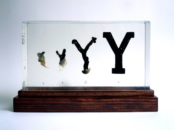
And the different stages of growth a letterform goes through.
Overall, I think this is such a fun and interesting idea and he has done it so well. The concept alone is so different than anything I have seen, and he presents it in such a playful way by pretending he is discovering and documenting a new species. The project even includes illustrated anatomical studies of the letters.
I can't wait to see what else he comes up with! http://www.behance.net/andreasscheiger -his portfolio http://grafischeslabor.blogspot.com -his blog, where he shows how he did everything!

Friday, September 21, 2012

I found you on a field, Mr. Fletcher.

Apart from being an aspiring designer, I have other hobbies and interests; for example, I spend a lot of my time outside of school skateboarding and following soccer. It's interesting to see how design, a frighteningly huge part of my life, sneaks its way into my mind without control. For instance, when I see a skateboard, I often forget completely about the physical act of skateboarding, and rather see it is a form of art, something someone was paid to carefully design and produce for the world to see. When I watch a soccer game, I pay close attention to the attire of the players. Everything is meant to look good. Nearly every product has a logo on it, because a major aspect of sports in general is advertising. The other day I was watching a match between Italian clubs F.C. Internazionale Milano and Torino F.C. I'm not the biggest fan of Inter, but they have always had an awesome kit with blue and black stripes. The way these colors interact with the green grass is really striking. For years now Inter has had a major sponsorship deal with Pirelli Tires (a company founded in Milan), so all the jerseys have the Pirelli logo right on the front. I always thought it was such a cool logo, even though for so long I thought it was "Firelli."


While watching this game, I got sidetracked with this Pirelli logo. I thought it was so simple, yet elegantly bold. I tried to figure out who designed this thing, I had to know. It took a while, but then I found that it was none other than Alan Fletcher, a designer who came up in class a week or two ago when we first started working on our initial logos. I was amazed, because during class when Kelly showed us some examples of well known typographic logos there were a couple that really stood out to me:
I didn't write down the name of the designer who created these logos, not surprising at all, but I rediscovered them when I was looking at other works by Alan Fletcher. He has a great way of working both experimentally powerful and subtly sophisticated. This is something I find most important in design. Sometimes it works to be over-the-top, but for the most part, at least in my opinion, less is more. Alan Fletcher has found a way of creating a name for himself through his work, combining commercial success and creative independence. In this way he has reached out to a wide range of audiences. 

This is one of the most appealing aspects of graphic design. It's truly a universal language. Whether the work is print-based or interactive, its ability to reach out to all the world is absolutely remarkable. Successful designers can create a portal through creating symbols. Their names are forever attached to their work and it resonates in many different facets outside of the art community. There's great design all around us, inspiration can be found anywhere... 

Sometimes it just sneaks up on you.


For a resourceful look at Alan Fletcher and other great designers, visit  the Design Museum. 


Thursday, September 20, 2012

we L O V E typography

We LOVE typography!


I was fumbling around on Pinterest and I found this great website titled "We Love Typography." This website has links to a bunch of other typography websites like ilovetypography.com or typography.com.  For instance, typography.com has very large collections of serifs, san serifs, slab serifs, decorative, condensed, etc.  You can test drive these fonts for free!  These are not free fonts like the ones on dafont and other free font websites.  You would have to trace the alphabet if you wanted to use these fonts, but they do give you the entire alphabet to test drive, there's just no place to download unless you sign up to the site.  Also, I think this is a good website just to get ideas for different fonts! Maybe you want to try out your hand done type skills and you can use these fonts for inspiration! It's good to look at all different types so you get familiar with what is good type and what is not so good type.  Here are some examples of fonts from this website:


Wednesday, September 19, 2012

Positive or Negative?


I was contemplating what to write about this week and which topic I would choose for my focus when I came across an article on Cyrus Highsmith’s book, Inside Paragraphs: typographic fundamentals. Highsmith focuses on creating and illustrating his own typography, and in this book, he discusses the paragraph and its functionality, perception, and reality on a page. He argues that it’s not about the book or the page but what’s inside and what makes both of those things have substantial content: the paragraph. In this paragraph are a number of symbols and words, but overall, it is the mass on the page and the part that holds the most meaning, the significance of each symbol, each word, together.

 
While all of this seems expected and like something you’ve already grasped before, Highsmith takes an interesting approach to his theory and perspective. He attempts to steer you away from viewing a paragraph as merely a positive space and more as a collection of negative spaces that relate to one another.


Those negative spaces are often ignored, but they create that balance with what is put on the page, that positive space. I started thinking back to my recent struggles with designing logos, typefaces, or even a simple poster, and how maybe the reason for that struggle was my preoccupation with the positive and neglect of the negative. After reading this article, I refreshed my perspective on things and have made some alterations.


Highsmith uses the form of a book to illustrate his views on the paragraph whether it’s contained in a space or spread across a page, it shows his perspective. He also uses his own typography to demonstrate the final product of this perspective and how it is applied. Overall, I thought this perspective and illustration of the paragraph was interesting and relevant to my own work.