Interesting!
http://consumerist.com/2010/11/walgreens-sues-wegmans-over-the-letter-w.html
What are your thoughts?

Friday, November 5, 2010

Emigre

1. Mrs Eaves
2. Mr Eaves Sans
3. Vista
They own over 300 typefaces, now.
Kinetic Typography
While perusing youtube for inspirational typography-related videos, I came across this whole sub genre of typography called "kinetic typography." Kinetic typography means the art of expression through animated text. I found this really cool because I never realized how possible it is to completely recreate the emotions stimulated by a clip from a movie or a song only using type. Here are two very different examples of kinetic typography. The first one is artistically beautiful, while emotionally very intense, and the second one is a little less artistic but extremely fun, using some great colors and animation techniques.
Fight Club: Chemical Burn scene
Blackalicious: "Alphabet Aerobics"
Thursday, November 4, 2010
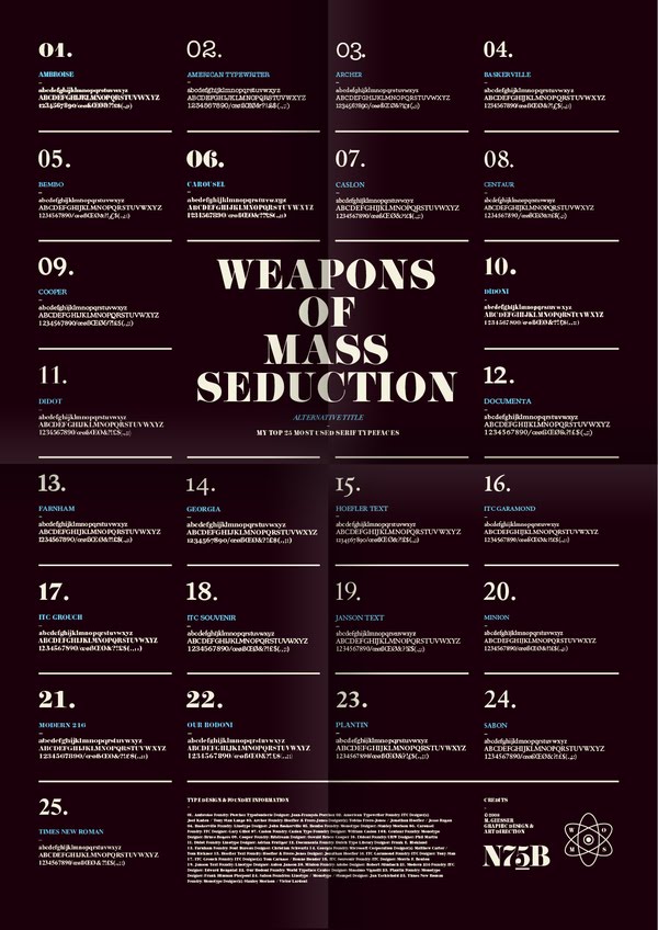
I choose this piece for a number of reasons. First being, I felt it was a good demonstration of hierarchy. I like how each one of the numbers is done in the type face its numbering. It's subtle but effective, also it's not too much of a change leaving the piece still looking very well put together. Also if you take a look at his website (mike giesser) http://mgiesser.com/home/ , in his intro he talks about keeping it simple. this just reminded me of all the times Alice has said that she could design with only 5 type faces for the rest of her life. I;m learning more and more how true this is.

Mostly I choose this because it made me laugh.Normally I hate this faux art nouveau font, but ever font has it's day and I think it works great here. This piece was done by Andrej Krahne. He's a german designer which also makes me a little sad because I can't read alot of his work. However his website is in english www.andrejkrahne.de/#home . He's done some great books that you should check out. His work is very clean. It's simplistic, but not minimalistic. He loves sans-serif.

Helvetica Swiss Army Knife. Couldn't find any more information on it. But it's pretty. The end.

I'm working on a catalog for Bicycles right now so this caught my attention. These were done by a designer French Designer, Juri Zaech. He wants to actually build these bicycles which I think is very cool and he would definitely be featured in my catalog. you can check him out at http://newcreatives.com/?userID=1182189218 . I don't really know his deal right now. His website says that he's an art director. His website has alot of information missing. Who knows.

This piece is done by designer Adam Augustyn. I choose this because his work is nice, but it's trendy and has become generic. However his website looks realy nice.
Wednesday, November 3, 2010
Who doesn't love typography and posters?
Talking about gig posters last week reminded me of Kevin Mercer's work. I found about him after meeting him and picking up one of his prints at R5's Punk Rock Flea Market (part hipster flea market, park local art/craft show). He's a freelance designer based in Oaklyn New Jersey and goes by Largemammal online. He does all kinds of design work but mostly makes screen printed gig posters that feature some pretty cool typography. He uses all kinds of type, making his own hand lettering, using existing fonts or manipulating them to fit his project. He has a lot of great posters on his site, these are two of my favorites. I really like how much variety he has with his type and how he makes it relate back to his illustrations.


I also found a series of posters by Tom Davie while browsing on Design Work Life. He studied at SAIC and now has his own studio, studio twentysix2, in Cincinnati, Ohio. I couldn't find out much about the actual project, but he has a pretty great series of posters illustrating different typographic concepts and terms. There's really nice looking and bold images of what different parts of type are and what they do or look like. I just really love the way they look, the photographic ones especially, and think it's a pretty good looking way to familiarize yourself with type.


Monday, November 1, 2010
silkscreened designs are so refreshing!


We all have probably created/tried to create a silkscreen effect on type or images. However, no matter how many textures we layer on, nothing beats a good old silkscreened poster. What first drew me to Ed Nacional's work was his poster series for the Terry Shop, a vintage clothing store. What is most attractive about the series is Nacional's use of screenprinting, which is refreshing in a world of primarily vector images. Based in Brooklyn, NY, Nacional blends the universally pleasing multi-typeface poster with classic handmade techniques like letterpress and silkscreening. Nacional's creative use of type paired with old school techniques makes his designs just oh so pleasant to look at.
Sunday, October 31, 2010


Subscribe to:
Posts (Atom)