
Typography can be executed in many ways where what you think, may not just be what you think...The typography illusion can call an emphasis to the words that it's presenting, or sometimes leaves the viewer in awe when two different words are presented in one. It pushes the boundary of what typography is in graphic design and extends it into fine art, and sculptural forms.


Type Addicted by Victionary is not just a simple typography book, since its cover is an optical illusion. The words are hard to see since they are made up of patterns from the black and white triangles. The words becomes easier to see when looked upon from far away. It is because the triangles making up the letters are slightly blurred in order to make this magic happen.
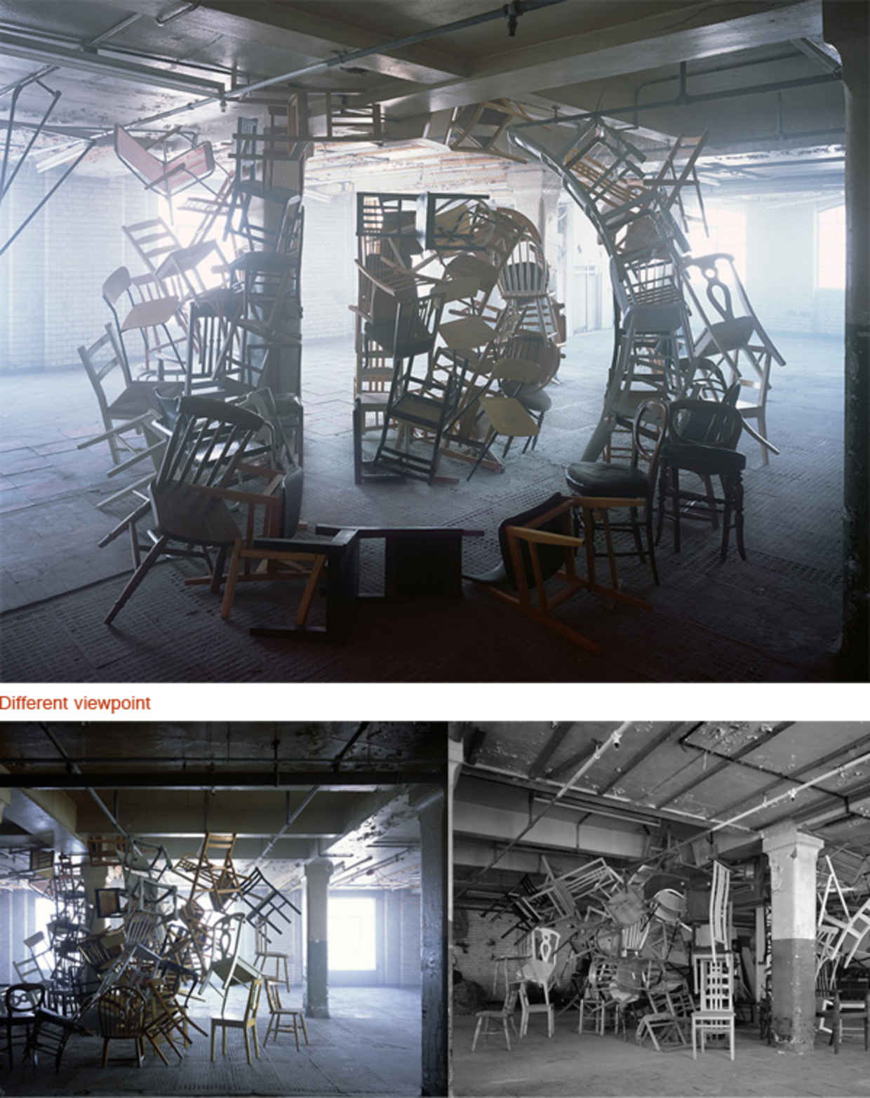
This sculptural typography piece from other angles can just be a cluster of chairs. But it is entirely different when viewed from another perspective.

Anamorphic illustration: Two sides to every story by Lex Wilson
Anamorphic illustration: Two sides to every story by Lex Wilson


Doyle Partners achieves the look of a 2d typography layout on top of an image in real life, with just the right amount of stretch and positioning for each letter.
Below are some that experiment with how the use of light interacts with the type and shows the hidden message.


No comments:
Post a Comment