
Graffiti is writing or drawings scribbled, scratched, or
sprayed illicitly on a wall or other surface in a public place for the purpose
of communicating a message to the public. It has been around since ancient
times when inscriptions and drawings were written on cave walls. Modern
graffiti that we know of and see everywhere today came about in the 1960s.
The graffiti movement began in New York City with a tagger
named Taki 183. He began writing his name in marker everywhere he went, whether
it was a subway station or on the inside or outside of the car itself. He
eventually became well known all over the city and in 1971 was interviewed for
an article by the New York Times. After this, kids started following him and
writing their names all over subway cars as well, realizing the “fame” that it
could bring to them.

There are three main forms of graffiti, tag, throw up, and
wildstyle. Tag is the most basic form, and is just the signature of the
graffiti artist, caller a tagger. This person is someone who tags their street
name everywhere, but lacks in drawing. Many street artists start
as a tagger and then develop more of a style from there.
Throw up style is recognized as bubble letter type, and
there are many different variations of it. These are done more quickly than
wildstyle and therefore are not as elaborate.


Wildstyle is the last and most creative style. These type of
graffiti pieces can take 2 hours to even months to complete. There’s no
specifics to this style, but there are many techniques applied, such as 3d,
shadowing, glows, and gradients, when writers try to develop their own unique
and memorable style.

So
does graffiti correlate with typography? In an article by renowned type expert
John D. Berry, he states that graffiti is less like typography and more of a
cross between hand lettering and sign-painting. Where typography’s main goal is
communication, graffiti is all about self-expression, similar to calligraphy
and its expressive forms. Both take standard letters and turn them into more
elaborate visual forms that have more to do with the art of it rather than the
communication.
Graffiti
making is just as much a process as hand lettering an existing typeface or
creating your own. Each graffiti artist has their own unique style and no two
pieces are the same, its like creating a new typeface each time, moving from
simple to more complex and adding decorative elements. If you strip away all
the excess of graffiti, you should be able to recognize a legible alphabetical
letter in its simplest form. There’s only so much you can do to stylize a
letter before it becomes unreadable or turns into another letter.
I
find Graffiti and letter manipulation to be a very impressive art. It isn’t
easy and definitely requires lots of skill and dedication. Being able to create
these letters seems simple, but is more complicated the process takes lots of
practice to become great at it. Each individual letter can be so elaborate and
expressive, it really amazes me what people can create starting with a basic
form, and I think it is just as important and accomplished as other examples of
hand lettering.
Graffiti art is very much a part of the type and
graphic design world. It can be seen everywhere around us, in the streets as
well as on t shirts, posters, album covers, and even in galleries. There are
numbers of graffiti fonts out there, but none do justice to actual graffiti
creations.
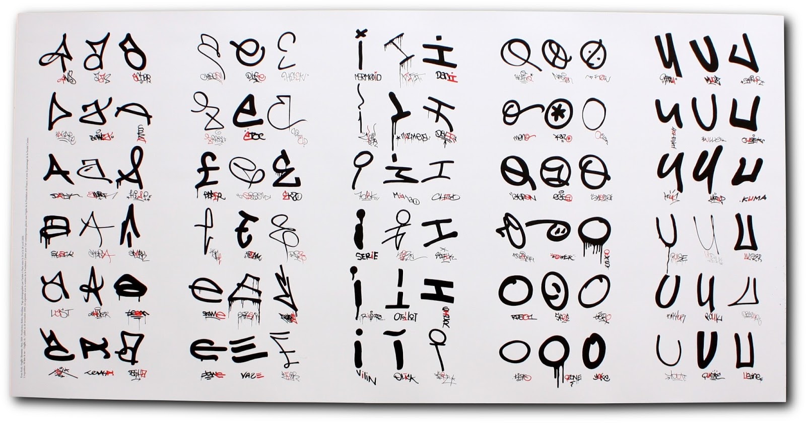
There is one project called Graffiti Taxonomy by
Evan Roth that presents isolated letters from different tags by numerous
graffiti artists in an effort to show the diversity in styles of a single
character. I find this interesting because it really captivates how different
every letter can look when they were all derived from the same form. It goes to
show that graffiti really is not only about added effects and extreme
abstractions, but the simplicity in the differences of the basic typographic
elements.

No comments:
Post a Comment