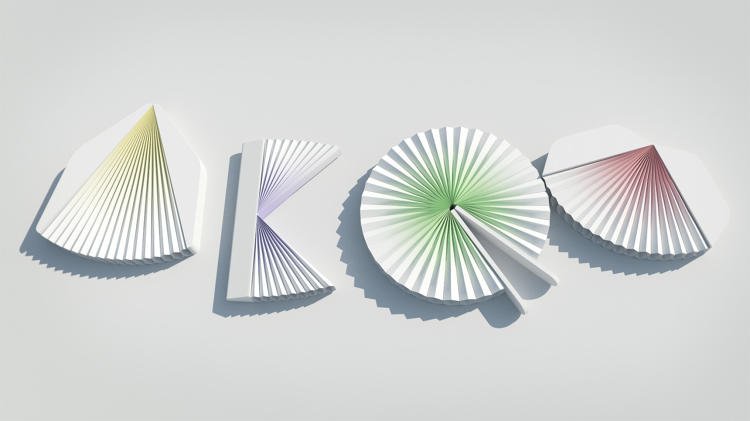
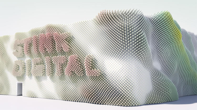
"Fusing kinetic architecture, typography and sound to construct audio-reactive buildings – words emerging from the structural movement.
Inspired by utopian city planning, Japanese paper houses, modular signage systems, rotating buildings, physical pixels and flexible building facades."


This video by Universal Everything depicts digitally-rendered architectural interpretations of brand idenities, visualizing typography as three-dimensional structures.
Designer and illustrator Jonathan Mak created a chinese typeface based on his observations of architectural forms.

"The name of my typeface, "Zhu Ti", literally means "Architectural Form" in Chinese. It originated from my interest in the geometry found in everyday life. Living in a concrete jungle as dense as Hong Kong's gave me ample inspiration, and I began a visual archive of all the interesting shapes and negative space observed in the buildings that surrounded me. I realized that it was not purely the geometry, but the ways in which structures ebbed and flowed that appealed to me. And it is the irregular visual rhythm that distinguishes Zhu Ti from the more rigid, restrained geometric typefaces."
Designer Matt Stevens also explores space and geometry with his Exploded Alphabet, which recalls architectural blueprints and isometric drawings.


View them all and more here
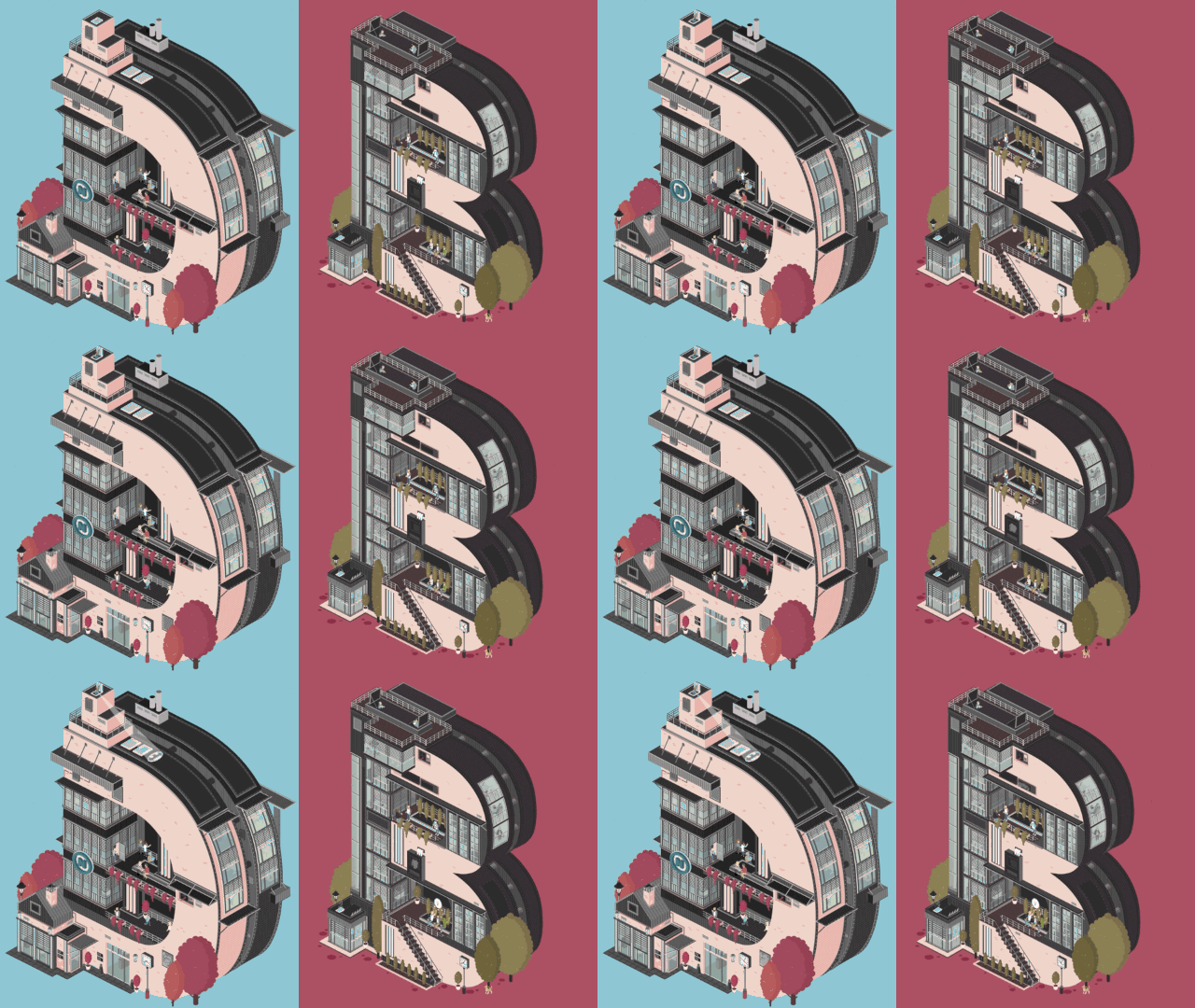
A German creative company called DeepBlue Networks created a series of animated buildings in the shapes of the letterforms in their logo (DeepBlue)."Each building-letter is filled with little Sim-like people running around, and represents a department within the firm, including art direction, copywriting, interaction design, and motion graphics."

Finally, I found this compilation of images of typography being used on or as part of actual architectural structures, impacting both how the typography and the buildings/spaces themselves are understood.


Another list like it (with more images of the korea pavilion) can be found here

No comments:
Post a Comment