
The environmental and economic impacts of design and print media are important to consider, especially regarding the cost and quantity of materials used. For this post I decided to research the intersection of typography and sustainability, and investigate typographic choices and innovations that respond to this issue.
The goal of sustainable typography is to reduce the amount of ink and paper used in printing. Simply put, conserving ink and paper saves money and the environment.
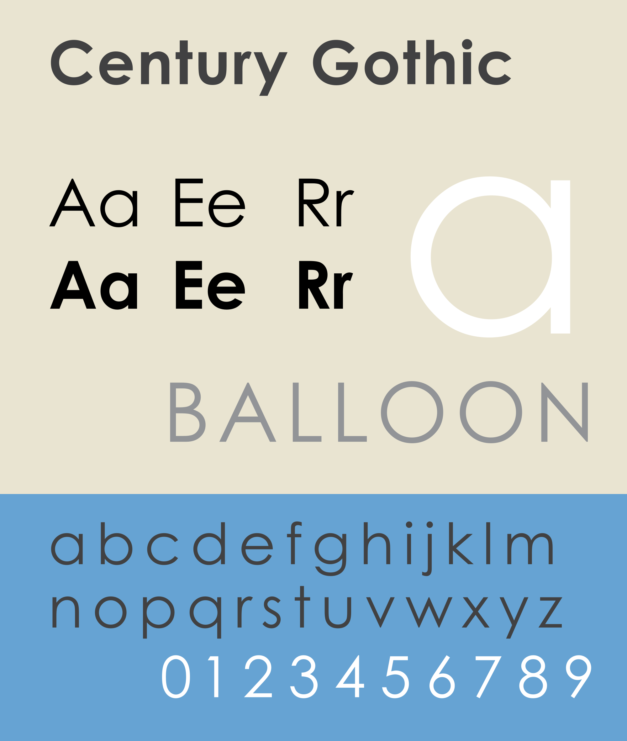
Century Gothic is regarded as a "green" font. A study conducted by the University of Wisconsin showed that it uses 30% less ink than the default font Arial, and even beats out Ecofont, which was designed for sustainability, in terms of ink usage. However, while it conserves ink, Century Gothic is wider than many other fonts, meaning that it is not sustainable in terms of paper use.

Gulliver, designed by Gerard Unger in 1993, was marketed "The world's most economical printing type." At 10 points, it can be condensed up to 90% of its original width, and due to a large x-height it can be read at smaller sizes without seeming small. The article I read gives an example of Gulliver's effectiveness. When USA Today had to adapt to a more slender layout, the publication lost a column of body. Switching to Gulliver allowed them to print the same amount of information in a smaller space, without the copy looking too small. This speaks to Gulliver's ability to reduce paper usage.

The Ecofont family was designed by a company called SPRANQ in the Netherlands, and is significant because unlike Century Gothic it was designed with sustainability in mind. Ecofont is a sans-serif typeface based on the Vera Sans family. The center of each letterform is lined with a series of small "holes," which reduce ink use by 15% compared to Vera Sans and do not reduce legibility. This version of Ecofont uses more ink than Century Gothic. However, the Ecofont software can also produce an Ecofont version of Century Gothic (and other fonts), significantly reducing ink usage. The creators of Ecofont recommend using a narrow version of Ecofont in order to conserve both ink and paper.
This post on Ecofont's website explains all of this and more, including the choice of Vera Sans (a lookalike of Verdana) as the basis for the font.

Ryman Eco, designed by Monotype, the Grey London advertising agency, and the Ryman stationery retailer in the UK, is another font designed to be sustainable. Each letterform consists of a series of strokes with space in between, and consequently Ryman Eco uses approximately 33% less ink than standard fonts. When printed at smaller sizes, ink bleeds into the negative spaces and causes the letterforms to appear more filled in. Legibility is extremely important in designing a typeface, and the designers of Ryman Eco took this into consideration in designing the font. Aesthetics were also a focus of Ryman Eco's design, setting it apart from fonts like Ecofont. In the words of Dan Rhatigan, type director at Monotype, “I feel other eco-friendly fonts have compromised on design, if you use them for anything other than an invoice, they’re just not very pretty. With Ryman Eco, we wanted to create something that looks like a classic serif from a distance but is also a beautiful font to work with when you blow it up. It was critical that it wasn’t just functional.” Ryman Eco is advertised as "the world's most beautiful sustainable font." What's more, Ryman Eco is free to download, making its sustainable impact widely accessible.
The Ryman Eco website features a series of designs using each of the font's capitals, as well as a video about the design of the font.
While no eco-friendly font is perfect, and none offer complete solutions to the issue of the economic and environmental issues surrounding printing. However, they still offer improvements and encourage consciousness of the environmental greater impacts of print design and communication.
Sources
https://en.wikipedia.org/wiki/Ecofont
http://www.ecofont.com/en/products/green/printing/saving-printing-costs-and-eco-friendly/why-ecofont-saves-more-ink-than-century-gothic.html
http://www.gizmag.com/century-gothic-is-greenest-font/14654/
http://www.huffingtonpost.com/2014/04/22/ryman-eco_n_5192501.html
http://www.trulydeeply.com.au/madly/2014/09/11/ryman-eco-beautiful-sustainable-typeface-brand-identity-design-studio/
No comments:
Post a Comment