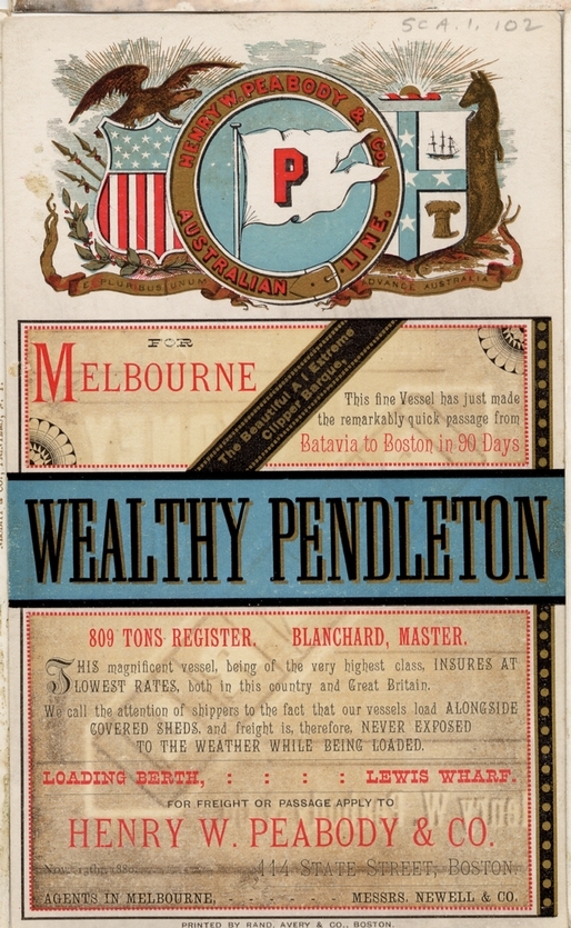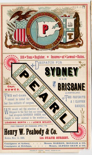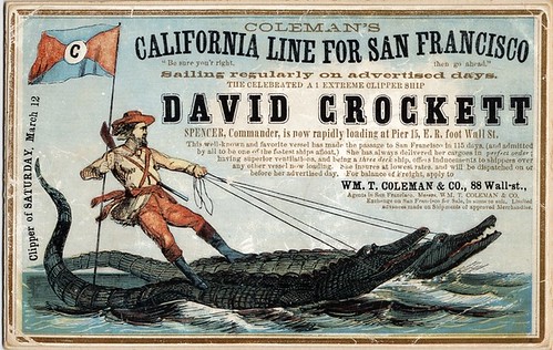
While browsing the internet I discovered "19th Century Clipper Cards." I read into them and they were small cards used to advertise Clipper Ships that would take people from one port to another. They're really great little pieces of typography and the images are awesome too.
This is one that I really like("Wealthy Pendleton"). I think that the hierarchy works really well. We're learning a lot about hierarchy in Type class and I think that these are good sources of examples.


Here is another pretty one that uses a lot of ornaments ("Pearl"):
There are also some funny ones that incorporate the imagery well.
Here is a link to the Flickr account where I found the rest of the Clipper Cards:
Here is a link for the history of Clipper Cards:

No comments:
Post a Comment