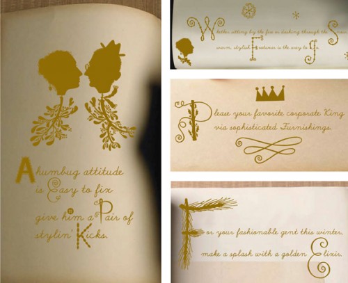
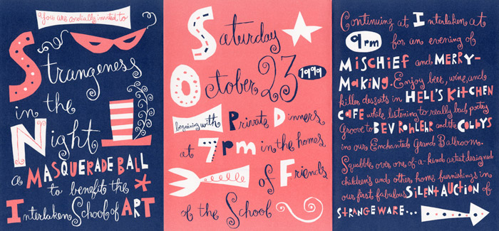
Melinda Beck creates a lot of her own hand-done typography. I didn't realize that I had seen some of her work from Noggin, the version of Nickelodeon for a younger audience. She created the cute, collaged characters for the animations she made.
She has has created book covers and images for magazine spreads as well and likes to mimic cut paper in her typography. The cut paper elements help to create a visual hierarchy in her work.
The last piece is still using hand-done type in a more sophisticated look than her previous work. Again the drop caps that she creates and embellishes break up the text to create hierarchy and more visually intriguing.


No comments:
Post a Comment