

 |
| Face Reality As It Is by Thomas Quinn, 2010
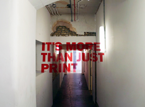
I came across these images on tumblr a couple weeks back and at first I thought it was photoshopped type simply layered on top of an image, but when I saw the second image I couldn't help but research what this was all about. This is an example of anamorphic type. Anamorphis in general is, "...a distorted projection or perspective requiring the viewer to use special devices or occupy a specific vantage point to reconstitute the image" (Wikipedia). Street artists like Edgar Mueller are known for popularizing this kind of artistic illusion - like his piece The Crevasse. Here, Chicago designer Thomas Quinn is mixes anamorphis with typography creating intriguing installation work. This video shows the distortion and illusion of the piece Face Reality As It Is within the space. Below are other anamorphic typographic pieces by Thomas Quinn.
   
For the HOLLY HUNT Showroom in Miami
Thomas Quinn wrote on his website that he takes his inspiration for his anamorphic type work from the works of Graphic Design students Joseph Egan and Hunter Thomson from Chelsea College of Art & Design. Here are examples of their anamorphic typography and their artistic statement about these installations.
And here's a video of these pieces working in the space:
Other examples of anamorphic typography by London designer Charlie Mitchell
 
Time lapse of another anamorphic type piece:
|
No comments:
Post a Comment